
Rebecca Vincent Artさんのイラストまとめ
@printrebFollow @printrebさんをフォローする
フォロー数:3694 フォロワー数:12314


Drawing on inspiration from Scottish islands, Sunset beyond the Headlands is an imagined view. The colours in the sea mirror those in the sky to give a sense of reflected light. The headlands were printed using paper stencils and shades of indigo ink. https://t.co/USKLJyWlLN

Not sure if I've shared this before - or if I have, it was a long time ago! This is an etching called Rift Valley, created on a copper plate with a variety of resists to form this piece. I love the unique combination of colours in this one - thoughts? https://t.co/lEX2GI8kID
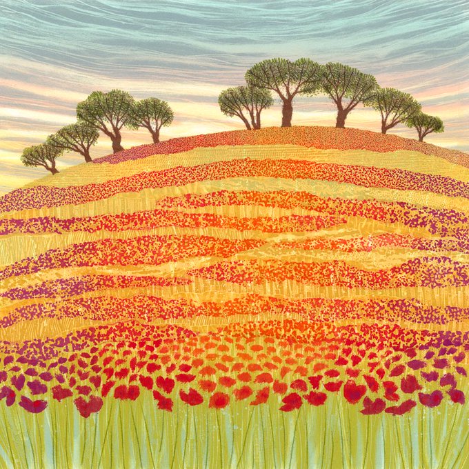
"A glorious meadow with poppies in full bloom. I do these more summery pictures from time to time as a seasonal change from my more wintery work. I wanted to incorporate more varied shades of red and orange to give light and variety.
https://t.co/sQAs2SBRvz"

"Do you enjoy watching the quiet patience of a heron fishing in a pond or lake? There's something about the dusky grey feathers and the bend in their necks which is mesmerizing. This image is available as a greetings card. Part of my #BritishBirds series.
https://t.co/zUdp9Ycdha

Final Colours: I've created many sunset skies using monotype printing but this one really seems to have the glow and intensity of a real sunset. The small trees give a hint of long summer days. You can watch a making-of video over on my blog: #sunset https://t.co/C28MdlWnSa

This large fiery sky began as an exploration in colour. I wanted to find a way to achieve a sunset sky that wasn't delicate pinks but brooding, powerful reds. "Catch Fire" appears to radiate light because of colour juxtapositions. https://t.co/EDRpDF3JRE

"On the Right Path" is a hand-printed etching. I used two plates to build up the rich overlapping colours. Inspired by family trips to the seaside. Available mounted and framed. https://t.co/0q10fFqJah

Earth lines is inspired by ploughed fields but when I'm working on the foreground area, it becomes more about colour and texture interactions and abstract mark-making. The trees give focus, contrast and a sense of scale. Print sold out but cards available https://t.co/FDtE8nWKZr

Serenity: influenced by Japanese woodcuts, this new original monotype is printed in layers of translucent ink to make the colours softly glow. Imagine the reeds moving gently in a light breeze, touched by the light as the sun goes down. Available now https://t.co/9M5WH05CzZ

"Rather than a specific coastline, this image is about the joy and anticipation of approaching the sea and moving through the varied flowers and grasses along the way.
https://t.co/V6Xk3D29f1"