Claire Hummelさんのイラストまとめ
@shoomlahFollow @shoomlahさんをフォローする
Lead Visual Designer @cyanworlds. Did stuff for Half-Life: Alyx, Westworld VR, Mondo. I draw lots of rocks and historical fashion. linktr.ee/shoomlah
clairehummel.comフォロー数:1017 フォロワー数:79278
237 件中 91〜100件を表示


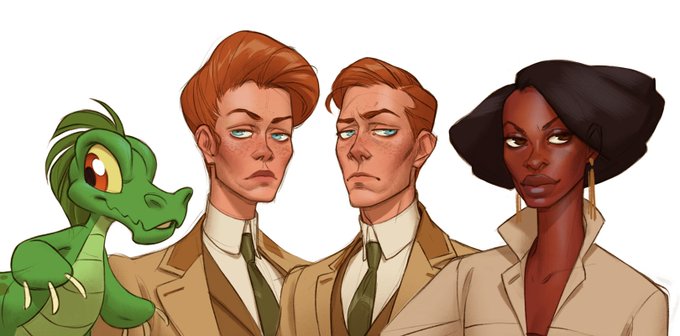
I first sketched these out a couple years back and just decided to ink/color it last night, but it's fun to look back at the reference-study-stylization process:
37
422


I designed a chitzy floral version of the @camposanto skull for... reasons, last year (which we didn't end up using), BUT we got to re-purpose it for the company holiday card🌹💀🌹
54
538


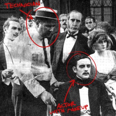
this comes into play in early filmmaking, where filmmakers are using green/blue makeup on their actors to make them look even vaguely normal on-screen, as well as carbon-arc lights (since incandescent light hardly shows up on orthochromatic film):
117
502