Sinobice (Commissions Open)さんのプロフィール画像

Sinobice (Commissions Open)さんのイラストまとめ


Artist and Designer with a focus on character design. Commissions Open.
Sketchy Huntsmen.

pixiv.net/en/users/34358…
sinobice.newgrounds.com

フォロー数:394 フォロワー数:200

RT is no better. This behavior is toxic to a company's image.

Big brands use stock responses to avoid creating bad press used against them, which Barb does regularly with RT. She didn't just "call them out," she mocked them by calling them "an edgy boy."

Always use this: https://t.co/FcA1KHv6Wn
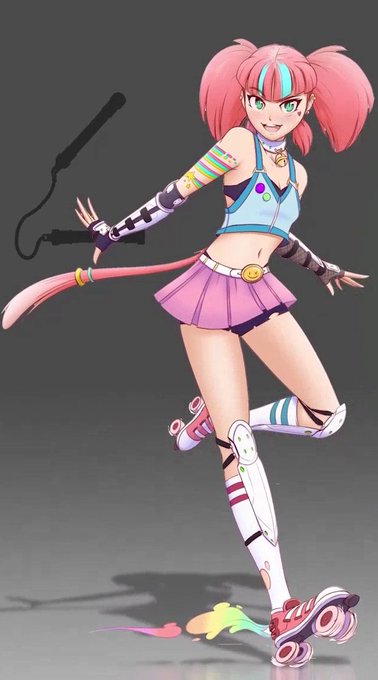
0 4

Not sure if it's official artwork, but this seems to line up with how they look in the show.

0 2

I absolutely hate this one.

I can't see Atlas clearly.

Main 4 posing takes up most of the view.

Ruby isn't as dynamically posed.

Worst aspect is it's just the V7 poster/cover again, but WORSE.

0 2

I've said my piece on this. I hate it. Moving on....

0 0

Forgot to mention this after V3. I'd say this one is alright. Mirror's V1 design by more fancy with the diagonal light frame. Says the Arc title and title is clear. V1 designs help keep the main 4-color scheme.

0 0

This is quite possibly the best promotional poster for a volume, I'm baffled it was not the Bluray cover.

The scythe and hair flowing into one another for framing.

The line of sight starting from Blake's eye going to Weiss, Yang, then RNJR.

And the visual communication! 🤩

0 2

Placement of the main 4 could also use adjustment.

The poster however is several tiers of improvement.

Clearer silhouette of Beacon, custom illustration, bakcground that doesn't obscure the focus, and fantastic framing of Ruby and the villains with her scythe.

0 0

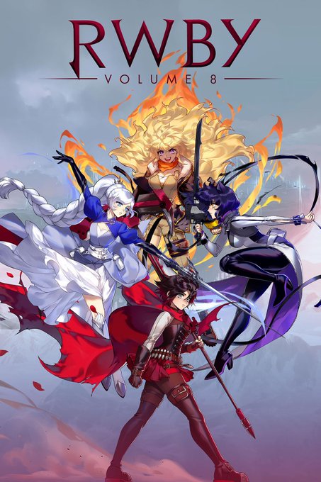
Volume 2 cover is rough. Colors are still well maintained, but using the show models can make it a bit jarring due to their quality at that time.

Thankfully the V1 designs are amazing, and the background doesn't obscure most of them (except maybe Weiss but her red collar helps)

0 1

The very first one I'd describe as humble beginnings.

Doesn't do anything too fancy, reuses concept images, but sets the branding standard spectacularly. 4 colors, 4 Girls, 4 letter title corresponding.

Short, Sweet, Simple, and stands out boldly among many covers.

0 2

I think the smoke in this scene is playing tricks on my eyes. For a sec I thought his aura looked blue.

0 2