My heavy psych band @lordloudmusic put out a follow up record, Timid Beast, last year but it sold out pretty quick. You can check it out here: https://t.co/GE6xkCrKkI
Here's a fav sngl off that record, Without You. Go peep it on Bandcamp or stream it, the guitar solo don't fit:
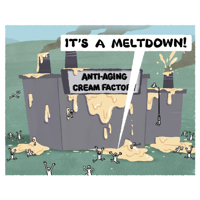
Happy #EarthDay. I already solved the climate change problem, but nobody's listening.
Contrast isn't the only way to separate elements in your image, it's just probably the most basic. There are other elements, like color saturation, to make certain things pop out and certain things recede. Like @MadyGComics said in a recent comment, it's about color relationships
To illustrate the 'no rules, just tools' mantra, sometimes you use the concepts but dial in how much value separation for desired effect. U can pull back on contrasts (in the case of this torchlit witch burning) or dial the contrast to 11 (in this dramatically lit closeup dialog)
There are many ways to lead the eye, but the strongest is often value contrast. Looney Tunes are great examples. Whites and Blacks are often saved for the main characters or framing the characters. Establishing good value hierarchy is one way to lead the eye
There are no rules, and these are just things to consider when something ISN'T working. If you're getting lost in the weeds, one simple trick is to try dark characters on light background or light characters on dark background:
Color is hard. Value is one way to reassess your work. Are your values separating in clear ways that tell your story? Have you grouped your values clearly? Is there value hierarchy to guide the audience's eye to where you want it?
Bandcamp Friday today! We only have a dozen @lordloudmusic (garage rock) records left, and about 30 @floralfaunaband (flower psych) records left if anybody's interested: https://t.co/GE6xkCrKkI


