


oc: @OkamiWolven
the satin varnish made the colors POP and the overcast neutral lighting enabled me to get significantly better pics


@KamiDaHobo @ArtRage i’ve only seen a brush engine like art rage’s in newer versions of corel painter. art rage was doing paint movement/interaction to an insanely realistic level before corel. it’s a brilliant program.
i did this 100% with the ipad version of art rage.
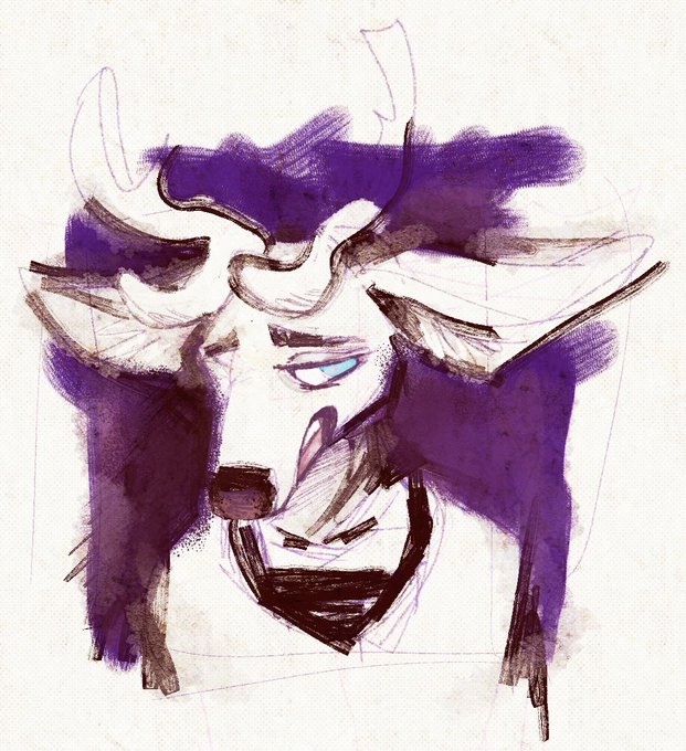

i want to draw good beastars fanart so i’ve been practicing drawing deer
i scribbled this in under an hour today and it vaguely resembles louis but it had been intended to just be a random deer lol


adjusted ute’s base color and now i feel like she’s too light ughhhhhhh there’s no winning
at least i managed to harmonize the colors better ?


@LunarOmens copics, definitely. i’ve worked with alcohol based markers for years, and i still don’t understand how people create stuff like this (art by @itaparu99 made with copics + watercolor, but it’s a good example) using copics. i don’t know what i’m doing wrong. LOL


sorry to spam but it’s kind of interesting to look back & see how far this evolved from the intended plainish flat drawing

this is so far from what i had originally intended to do Holy Shit.... initially i was just gonna do a flat and slap on some screentone textures. the drawing took the wheel tho and had some different ideas
mostly posting this to test colors, but constructive crit is welcome
