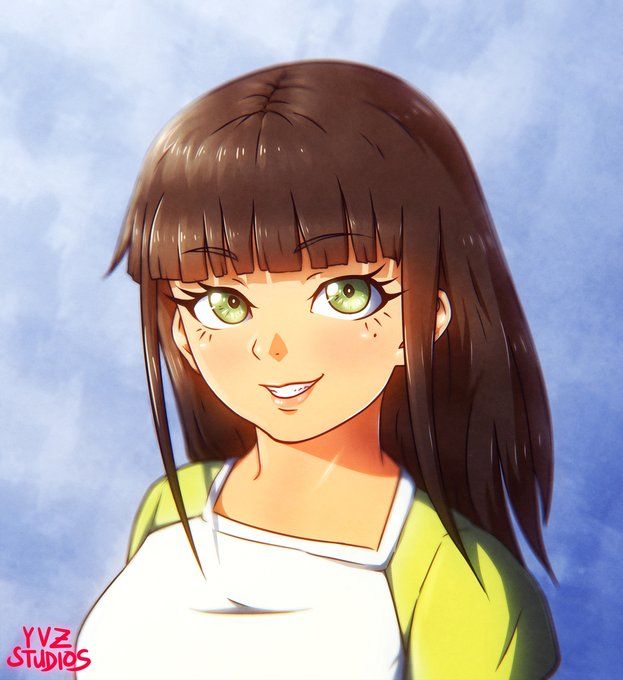
Time for constructive & honest art critique! 😃
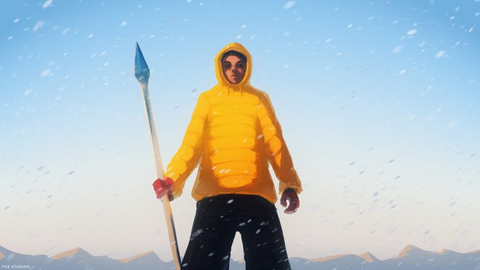
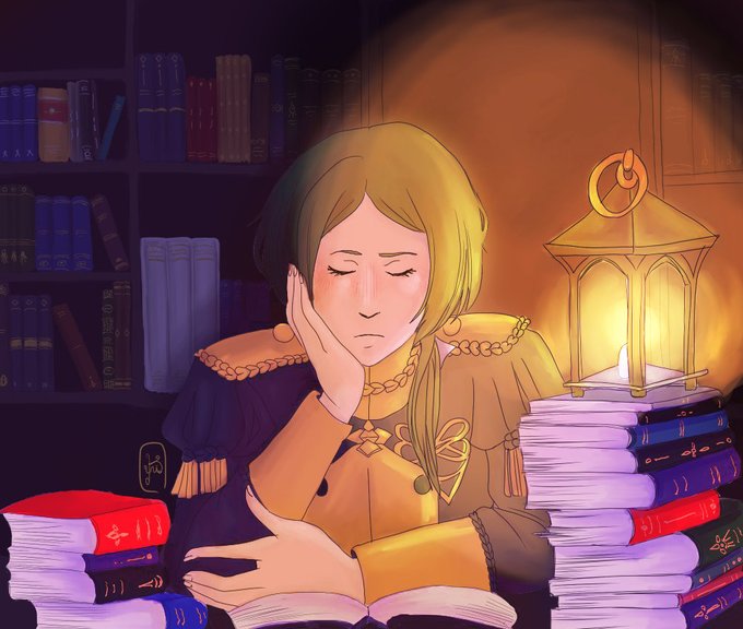
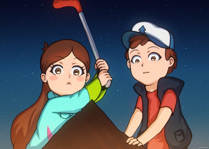
Here are some of my works:
✨ Tell me what you like about it or not (optional)
✨ Tell me what you think should be improved (perspective, anatomy, shading, etc.)
✨ Ask to do the same for you (optional) https://t.co/HD6xITd0as
@aldebris Another thing is that the intensity of light decreases the further away you are. That's why the wall in the background should be a bit darker. And to really show how bright you light source is you can add a glow to it by using a soft brush on a layer in "Add" blending mode 😃
@aldebris oh! interesting 😃 I'll choose the first one then. Mainly I'd recommend using a different color for the skin. The key light is a pretty warm one, so the skin should recieve that. You can keep the purple/blue shadows of the books bc they are not lit much from the key light.
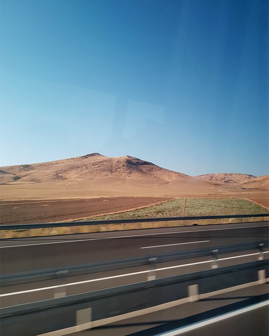
@itstarekali The aesthetic of film is the reason why I tought myself how to color grade and edit images so that they convincingly look like they were shot on film 🥰🎞️ #35mm
@Robots_and_Such Hi, I'm yvz! (◍•ᴗ•◍)
I make drawings, tutorials, music and love color theory!
The most "demon" thing I have is this DTIYS I've participated in 😅
Here is a Collection of my Artworks:
🎨 https://t.co/bg5hkI3KwA
🎵 My Music: https://t.co/K18cHnnOnh
@AsheIllustrates Hi, I'm yvz! (◍•ᴗ•◍)
I make drawings, tutorials, music and love color theory! 🎨
Here is a collection of my artworks on Twitter:
https://t.co/bg5hkIllo8
🎵 https://t.co/klVgborklk
✨ https://t.co/iICWlfwi2U
@Fierce_Chai I usually have blue in my works as a complementary contrast to warm colors 😄🎨
My favorite fruit: 🍏 sour green apples 😋
@liXhu Here are some of my works from 2016/17! 🎨😄
https://t.co/JKlCA9rjyK


