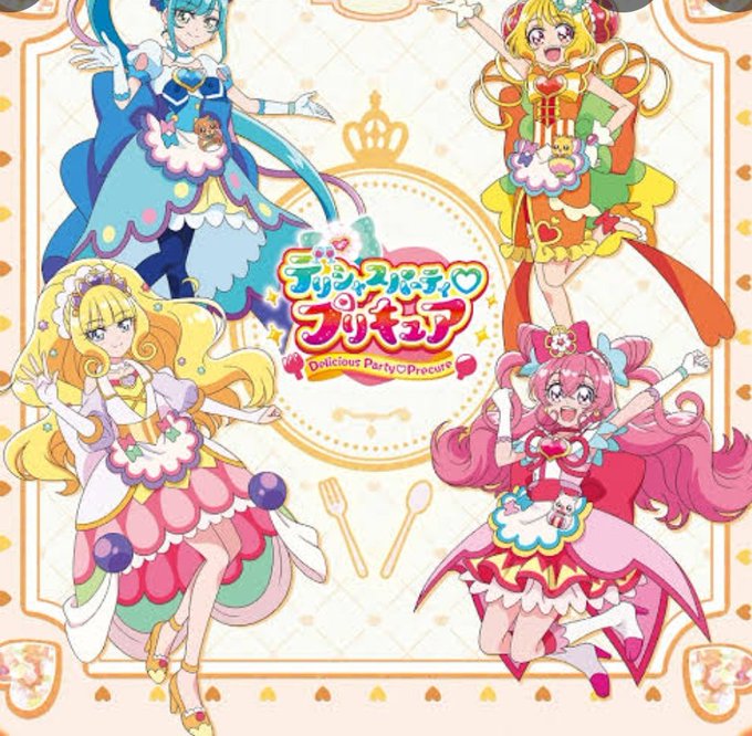
デリシャスパーティ♡プリキュアのタグが付いたイラスト。 280ページ目
23274 件人工知能が画像解析を行いタグをつけます(α版)


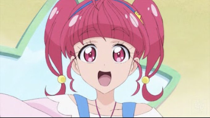


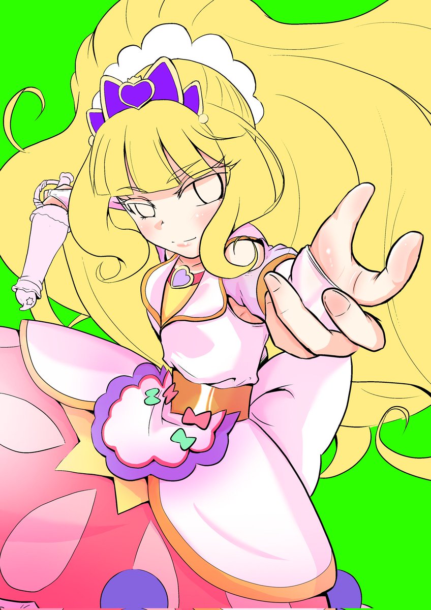
最近プリキュアしか塗れてない💦
その分いっぱいプリキュア塗ったからぜひ見てってね!
#デリシャスパーティプリキュア
#塗り絵
#プリキュア好きと繋がりたい
0
2


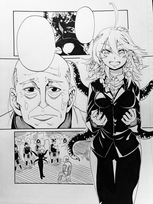
自分の夢のニート生活実現と零士さんの借金返済するために必死にラナを捕獲しようとするお話になります。※多少の内容とは異ってしまい申し訳ございません。😥💦"
まぁ、私の描く閻魔ちゃんの外伝漫画はプリキュア、スパイファミリーそして、ルパン三世がぎっしり積み込まれた感じになります。続き⬇
1
10


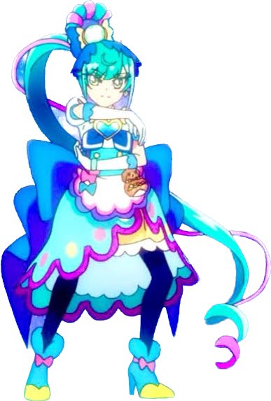
@YamiPGOld もうこっちにしか見えなくなった🤣
S12の報酬はキュアフィナーレで🤪
キュアフィナーレ可愛いね👍️
0
1


ぽわぽわらん
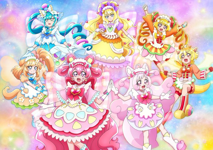
デリシャスパーティ♡プリキュア 第8話 ちゅるりん卒業!? おでかけ! おいしーなタウン
らんちゃんの様子がおかしい
#デリシャスパーティプリキュア
0
0


@val8RJzZQLkWNe7 はじめまして。検索から失礼します。
当方6弾プレシャスを所持しております。
こちらのあすか先輩との1:1の交換は可能でしょうか?
ご検討よろしくお願いします。
0
2


@Dolly0607 推しは推せる時に推せ
ですね‼️
私も5やハグが終わってしまってから
今を楽しまなきゃと思いデパを大いに楽しんでいます
0
4


またひとつ歳を重ねてしまいましたが、皆さまのおかげで元気に過ごさせて頂いています、ありがとうございます。
あとどれくらい稼働出来るかある意味チャレンジですが頑張ります(笑)
サプライズでけろまる師匠@k669583029 の奥様から素敵なここねお嬢様の誕プレを頂きました!感謝です♡
3
29