ルビー・ローズのタグが付いたイラスト。 305ページ目
17485 件人工知能が画像解析を行いタグをつけます(α版)
#RWBY #whiterose Fanzine INTEREST CHECK!
Are you interested in being a part of a whiterose fanzine? If you are, please fill out THIS FORM! It’ll only take a minute, and it’ll help us figure out what you, the fandom, want!
https://t.co/jTcjUtDprq
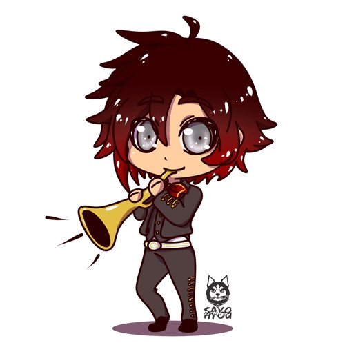
Some icons I made recently. (Oldest to newest) Been trying to draw more fanart too! I am enjoying this style for smaller, more cutesy stuff, so I'll probably keep it.
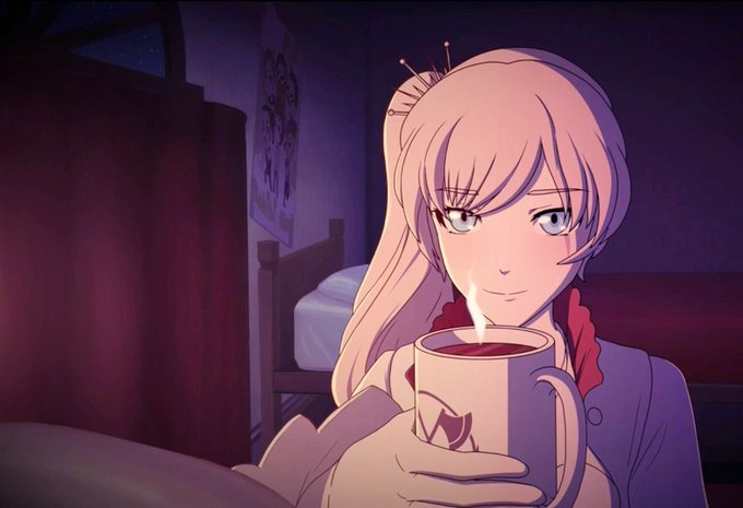
The 3rd image is a redraw of the last image drawn by Ein Lee
#rubyrose #AmityBlight
the best part of getting screenshots is the unflattering frames
Centinels: GET YO FUCKIN DOG BITCH
Yang: GGGGGGGGGRRRRRRRRRRRRRRR BARK WOOF GGRRRR
Ruby: she dont bite
Centinels: YES SHE DO
Fuck all this negativity
Which 2 RWBY songs are you playing on full blast
I'll start:
karma’s art <33 theyve improved so much!! also uhhh here i guess
i tag any artist who wants to do this idk auuuuuuuhhhh https://t.co/v8ofuB6qhs
i like #whiterose. i'm not crazy about it, but i do make content for it and enjoy it as a ship.
that being said, some of this behavior is unacceptable to me. i'm not sure where the fndm got the idea that complaining and yelling the loudest means RT will make their ship canon.
To my fellow White Rose ❄🌹 fans. Let's not give up!
We can be vocal to Rooster Teeth, how much White Rose means for us and the series.
Maybe they already have a suprise for us soon, In V8 and New Merch?
Be strong WR Nation and let's not lose our hope ❤💙 #RWBY #Whiterose
bonde das ceifadora 😎🌹
#rwby #rwby8 #rwbyv8 #rwbyfanart #rubyroserwby #roosterteeth #rwbyredraw


