ワイス・シュニーのタグが付いたイラスト。 218ページ目
16154 件人工知能が画像解析を行いタグをつけます(α版)
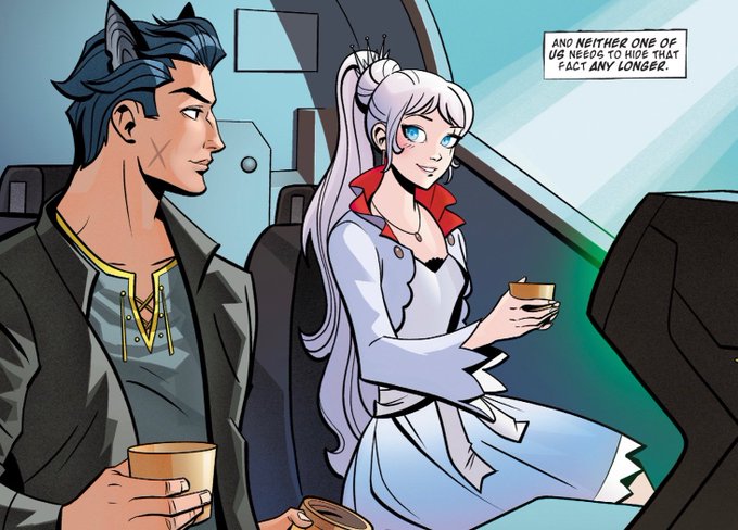
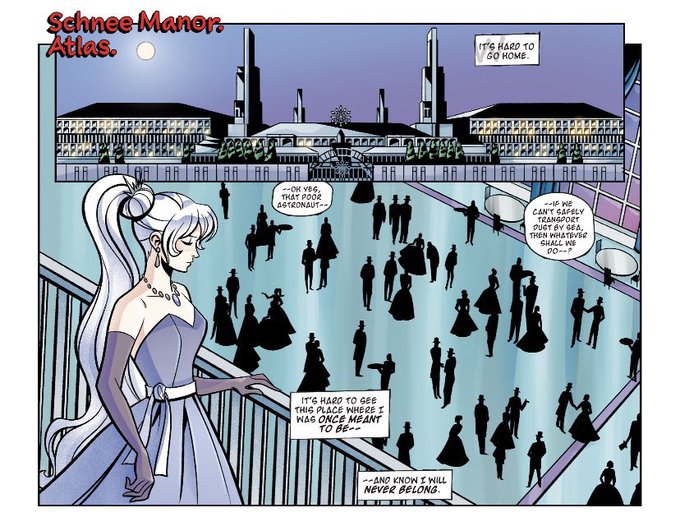
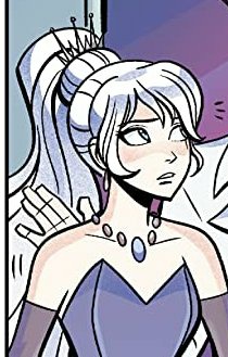
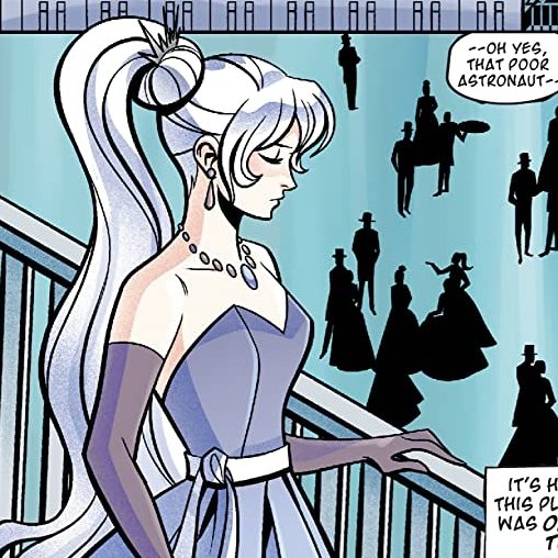
RWBY x Justice League Issue 3
Description: Weiss comes face to face with a brooding boy accused of theft at the Schnee Dust Company dinner, and in an act of defiance, teams up with him to prove his innocence, combining both of their shrewd detective skills! #RWBY #JusticeLeague
#RWBYV8SPOILERS #RWBY8Spoilers #RWBYSpoilers #RWBY8 #RWBYFanart
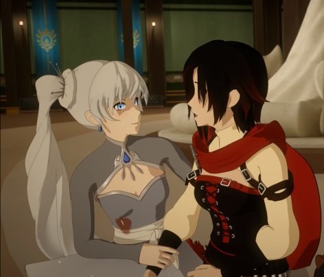
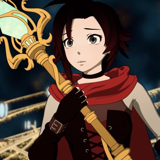
my poor baby Weiss, this scene hHURTED
Hii #VisibleWomen
I'm Yellow Nicky and I usually draw more female characters and RWBY fanarts.
Currently working with commissions and studying to try to improve my work 💛
OH DIOS MIO QUE TIENEN EL PUTO VALOR DE SHIPEARLOS.
PERO QUE MARAVILLOSO MANJAR DE LOS DIOSES ES ESTE.
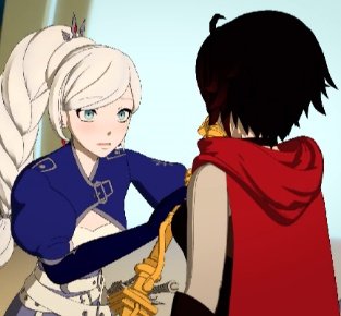
The crossover comics are slowly converting me so allow me to present a thesis complete with empirical evidence backing up my conclusion ✌️
#RWBY #RWBYSpoilers
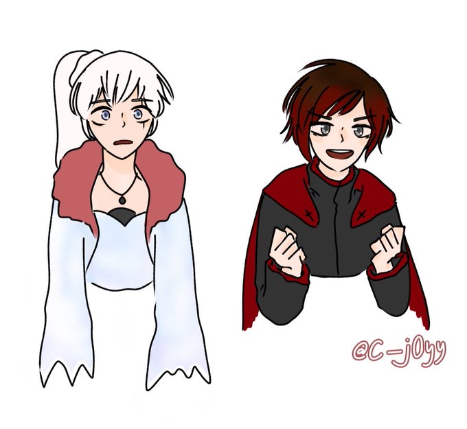
i haven't drawn RWBY art properly in ages, but i was reminded of a couple traditional ones i drew way back when i first got into the show! i planned to do the whole team but never got round to it 😅
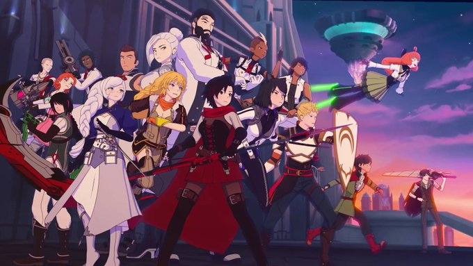
anyway volume 8 was a blast, so joining in on the #ThankYouCRWBY 💗 #RWBY
Hehe the Bees ship it too 👀
#RWBY #RWBYSpoilers #Bumbleby
Forgot to mention this after V3. I'd say this one is alright. Mirror's V1 design by more fancy with the diagonal light frame. Says the Arc title and title is clear. V1 designs help keep the main 4-color scheme.
This is quite possibly the best promotional poster for a volume, I'm baffled it was not the Bluray cover.
The scythe and hair flowing into one another for framing.
The line of sight starting from Blake's eye going to Weiss, Yang, then RNJR.
And the visual communication! 🤩
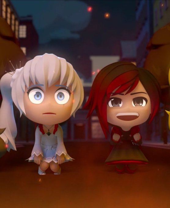
Weiss pushes Ruby and sacrifices himself to save her: a
Ruby: NO! *Explosion*
#whiterose #rwby8
Placement of the main 4 could also use adjustment.
The poster however is several tiers of improvement.
Clearer silhouette of Beacon, custom illustration, bakcground that doesn't obscure the focus, and fantastic framing of Ruby and the villains with her scythe.
Volume 2 cover is rough. Colors are still well maintained, but using the show models can make it a bit jarring due to their quality at that time.
Thankfully the V1 designs are amazing, and the background doesn't obscure most of them (except maybe Weiss but her red collar helps)
The very first one I'd describe as humble beginnings.
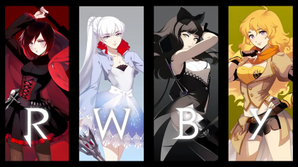
Doesn't do anything too fancy, reuses concept images, but sets the branding standard spectacularly. 4 colors, 4 Girls, 4 letter title corresponding.
Short, Sweet, Simple, and stands out boldly among many covers.
// #ThankYouCRWBY Your hard work on the show has proven Monty's philosophy true. His dream of the show has transcended him, and he lives vicariously through this glorious product. Eternity loves the creations of time, and the spirit is indomitable.


