TypefaceのTwitterイラスト検索結果。 605 件中 6ページ目


Ardoise met the needs of publications. By extension, it met the needs of a newpapers typeface featuring a low contrast, straightforward forms. The verticals metrics and proportions are calibrated to match perfectly others Typofonderie families.
➽ https://t.co/Cie5hXC4Iw


Not quite oldschool but still relative! ⬇️
In August 2019, a 20th-Anniversary special collection of redesigned 'Brainreactor' typefaces was announced on Kickstarter by Andreas Lindholm. The collection contained approx 40 fonts, featuring refined editions of his classic typefaces


David Milan ✨ @mdemilan
A Lettering Artist and Illustrator, working across multiple disciplines including 3D Typography, Illustration and 2D animation.
#type01 #typeface #lettering #calligraphy #typography #design #illustration #c4d #3d #adobe #photoshop #designspiration


สีพาสเทล ไม่มีแบล็คกราว ส่วนใหญ่เริ่มงานจากเส้นดินสอ เเล้วเราก็ชอบเขียน typeface ลายมือใส่ในงานด้วย น่าจะมีเท่านี้ 😂
#เอกลักษณ์งานวาดของเรา

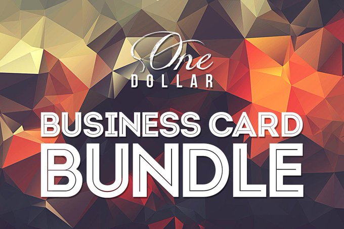
One Dollar Business Card Bundle x20 https://t.co/E6g4O0nnrE #design #typography #card #IDCardTemplate #BusinessCards #minimalbusinesscard #retro #CompanyCard #typeface #BusinessTemplate #creator


It comes as no surprise that many brands engage in their own custom typeface design processes 🦋 See more Love for Ligatures in our bio ✨
[ Featuring Idealist Serif by Nicky Laatz ]
#designelements #creativemarket

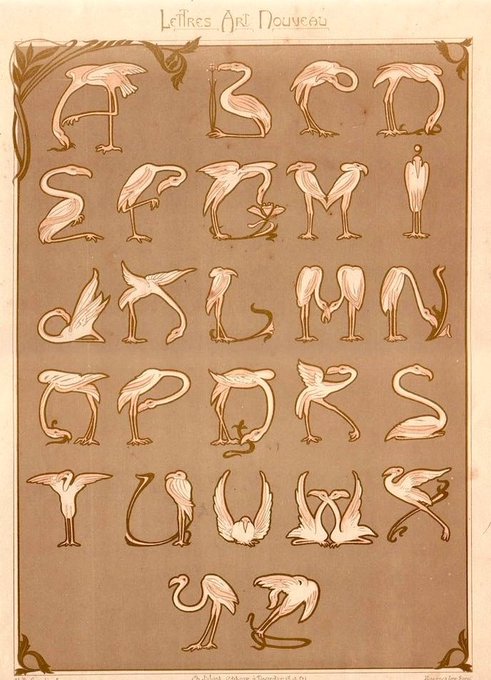
A whimsical typeface design of flamingos by E. Mulier, published in the “Lettres et Enseignes Art Nouveau,” Paris, 1901.


Even if the tradition of Caslon is visual irregularity between glyphs, ensuring consistency between weights of the same family is a necessary evil, here Caslonian.
— — —
#typefaces #fonts #glyphs #typography #logotype #typedesign #typedesigner


Mood
_
A poster every day 👇🏼
https://t.co/LT2HEofJKH
Typeface by @Fontfabric check link in bio for more info.
#nft #nftart #nfts #nftcollector #nftartist #nftcommunity #cryptoart #cryptoartist #cryptoartwork #cryptoartists #dailyposter #visualarts #dailydesign #cryptoph


#wips
Making a logo illustration for a commission. I was nervous trying to sketch out the jet they requested but it came out so well. Thank you references! Lol! Now just gotta find a good typeface yo go with the logo/mascot design c:


@kinsppi2 my name is mahdeemahd or mahd for short. I draw whatever, I like to edit some stuff, I like to do typefaces, and I like taking pictures.


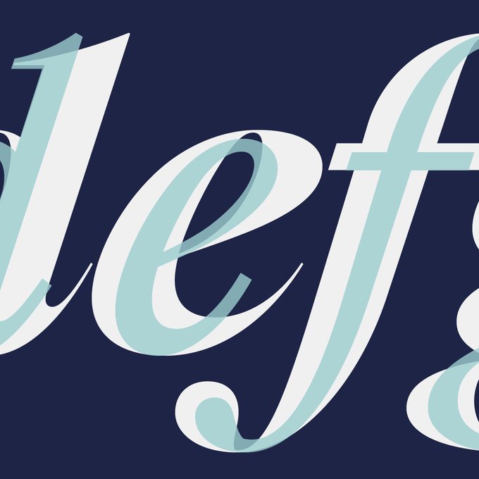
Testing this new Didot on a The Supremes record sleeve. Just for the beauty of the shapes in titling.
— — —
#typefaces #fonts #glyphs #typography #logotype #typedesign #typedesigner #lettering #lettering101


So excited to present you our real punk typeface, that inspires for totally bizarre designs! Are you ready for some bold moves? https://t.co/ieT1aAMSY2


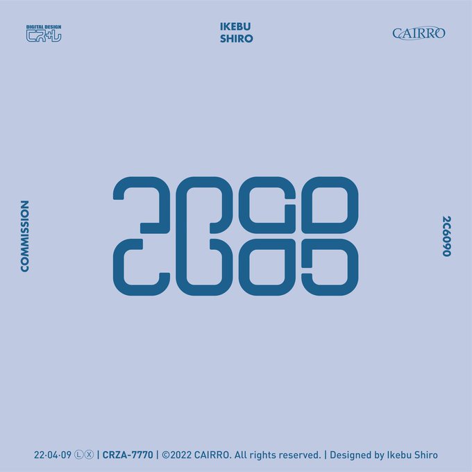
COMMISSION
「 DEEP BLUE 」
「 茶 无 此 人 」
「 Leviathan 」
「 打 雷 打 人 」
#作字 #logo #typeface #design #typography

Psycho
_
A poster every day 👇🏼
https://t.co/LT2HEofJKH
Typeface by @Fontfabric check link in bio for more info.
#nft #nftart #nfts #nftcollector #nftartist #nftcommunity #cryptoart #cryptoartist #cryptoartwork #cryptoartists #dailyposter #visualarts #dailydesign #cryptoph

Since the release of Factor A, @intervaltype has added an extended of alternates to the font family. Go check them out 💥
#type01 #intervaltype #typedesign #typography #typeface #logo #graphicdesign #graphics #functional #branding #lettering #variablefont #typefoundry


NEW FONT 🔥
Fayte takes a few departures from the norm in order to bring it into the modern realm.
Test it out here >> https://t.co/NPAG7rcFmC
#type01 #typedepartment #fonts #font #typedesign #typeface #typedesigner #fontinuse #graphicdesign #typography


Throwback
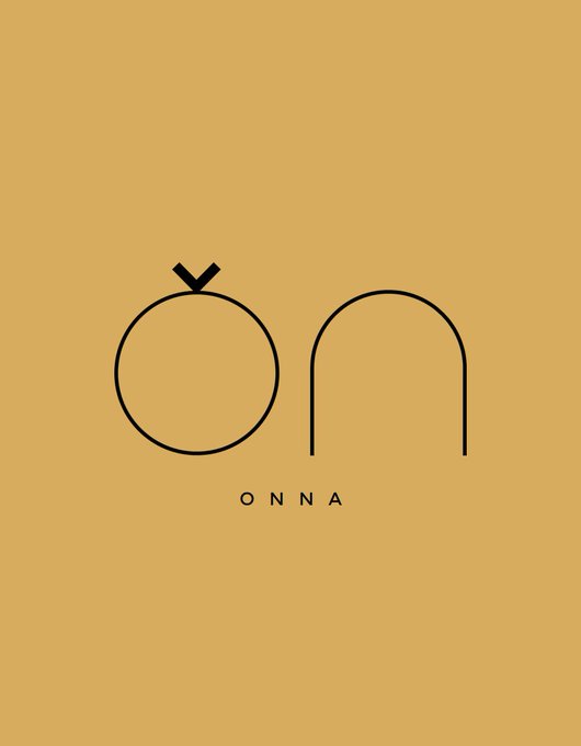
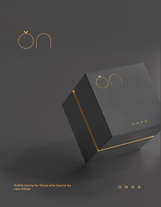
Branding for Onna a ring company.
The logo is a sleek typeface O and N designed specially for Onna.
The upside-down accent on the O is to show it's pronounced as Or-Na and not Own-Na.
(1/2)
#designthinking #branding #encer #logo #designtwitter #GraphicDesign


@typedirectors has announced the TDC68 Communication Design, 25TDC Typeface Design & TDC Young Guns winners! Less than 10% of this year's entries were awarded certificates, making this work truly the best of the best. Congrats to all! See the full archive: https://t.co/6BcxwE2htd