typefacesのTwitterイラスト検索結果。 100 件
Brand Archetype | 02/12
--
🌈 THE CREATOR - https://t.co/iExxKAqAbL
Typefaces, icons, colors: all the essential elements to build a creator brand. Be original, visionary & daring.
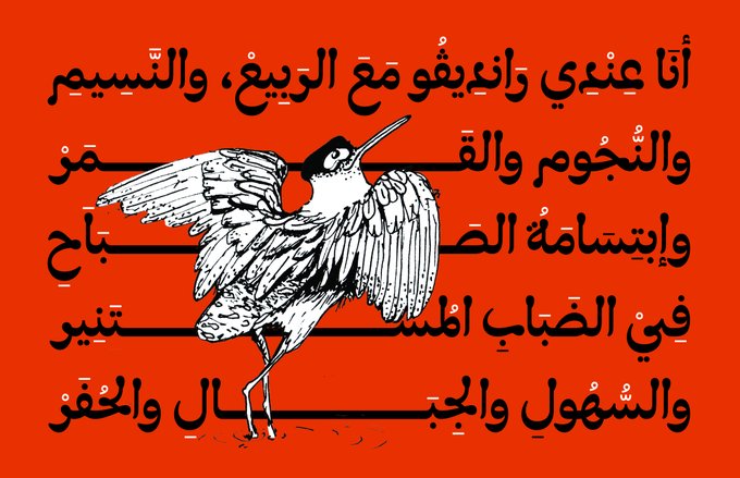
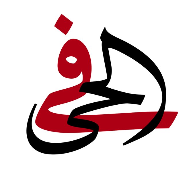
FEATURE: @arabictype examines the approaches of Arabic type designers @emForMaha, @lara_captan, @BornaIz @MamounSakkal and @KristyanSarkis to reveal a wealth of history and technique in creating Naskh-style typefaces. https://t.co/UbFaJxZlfn
FEATURE: @arabictype examines the approaches of Arabic type designers @emForMaha, @lara_captan, @BornaIz @MamounSakkal and @KristyanSarkis to reveal a wealth of history and technique in creating Naskh-style typefaces. https://t.co/UbFaJxZlfn
2023 i'm learning more about typefaces and graphic design in general, i feel like really interesting fonts and design can elevate the aesthetic of a given show/comic/illustration and give it a certain nuance i don't know how to articulate yet
Oui! with 38 OpenType features, Altesse offer a lot of possibilities. The 1557 glyphs are divided as follows: two sets of capitals, two sets of numbers and lowercase glyphs, punctuation, ornaments and vignettes.
➽ https://t.co/K345Id9o8k
— — —
#typefaces #fonts #typography
5/6 Typofonderie's Year in Review 2022
November: Austerlitz
Austerlitz, is a humble typeface in small sizes & a charming Parisian Didot in large sizes. 56 fonts divided into 4 optical sizes of 7 roman & 7 italic.
https://t.co/eryJITVYv5
— — —
#typefaces #fonts #typography
🔤 Austerlitz alternates: Italics offer different endings for the g and y, in reference to the detail of the g present in Romans (Affiche, Gros, Labeur, not in Petit)
➽ https://t.co/BoOPfuLJzB
— — —
#typefaces #fonts #glyphs
🔥🔥🔥 Just to show you some French words set in different optical sizes of Austerlitz. Extract from this page:
➽ https://t.co/BV3XNc6GFG
— — —
#typefaces #fonts #glyphs
🔤 Austerlitz alternates: Asymmetrically, the typical shapes of Roman a and italic a are available. In fact you can use the roman a shape in its italic version, as it was the case a century ago for certain typefaces families.
➽ https://t.co/BoOPfuLJzB
— — —
#typefaces #fonts
👋 New! Austerlitz, is a humble typeface in small sizes & a charming Parisian Didot in large sizes. 56 fonts divided into 4 optical sizes of 14 styles.
➽ https://t.co/eryJITVYv5
Discover the history of this typeface loosely based on Série 16 by @jfporchez
— — —
#typefaces #fonts
#newreleases Void by @optimofoundry is one of the 13 typefaces we highlight in our inaugural Fall Font Report.
Plenty of #typography after the jump
https://t.co/nfDNozDYjI
#typography #typefaces #typedesign #fonts #variablefonts #typeroom
20% OFF — ENDS AT MIDNIGHT 🔥
Secure high-quality, contemporary typefaces that'll help upgrade your design solutions.
https://t.co/sOMYMlFH2P
#type01 #typedepartment #font #fonts #typeface #typefacedesign #typefacedesigner #design #designer #type #typedesign
https://t.co/GjKOozPyJF — This is a funny type foundry. They do typefaces inspired by plants. They're fun.
We’re still looking for the best type-centric design and advertising work, typefaces and hand lettering—to celebrate in our 2023 Typography Annual. Enter by this Friday, September 23rd to be considered! https://t.co/uEn6ZXqUQv
Top 20 Best Serif Fonts to Download.
Top 20 Best Serif Fonts to Download
This roundup of serif fonts features a selection of best-selling typefaces in the industry.
What makes a serif font different from a sans-serif? If you were to compare the t https://t.co/SFUttHpHwY
We just had a visual makeover of our work so it's time to show off our new @cydney_cherepak portraits!
We are @benkiel and @jesseragan, the partners at XYZ Type. Our work includes custom typefaces & lettering for clients, as well as selling our fonts directly.
More to come…
Rejigging my 'Waterton's Park' booklet. Out goes Viners Hand, one of my favourite typefaces from my early days of desktop publishing and I've stuck with Caslon for text and headings.
#waterton #waltonhall #watertonpark #InDesign
https://t.co/1QU0HxZVLL
Le Monde Journal, originally designed for Le Monde newspaper, has since become a typeface that adapts to extreme situations. It is economical, in the sense that it can be set in smaller sizes than other typefaces while remaining legible.
➽ https://t.co/JO5GEHbcLi
posture check - my upcoming clothing brand, experimenting with custom typefaces.
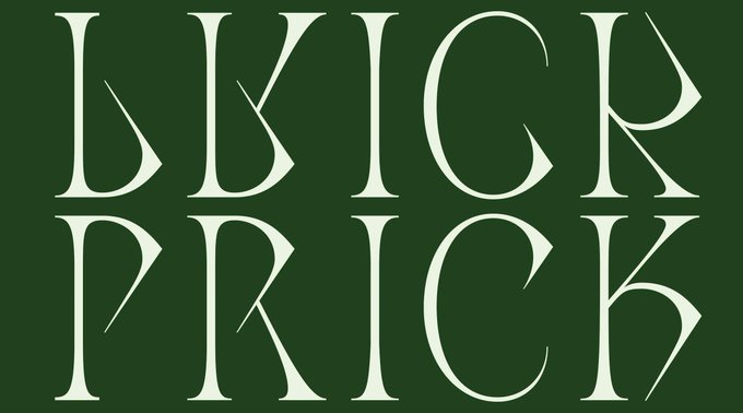
Drawing typefaces means understanding the way in which counter-forms are balanced against shapes, how the dynamics operate between the two. The aim is to create a dynamic from left to right. And for this, there is nothing better than to observe them in mirror.


