saturation.のTwitterイラスト検索結果。 158 件中 6ページ目


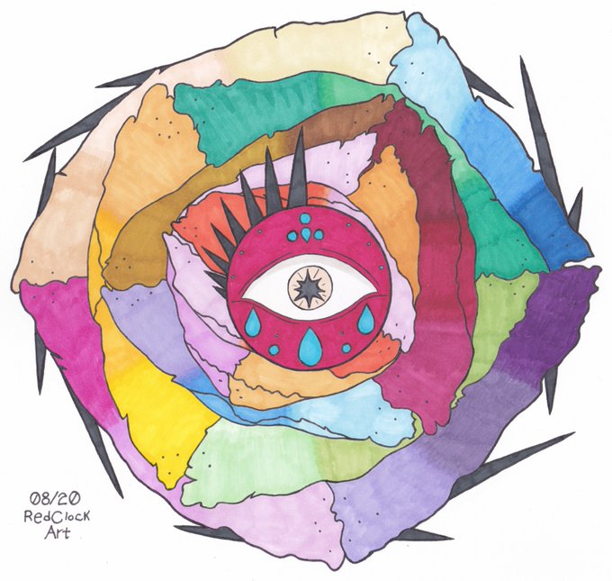
► Floral Sight
Practicing with #ParKoo alcohol markers — first piece on ~30gsm copy paper, second piece on 199gsm cardstock. I mostly used a single coat of color outside of blending to test saturation.
(08/20.)
#redclockart #traditionalart #originalart #coloredart


@sapphicnarwhal @catrxsdelle Sorry, I used a season 4 screen cap for colour picking and my usual lower of saturation. I’m guessing the screen cap I used was a bad one. Will make sure in the future all screen caps show darker skin. Was not my intent and I apologise.

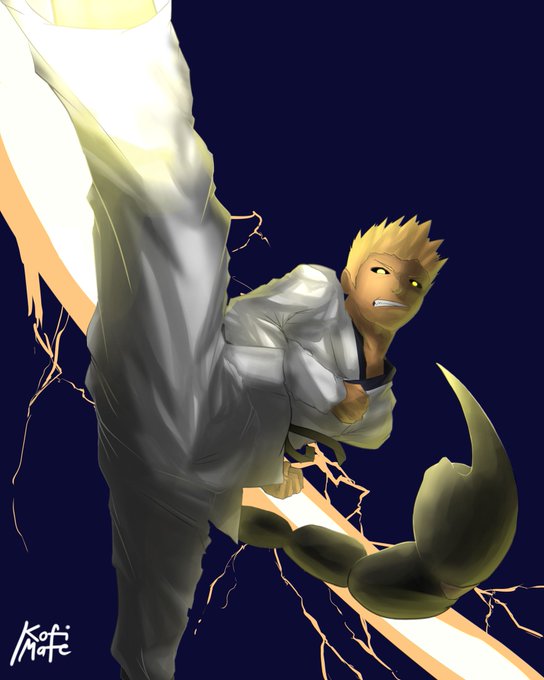

I AM BACK on the #emojichallenge with a big boi. Thank you @dreniko11 for the emoji set which iiiiis:
🦂🥋⚡
I like how I went with this and the effects. I just need to learn in my head how to go with saturation. There's also the obligatory chibi.

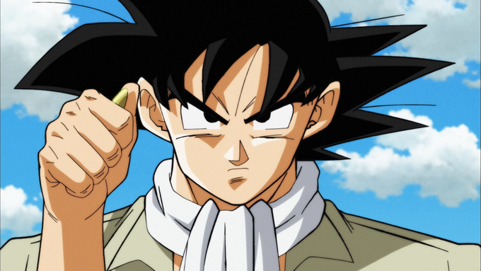
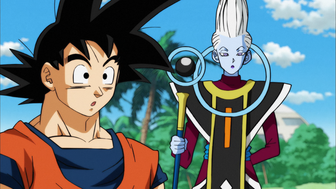
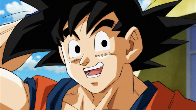

Episode 77:
The new arc kicks off with a Yashima episode, though it's a polished one thanks to corrections from Takeo Ide and Tadayoshi Yamamuro. The show's composite sees a total overhaul too, introducing a line filter, soft glow, and desaturation.


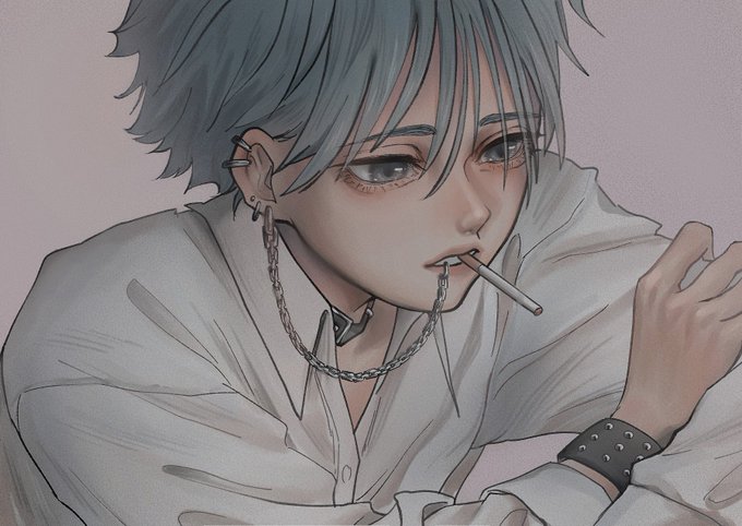


#NobodyArtistClub
Hi I’m Mina and I love drawing with low saturation.

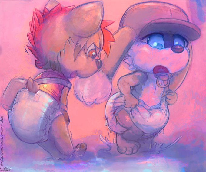
Support if you want some diaper arts: https://t.co/mytkh9NBuy
Reward for @Zeik_The_Yordle Featuring @ThisOneDylan
Who gave me free range, and wanted his cutie and Dylanamin to be playing in the water puddle, and experiencing some water saturation. ;^/////w////^

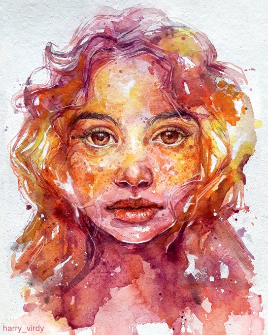
#Watercolor play on paper!
I used a bit of acrylics too, just to pull the saturation. I use acrylics when I feel that the colors are fading & need some vibrancy. It was really fun #painting this & letting colors flow by themselves & forming textures they wouldn't form otherwise🎨


Ya embrace them thorns
The xp pen is great but i wish there was a way to adjust saturation.


#skullstudy2020 118-21. Experimenting with value, hue, and saturation. I changed one thing and kept the two other values/measurements the same


For hearthstone standards this needs some more brights and saturation. But we are getting there! Go Agumon!
#Digimon #Hearthstone


Art markers 👍👍 - they easily do crispy black lines and saturation. Digital artists should look into them.


Here’s a finished Boba sticker I started a year ago... I thought it’d look better if it had more saturation....is it too blinding? 🤣


So I finished this one. I started early so I don't know what I'll do tonight while I can't sleep. This is one of @scaberix drawings that were posted for us to paint. These are versions with different saturation. I really enjoyed doing this even if my eyes resent me now


May your #colors be #cool, #vibrant and with a pleasing degree of #saturation.
#WednesdayWisdom #blue #Creative #artist