serifのTwitterイラスト検索結果。 422 件中 6ページ目


Only SIX days until 2022 & our Annual New Year's Day Font Sale! Today's graphic features our sixth release of 2021, the stupendous sans-serif family SINGLE BOUND, now with additional Light and Heavy weights and a super-powered Variable Font! https://t.co/nTqS5bSdSl #happynewyear


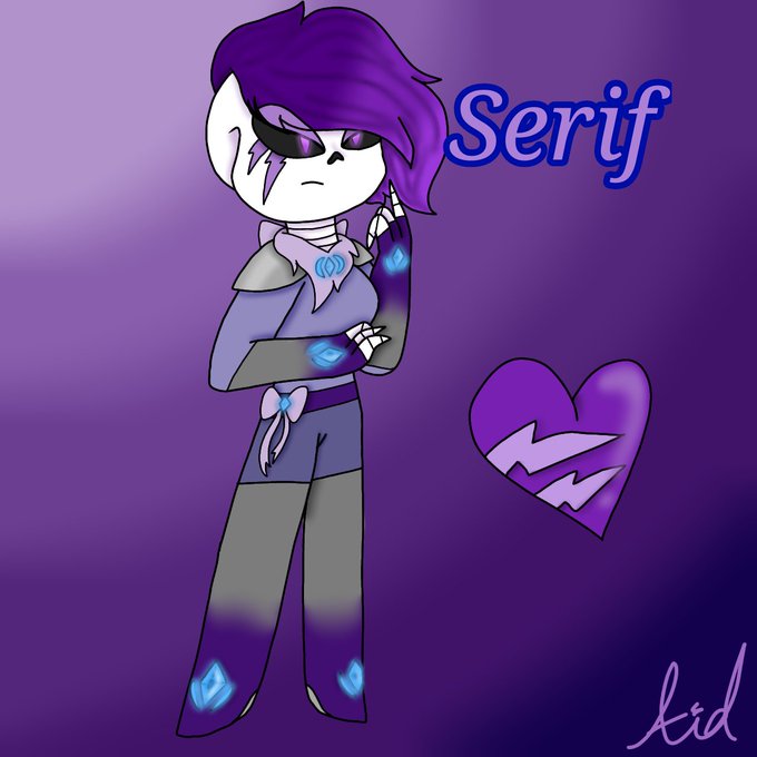
Left to right: Mouse, Proxy, and Serif strolling around the testing.hall. Serif doesn't look amused tho x3
#testinghall #thetestinghall #undertaleAU #undertale #snowdin #waterfall
Mouse, Proxy and Serif from The testing.hall © S-E-Sagas
Undertale © Toby Fox


Adyta - Display Modern Font https://t.co/sO8gXLhArS #nature #FontDesign #sanserif #decorative #book #game #handwritting #signpainting #logo #logo #logo


ME!!!!!!!!
this was commissioned by one of my best friends (serif) and drawn by @Glacoe776!!!!!!!
would post full sprite, but don't want myself to get CormillaLover'd/WoomyZilla'd lmao


Testing and re-testing a typeface (here Le Monde Livre) in unexpected combinations in order to verify the overall coherence. Beyond the weights, serifs, it is the spirit of the forms in their totality which marks a style. https://t.co/IatbPFLGtL




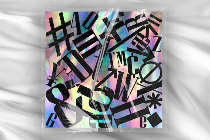
Hologram by KAZER STUDIO There are 3 distinctive styles - display sans, display serif & display wedge. https://t.co/jXrtmK3NjO


💙🕶️
𝐏𝐨𝐫𝐭𝐟𝐨𝐥𝐢𝐨 𝐨𝐟 𝐭𝐡𝐞 𝐝𝐚𝐲: Jules Davies
𝐓𝐢𝐭𝐥𝐞: Commercial & Editorial Photographer
𝐁𝐮𝐢𝐥𝐭 𝐰𝐢𝐭𝐡: @Squarespace
𝐒𝐭𝐲𝐥𝐞𝐬: Sans Serif, Duo Color, UI Interaction, Multiple Page, Serif, Simple
𝐕𝐢𝐬𝐢𝐭: https://t.co/MbfDtti5tz

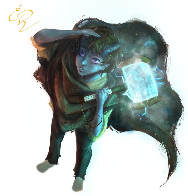
Hey guys!This is a commission for @Firefly-Serif featuring their OC, Iravat!He's a Qunari, a gray skinned race from Dragon Age! I only played the Inquisition, but I love the game so much this brought me nice memories!
#clipstudiopaint #commissionsopen #dragonage #dragonagefanart


DATOS QUE NADIE PIDIÓ
La tipografía nueva que usan para los títulos de Star Wars es la misma que la de Halloween de John Carpenter
Tenía mis dudas por la "W" pero es que en su versión más pesada, cambia ligeramente
La fuente es ITC Gothic Serif
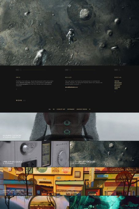


💙🕶
𝐏𝐨𝐫𝐭𝐟𝐨𝐥𝐢𝐨 𝐨𝐟 𝐭𝐡𝐞 𝐝𝐚𝐲: Davison Carvalho @colorblindmess
𝐓𝐢𝐭𝐥𝐞: Art Director
𝐁𝐮𝐢𝐥𝐭 𝐰𝐢𝐭𝐡: @semplicelabs
𝐒𝐭𝐲𝐥𝐞𝐬: Multiple Page, Sans Serif, UI Interaction, Loading State, Animation, 3D
𝐕𝐢𝐬𝐢𝐭: https://t.co/3hXn5VHKCt


Serif dropping in.
#paraversetale #undertale #undertaleau #serifpapyrus #papyrus #ArtistOnTwitter


Inject a good sans serif font into my veins at all times.
#typography #illustration #art #meme


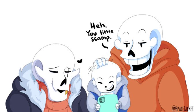
Little Serif hanging out with the guys. 📸
#paraversetale #serifpapyrus #undertale #undertaleau #underswap #swapfell #papyrus #comic #ArtistOnTwitter

Detroit - Slab Serif Typeface https://t.co/NqKVoswgZr #slabfont #truetype #fonts #logofont #typography #label #badge #sea #college #woff #typography

Calvous - Slab Serif Typeface https://t.co/M862lun116 #sansserif #indian #fonts #typography #opentypefont #quote #woff #truetypefont #font #forests #invitation


One of the ideas of Le Monde Courrier is to play up the surprise effect with certain serifs in order to improve letter recognition, such as C and G. Nothing very scientific, just visual! Rounded low contrast fonts are pleasant to read on screen. https://t.co/qbaHESHjsZ