visuallyのTwitterイラスト検索結果。 3,314 件中 6ページ目


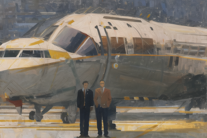

Working on making my stuff a little more visually interesting
#AIArtボディスーツ部 #aiartcommunity #NFT #AIIA #stablediffusion


WHY I’M EXCITED TO MINT STAG ALLIANCE NFTs @StagAlliance
#Fortheherd
A thread 🧵
1/4 Unique design: Stag Alliance NFTs are likely to have a unique and visually appealing design that can be a source of excitement for
collectors or fans.

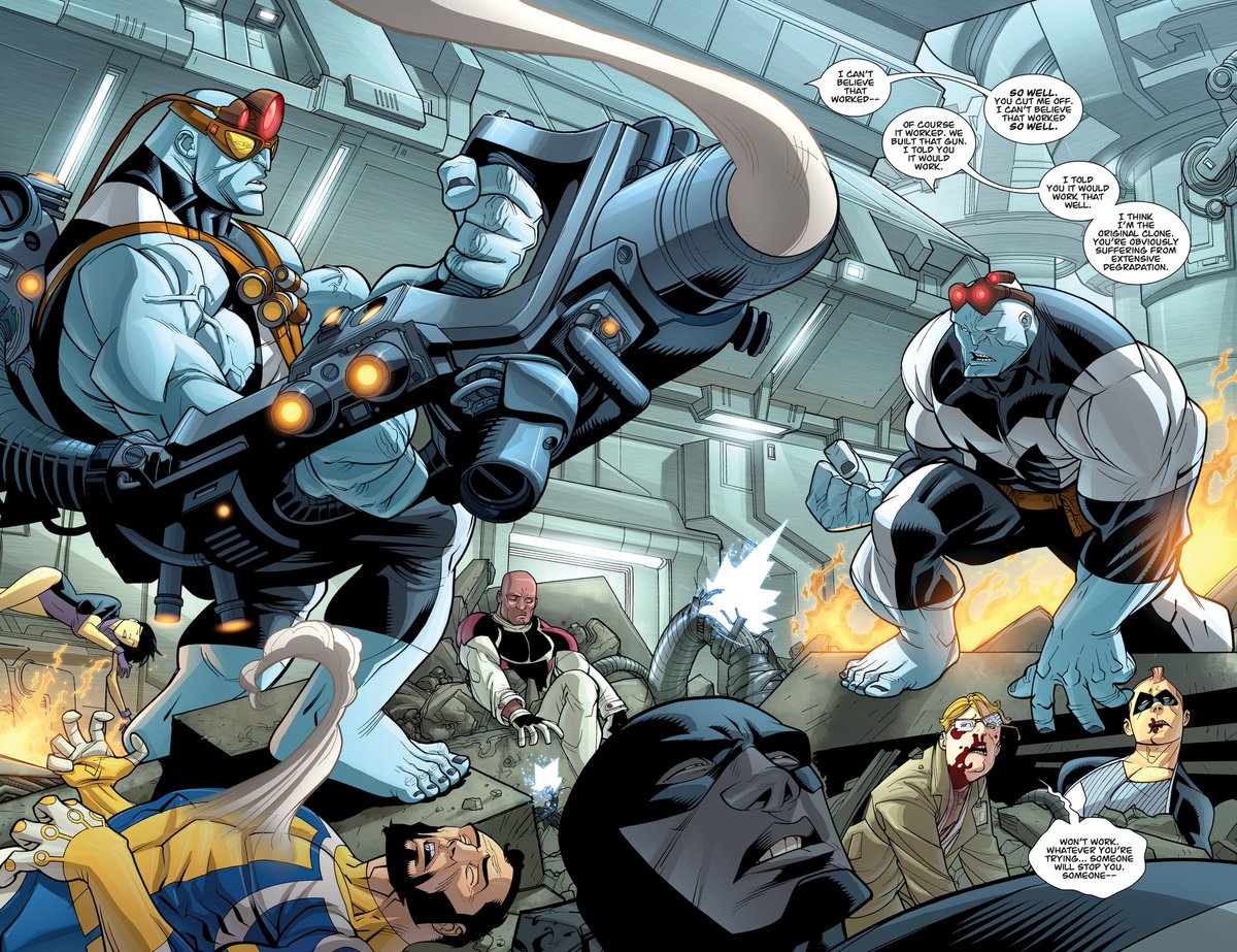
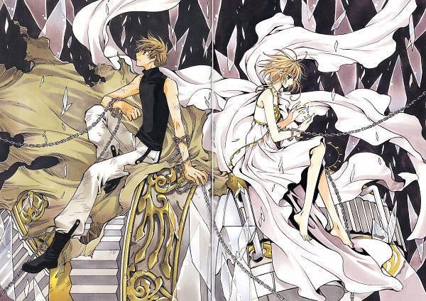
I think this is possibly one of the best looking splash pages of the entire run.
Something about this shot is just so visually satisfying. The colors, the lighting, the atmosphere, it's all so good.


another pose tweak. feels like its decent but lacks a sense of energy?
i think one could pose it so that its more visually close to some sort of katana draw-ready pose. not 100% as the example pose. cos that hides the weapon too much. but just the vibe.


@soulartshares thank you so much for hosting and the opportunity! ❤️
I’m Yeye! A visually impaired artist who loves to work with bright colors! I don’t have much recent art atm but here’s some of my favorite pieces! I draw mostly ocs and sometimes fanart 😊

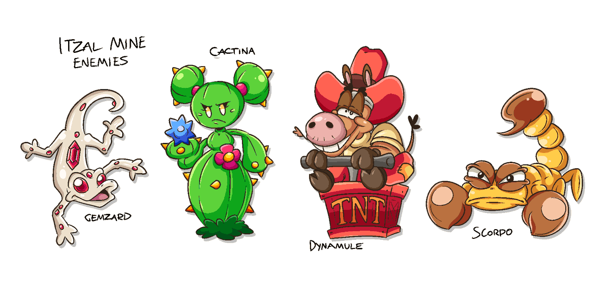
It's been a while since I've doodled anything, but the Itzal Enemies need reworking so I decided to see what I could come up with visually <3
#platformer #gamedev #indiedev #GameMaker #conceptart #gamedesign


You can rely on a historical illustrator to bring imaginary artefacts alive visually, and when it comes to #Tolkien few can match the mighty Angus McBride. Take his Sea Lords of Gondor cover (1987) which features a super-cool Corsair captain wearing Tolkien's own Númenórean helm


@twoonrey Hi, I'm Byrd, I'm visually impaired with chronic pain!
I really like DMC and Fighting games!


Anybody got any tips to make my art more visually appealing for socials, I'm not too fussed with numbers but after 2 years of not much growth I'd love some advice ig


What people aren't understanding about the point i'm making is that these characters are so visually uninteresting, I could not even tell you their names
I'm sure the show is very popular, but on the basis of a VISUAL cosmetic, you'd think it would be something more appealing https://t.co/0ydgck8LdZ


@VictoryDraws Thank you so much for hosting! ❤️
Hi, I’m Yeye! A visually impaired artist who loves to work with bright colors! I don’t have recent art atm but here’s some of my work! I draw mostly ocs and sometimes fanart 😊


@Noodledori1 I know they're not as visually impressive as the others, but I really love CLAMP's style.


I never found time to finish it, But Keiji ultimate survivor is probably one of my favorite-looking anime visually. It's so stylized and willing to look ugly that it really stands out. you will not mistake it for something else.


Don’t underestimate projects with good art
People are easily attracted to things visually;
one of the reasons why I love anime is because of their amazing art and animation that brings the story to life https://t.co/IdHvVAW1iF


lackeys new color palette makes me so gay and happy i love him i love him lackey is my 4th favorite child he’s so visually appealing


Visually, League of Angels is a major influence for the upcoming SKY GODZ RPG.
#rpg #crystals #aliens #UFOs #extraterrestrials #vampirehunterd #anime #animation #starseed #scifi #sciencefiction #comicbooks #comics #fantastic #inspiration #scifimovies #crystal #starwatcher #mmorpg


Kaveh and Baizhu have the most visually harmonious drip marketing yet
THEIR VASTLY DIFFERENT COLOR SCHEMES BOTH GO WELL WITH THE DENDRO GREEN


📺️Learn Visual Development for Television with @ChrystinGarland
🔗https://t.co/T7qwdZNObH
👉️Learn about the process of building a world for television that visually communicates a story from scratch!
🖋️Sign up at Schoolism & get access to +50 art courses & live webinars!
-AR


📺️Learn Visual Development for Television with @ChrystinGarland
🔗https://t.co/fRNyLpFGpZ
👉️Learn about the process of building a world for television that visually communicates a story from scratch!
🖋️Sign up at Schoolism & get access to +50 art courses & live webinars!
-AR