visuallyのTwitterイラスト検索結果。 3,311 件中 51ページ目


Turn A Gundam #27 is a visually striking episode that features many talented animators, with Masami Goto at helm as mecha animation director.
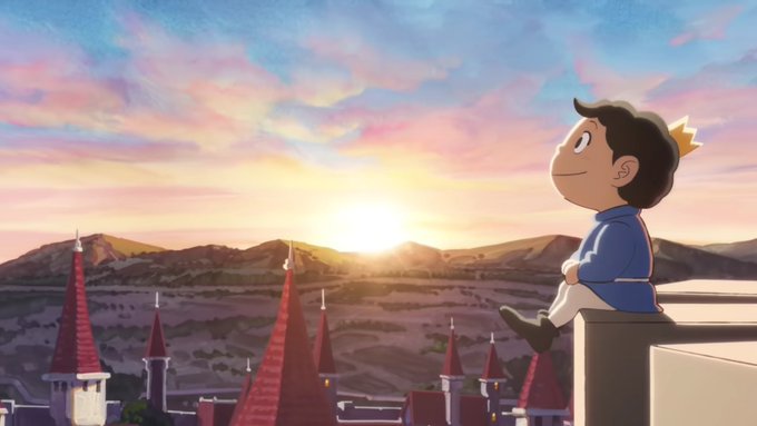
Here is Seiichi Nakatani's cut.


Happy Aromantic Spectrum Awareness Week to all the arospec people!
Especially to those of lesser known arospec IDs, neurodivergent arospecs, arospecs in relationships, loveless aros, alloaros, oriented & angled aroaces, aros of color, visually impaired arospecs & short arospecs.


George Perez appreciation post Day 72 & 73:
We wrap up the final 2 issues of JLA/Avengers!!! What a visually beautiful set of covers and book interiors. Look out for something from us this week to further honor George Perez and this series
#GeorgePerez #Marvel #dccomics #comics


Doom Patrol is so visually beautiful, it has high-quality cinematography for a series, and is highly underrated


#EpithetErased
The collective Naven hivemind has banded together to give you 3 awkward green apple gijinkas in the most visually appealing way possible!! Check out their versions of this posh moss ceo boss!!
(@etighost and @lululurururuu!!! LOOK AT THEM!!!/threat)


ok like. ik i’ve harped on aa5/6 a lot especially visually but ngl the artstyle they use for the aa6 character renders us very nice, i like these a lot


Doxxing yourself visually in the #metaverse is a lot more fun than IRL


The off model character animations in OG Macross sometimes made the show unintentionally hilarious.
You can visually tell which episodes were animated in South Korea because the ones that are look like Dogshit like their knock off movies like Space Gundam V
lmfao


I'm a big fan of the art done by @NotNickNot , @samarecarme , @TORYEX2, and @Drawloverlala. I think all of them have created some of the most visually interesting Sonic art I've seen. https://t.co/XCJGRiPLN7


So.. after a couple years of trying to figure out whats been wrong with my hand, the culprit has finally visually shown itself, I have developed a cyst in my wrist that shoots pain up my hand.. I and gonna get this sorted as fast as I can


@Freddy1565 It depends on the context for me. Generally, I like recolors that are visually distinct despite having an obvious identical base, and a gimmick to separate them aside from one just being stronger than the other. I.E. maybe they're opposite elements or fit different team niches.


This is what I was watching when I finally learned how to visually crop a video on my phone... what a beautiful learning experience😍


Mnemonic helps me a lot in learning Japanese Hiragana, but this is just dumb my brain won't connect ゆ with unicorn. it just doesn't connect visually


And this isnt a diss at like, the actual character nor the creator (SaltyNoodles) cause like, he knows how to draw her, dude even created her and she looks visually alright in his drawings
So what the hell happened for the plush


@Dubeski256 Wit studio has the most diverse artstyles and all of them are visually stunning


I don't know why it took me so long to get around to it, but i visually updated Phantom High's thumbnail!! They're very small changes, but my goal was to make the lineart pop more


Latest finished piece is a gargoyle version of my character. I had a lot of fun pushing the surface depth visually to give the appearance of carved into stone.


Happy #ValentinesDay2022's #Evercade community 💜
When you think about #games on Evercade that you #love...🤔
Which one springs to mind first?
Mine has to be @tanglewoodgame visually stunning & #magical from start to finish 😍
Have a great evening & happy #gaming 🕹️🎩 #Retro


@antdude92 To me the worst designs are the gen 4 evolutions that don't elaborate on the original's concept in any meaningful way. They're just bigger and more with a lot of unnecessary clutter slapped on and often visually inconsistent with the pre-evo.


