opacityのTwitterイラスト検索結果。 1,333 件中 52ページ目

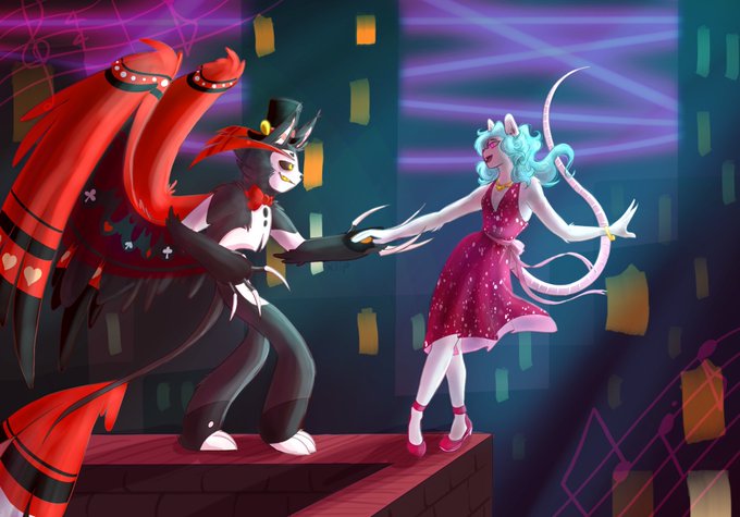

Without vs with
Magenta, soft light layer setting, 36% opacity, and bam the colours pp a lot more and the whole thing looks cleaner and technology is amazing https://t.co/tRDuFrhnmB


The diffrence white makes on a character is huge, It changes the entire skin tone, (Im using the opacity setting of what ive seen 'bad lighting' look on other characters)
It takes a completely POC and makes them white/very light skin compared to their normal tones.


@Aeroon7 Here's the settings using one color and 100% opacity on the layer.
Overlay- think tinted windows, brings the entire color pallete together
Multiply- good for shadows that don't look bleak!
Add- for shiny things like gold and fire, makes things g l o w
Screen- best for pastel!


@zonakaryaid Dengan pas di finishing lu kasi tekstur pointilis yang opacity-nya lu sesuaiin, kamu bakal dapat kesann shading yang uwuu


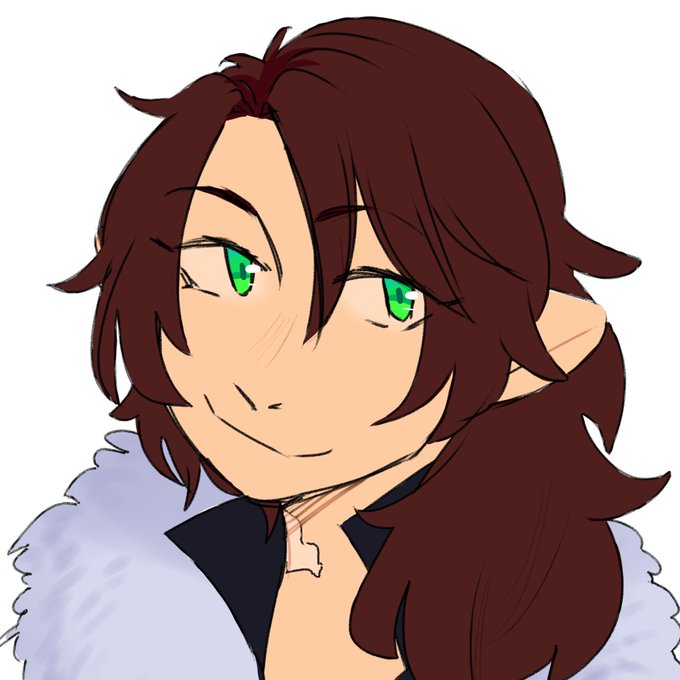
#NewProfilePic (Realized I forgot to change the opacity of the white outline)

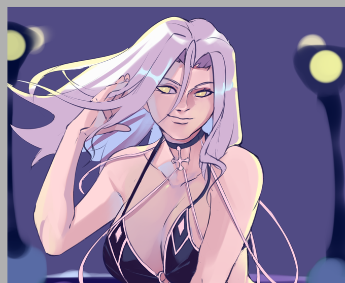
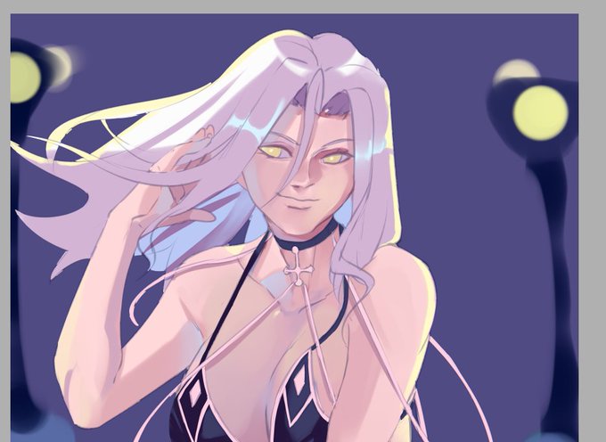
Honestly there's not much different rendering wise but just lowering the opacity of the lines makes such a difference


Just in case you ever wanted to know what Merman Lan Wangji’s tail and fins look like before I shade them.
Yep, the fins have a pastel gradient! I later add shading and lighting and lower their opacity to make them translucent and give them a slightly iridescent shimmer.


@creonnida Wkwk pernahhh tp cmn buat warna, gambarnya pake pen biasa trus discan pake hp trus pake marker opacity gitu wkwkwk... kalo buat garis lurus sayangnya pake ini msh susah 😔😔🤘


Step 13: bikin highlight lagii, pakai warna merah trus diatasnya kasih warna kuning layernya mode add (glow) kalau di csp. Opacitynya sekitar 79% trus diblur~

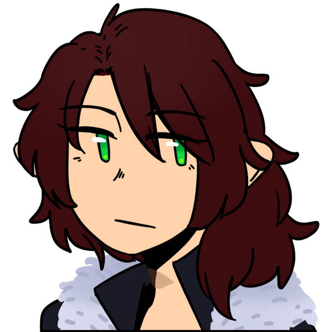
the only real improvement here is that i actually remembered to draw her scar and didnt just draw a scar over and lower the opacity


Tried the doodling practice with a hard color instead of with opacity that I usually do and ended up drawing Queen Horsey-Time with some ACTUAL sun colours.

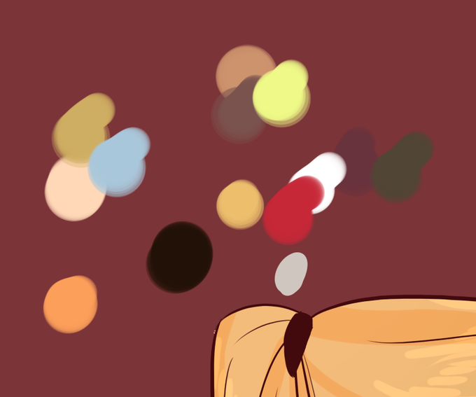
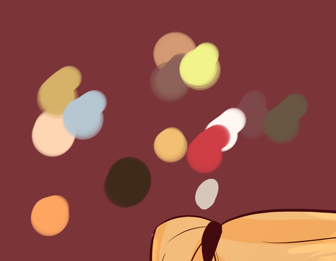
@dxxmah @chatradora what i do is do lil dots of an original color palette, then take another color (in this case, light orange) layered over the original palette and lower the opacity. i color with that and then shade with the same color i used to overlay the color palette and i use sai's shade mode


Yep it’s official, I’ve finally gotten comfortable with coloring with the pen on a lower opacity to make better details AND I have a defined shading style I like :) wooo! This is a finished comm for @LuftRaptor♥︎
#furryart #furry #commissionart

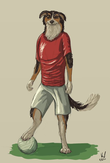

Coloured a couple of doggos. I have fallen out with low-opacity brushes. Fur is murder.

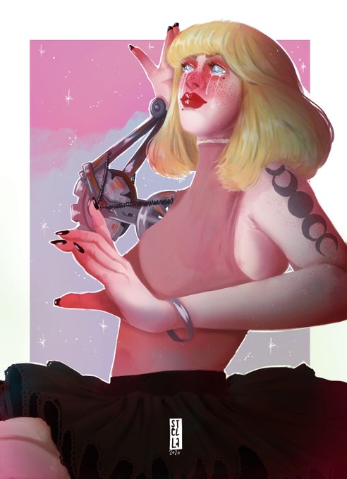

when in doubt add a magenta overlay at 16% opacity
redraw things, still many things id like to fix on the new one, but i dont wanna 🤷♀️


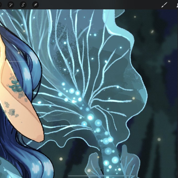

@aintkafaro Buat sirip transparannya bisa pake layernya dirubah jadi screen, terus atur opacitynyaa. Buat yang titik2 itu ada brushnya sih (luminance namanyaa seingatku), tpi dulu aku bikinnya di photosop gini-


Sometimes I Gaussian blur a colored line art in a layer under my black line art . Or flatten and duplicated the entire art work to a new layer. Set to hard light, blur, and then drop the opacity https://t.co/8mmPI8qAEC


4. FILTER
If you're too lazy to find a good filter online, do it yourself. Greyscale your drawing, make a blue layer FIRST, overlay it, and a multiple yellow layer AFTER. Merge the three laters, and play with opacity. You can use any colours but the DARKER goes UNDER the lighter!