opacityのTwitterイラスト検索結果。 1,340 件


Technique is lacking, like you can tell I don’t do backgrounds.
I thought I did pretty well with setting the mood and storytelling. Still feels like it went right over people’s head.
So I turned down Yelena’s opacity https://t.co/usFW6c0YP5


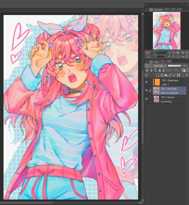
for those still unsure of how this works:
1. duplicate your image
2. clip a Brightness/Luminosity layer filled with orange to the duplicate
3. set the duplicate to Hard Light
you can then merge the brightness and hard light layers, adjust the opacity, levels, etc. https://t.co/PdNQpvvaFg


I TRIED THE NEW TRENDING TIP !! it made it look more like how i intended it 😭😭 SO SOFT AND PRETY WAAA
all you need to do;
1⃣ duplicate to new layer
2⃣ clip an orange layer set to "Brightness"
3⃣ change the new layer to "Hard Light"
👉adjust the hue & opacity to your liking


@Daviduserwhy I use this brush and then use "drop shadow/frosted glass" filter, before merging all layers, the sketch layers was put in lower opacity and then I finish the rest with Lasso Tool (Fill)🙆🏻♂️


The most distinctive part of this style IMO is to let the underpainting show thru! I used pink this time but I also experiment with bright yellows, blues, purples, greens, etc.
I also colour it in with a big grainy brush that’s not at full opacity.


@RadicalHighway_ question! I know that when you erase from your shadow layer it becomes your lighting, but how do you get it to apply to your other colors? do you just use a multiply layer and lower the opacity?


queerest marker brush I know, great for coloring if you set the opacity painstakingly low and layer. And layer. And layer. And layer.
Definitely rec making a new layer for lightening and merging after


like do you see that the lightest color is the base, then i add on the shadows gradually? i basically "cut out" the highlight and add lots of dimension of darker shading thru a low opacity marker brush that stacks opaqueness well. i feel like a crazy person


The app glitched out reduced the layers opacity & destroyed the line quality 🫤 https://t.co/hNXSBttx5s


before & after
This is also how I make my art look softer!
also: Duplicate Lineart > Gaussian Blur at 65% opacity (for a bloom effect)


#illustraion #イラスト
人物背景の上にリニアライト等のレイヤーを5-70%の不透明度で乗せるとこういうイラストができる
色によって発色が違うけど🙄
An illustration like this can be created by placing a layer (linear light etc) on top of charactors & background at opacity of 5-70%😳


Ever too lazy to color your line art?
Copy entire color layers and merge them
Add gaussian blur
Clip copy to line art layer
Reduce opacity
Adjust saturation and value if needed


hmmm - very technical but
I do notice a lot of these Sketch Brushes over at CSP or sketch brushes other people use definitely have a texture sometimes
Me, my sketch brush tends to be just lower opacity with some softness... I should try with texture sometime


ตัวอย่างงานที่ใช้เส้นที่โดนปรับเป็นoverlayนะคะ แต่เราจะยังมีเลเยอร์เส้นที่เป็นโหมดปกติอยู่ใต้เส้นoverlayอีกที แต่ปรับให้opacityลดลง


Live2D thing I like to do: copy and paste at least 2 mask types into every project so that you always have them handy!! at least one soft and one hard one is what I do
(the 2 colors is just so it’s more easy to differentiate before the opacity is turned off :3)


Artist!
Gambar yang mana lebih ngasih kesan misterius, guys?
Perbedaannya di opacity aja kok.
Aku mau jadiin foto profil. Makasih buat yang jawab ^^


Day 790: Nemuriiiiiiiiiiiiiii
I always have trouble with her socks, they're supposed to be more opaque, but finding the right combination of my usual layers/opacity to get the right effect takes some time. Maybe I should just raw dog it all on normal layers 🤔