visuallyのTwitterイラスト検索結果。 3,308 件中 52ページ目


8) The Five Star Stories (Movie)
I can feel Mamoru Nagano in this work. Many elements I can see resurfacing from L-Gaim. Its uh, pretty neat. An advertisement of sorts for the manga, and a treat visually. Nice score in places too.
Very Gender.


Further design testing. Is fun to draw, and seems to work visually. I'll develop that further :)


VR Art for @sharafi_eth
Created in collaboration with visually impaired VR artists
0.1 eth
https://t.co/Aj1iekxmPs https://t.co/VMcDzQ5WLA


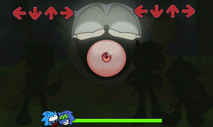

Have these weird Fake fnf screenshot bs cause I can’t make a mod but I’m still desperate to see the idea visually
(The characters on the “enemy” side is owned by RabbitStatic on tumblr)
#sonicexe #sonicexefnf


@takanashikiara One thing for certain Kiwawa will use the Voice Pack from the world famous official Paladins announcer Amelia Watson from Hololive English Myth.
But will she venture off and look into different champions that may or may not look like a perfect fit for her, visually, like Furia?


I’m never getting over aida’s play with colours, it looks spontaneous but the color paletter turns out to be visually significant to the story and the character, the complementary colours of warm orange and cool blue. This could possibly suggesting his connection to both shores


🚨3 HOURS LEFT🚨
Are you ready guys?😊AMZHADI x BEARDROPS auction will start at the time below👇
Time : 10Feb(9pm) - 11Feb(9pm)
FP : 0.08bnb
Auto win : 1.5bnb
50% will be donated to the blind and visually impaired kids from Yayasan Orang Buta Malaysia.
Thank you
@beardropsmy


Day 9: Worst Precure Uniform
While the use of color in Star Twinkle is visually appealing, I can't say the same about the cure designs
They're overdetailed without feeling significant to each character
Individually: Scarlet, Parfait, La Mer


20. raphael. way too goofy LOL hes like a cartoon character. doesnt fit in a game with characters like edelgard for example. they tried too hard to make a himbo. so visually unappealing im sorry but he just looks wrong


id argue the face design is the most important part of creating the feeling you want in a character or series
visually these are absolutely not the same character


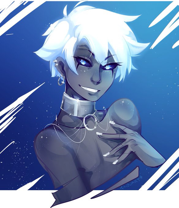
Somehow, despite my love for antagonists who are aesthetically simp-worthy, no?? None of them are to me, anyway 😂 Circ (last pic; art by @/kaizuart) is probably closest. I created him to be visually appealing, but not in that sort of way. https://t.co/dP62P61Jko


We are slowly finding what we want visually, in terms of constructions, depending on which energy core the player carries it will be the type of construction that he can do.
#indiedev #pixelart #scifigames #ドット絵 #gameart #indiegame #gamedevelopment #gamedev #Pixel


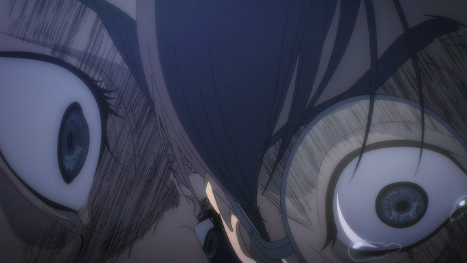
Like this is one of those episodes that you look back on and can’t believe it’s done so well, I genuinely didn’t expect this episode to be so visually impressive and don’t with so much care. Congrats to the entire team at Ufotable and what an amazing ost.
#鬼滅の刃
#DemonSlayer


⚠️Pokemon Legends Arceus
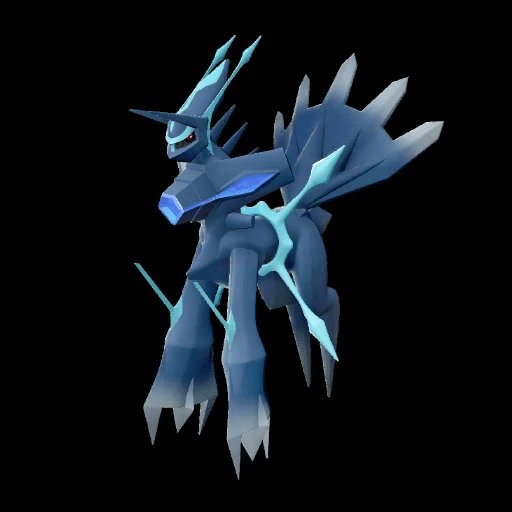
the game may not be that visually appealing but the gameplay was fun, though I won't forgive what they did to Dialga, so here's my version
#arceus #pokemon #nintendo #dialga #gamefreak #nintendoswitch #sinnoh #pokemonlegendsarceus #videogames #art


@SpinStellar @TigheSam I feel like Kit is probably intended to be at least a bit visually dull, he's very unassuming and not much is visually special about him other than he summons water from his backpack
Not exactly great if it's intentional but he's an afterthought to me
I love Surge's punk ass


@SammyTheFatty @Kriban15 @Itechz_ @Lileren__ Nothing in the anime was emotionless bro, the fucking anime gave emphasis to it both visually and voice performance wise. He just was whispering in one line, you have problems in the ears? Thereʼs nothing emotionless in that