comparison.のTwitterイラスト検索結果。 2,015 件中 57ページ目

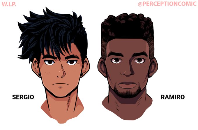
Here's Ramiro next to Sergio (my other big boi) for style comparison. I really like the direction I took him ^^;

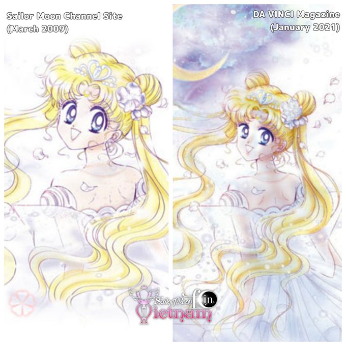
There is another version of this picture, which was released as the layout picture of Sailor Moon Channel Site on March 2009. This is the comparison.
In my opinion, Usagi in the 2021 version looks much more mature.
#SailorMoon #SailorMoonManga


Here's the scrapped version for comparison. Back then I didn't know his skin is black instead of metallic gray in this form lmao


Just because my character Ana is a Cyclops doesn't mean she's Eyeball so please stop making the comparison.
I actually inspired her from one of my other characters called Arcanum 😓


I dont have much to show improvement but might as well just hop in and do this comparison. I havent been drawing for long and I started in 2019.
Late 2019: 2020:




And now for the comparison. It's nice to see that it's more even out but it seems like Kaizue is still the most suspected mastermind candidate. hmmmmm🤔


Small note: I think I prefer +R Fuujin's particle effect, Strive Fuujin look kinda generic in comparison.


I must've significantly resized Maruko at some point. Tsuyuri—whom I used as the original proportions reference—is gigantic in comparison. I like Maruko's proportions better so I think I'm going to resize Tsuyuri down. Smol Shun for old-res reference



I dug up this old work just to make a comparison...I think I've improved a bit over the years! Here's to a good 2021 💜#pixelart

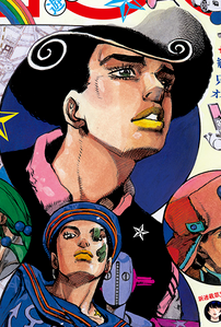
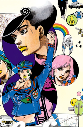
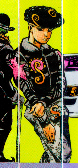
Here are some Tooru's from Araki for comparison. If they went with something like this I'd think they based him off his spineart appearence but changed the gray with something more interesting lol

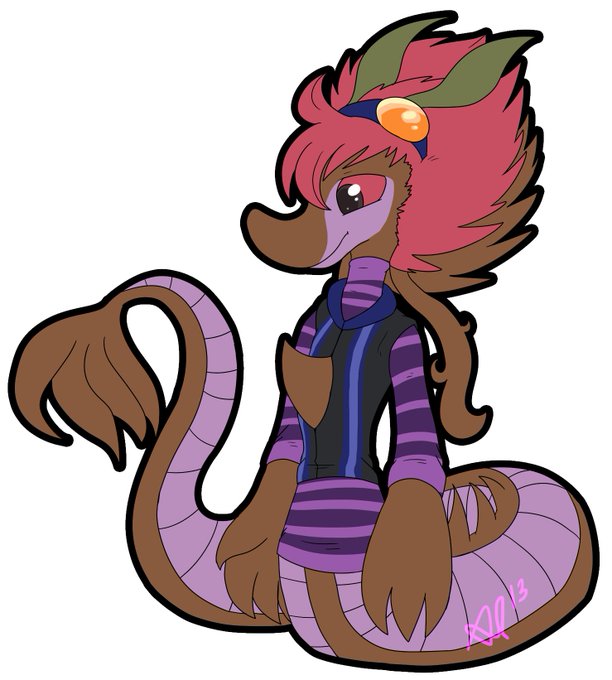

I know I just uploaded him but this is technically the same character so. Comparison.


Here's this year's comparison. Left was drawn at the end of this year while the right was drawn at the beginning!
#Redraw #illustration

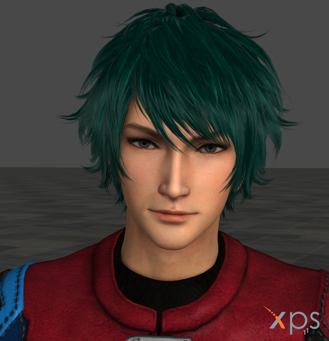


Oh, why not? I also gave the hair color change treatment to Zhong Hui for comparison. Because Zhong Hui's hair is lighter than Zhu Ran's, the "dye" took better.
Also, for contrast, while Zhu Ran looks all miffed, I have a happier Zhong Hui here. Getting better with XPS.


what the fucklmao. my first ever digital ref and one of Jai's earlier designs.. vs lastest ref & Jai design for comparison..think im startin to get the hang of digital art maybe O_O...


So I was trying to design the next boss. This is what I have so far, next to the player for size comparison. A shroom monster.
I'm thinking he stomps, jumps, lets out spores, and maybe spits out smaller mushroom dudes.
#pixelart #pixel #pixelartist #gamedev #indiedev


I'm out of data and in slow mode so I don't know if this'll post BUT have some slightly updated art of Cyrzn. I couldn't decide which version I liked better? Still playing around with line rendering, I'M NEVER SATISFIED. And then the old art for comparison.


Another "New Art/Old Art" comparison. A Christmas/Camdy Cane comparison (Left: 2020, Right: 2017).


