pacingのTwitterイラスト検索結果。 60ページ目


Hoo boy, after around a week, the exposition comic is finally done. It's far from being a best-work-thing though, you can tell where I rushed it (the pacing) and this is my first digital comic.
Enjoy the story of how Mima put a cursed bucket on Marisa's head :)
1/4


NOOOOO!!!!! YOU CANT JUST BACKWARDS JUMP AND SURF PAST ALL THE COMBAT SCENES!!!! YOU ARE GOING TO RUIN THE PACING TO A RICH AND UNIQUE SCIENCE FICTION NARRATIVE NOOOOOOOOOOO





@SnaiLords Depends on the series for me. For the contest, I'm focusing on natural flow and writing the story as I draw.(fig1) For Cup Noodles, I have the dialogue scripted and just draw them out semi detailed (fig2) or full stick figure and expressions lol (fig3) Spacing is usually.. (1/2)


Surprising how this page's pacing changes without the dialogue haha


Mixed feelings on the movie. I loved it, but also felt that the pacing could be better. Felt a bit predictable. Felt I needed something more in the ending.
Overall I enjoyed it.
Anything involving a sick dad though was extremely hard to sit through. #OnwardPixar


The 8th Son? Are you Kidding Me?!
-Everything about this is painfully generic (and cheap looking)
-Our dude just dies on the spot while making dinner and isekai’d
-This pacing is so bad
-These brothers look more samey than the Osomatsu brothers
-All these bitches illiterate??
❌


✨NEW RELEASE✨ Ompu, a new typeface from @teotuominen, is a heavy, condensed, sans serif, with sharp angles and tight spacing. v0.1 includes capital letters, numbers, and symbols and is available now for print, web, and app.
https://t.co/wCXrQViquB

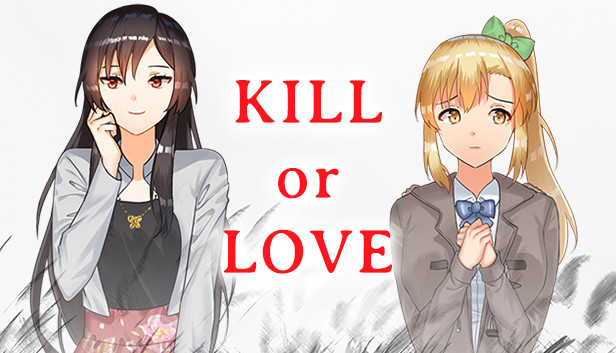
I finished Kill or Love by @AndyChurch_ and man that visual novel was GOOD. It's free on Steam!(https://t.co/dNQ2Fx5W0q) There are no hentai, and it managed to get me interested in the story. Love the pacing, I freaking LOVE the character design especially Grace. I want more!^^


@RosenniaArts Old vs New (pacing yourself and creating a backlog of images to share is healthy and removes stress of consistent posting) :>
https://t.co/xPERCLl1ut
https://t.co/qk4Oe0S2uI


10. Iyashikei
Shoujo Shuumatsu Ryouko
También pensé en Yuru Camp pero creo que esta se acopla más a la idea de este apartado. Una obra donde tan solo disfrutar de un viaje en low pacing mientras te preguntas sobre el mundo y los paisajes. La recomiendo mucho.


Our weekly big list of kid lit links is up (Mar 27): https://t.co/O5UrRX4eb1 Inside: @InkedVoices workshops on muddy middle & agent first-pages critiques, PB pacing, character arc, more. Thanks @QZhuang for the illo & @ShannonDoleski @KCareyWrites for the MG & PB #giveaways.

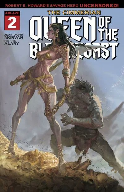
#NCBD #TheCimmerian - Queen of the Black Coast 002 Just as good as issue 1 or better, excellent pacing, raw powerful art, this book is full of win. Hope @AblazePub can withstand the storm, can't wait for next issue "Red Nails" 4/5 sidekicks


I was originally gonna draw this one with the original composition in mind but the spacing just didn't really work with Robotnik being rounded. Honestly the original cover's placement was just squashed in general, so I went with my own. Wanted to capture the "final battle" vibe! https://t.co/MiKaEn3JxV


3. …And dealing with adjusting line and letter spacing since CSP doesn't have autoligatures or other opentype features.
1 that goes over adding the balloon tails. & then maybe one that goes over some special tips and tricks for more expressive lettering like the attached image


What you are seeing is the WIP ‘rough cut’ of “Tales of Zero” filmed one page at a time. We are laying out the whole book this way before we do finished inks colors & lettering - this allows us to work out visual flow & pacing and narrative impact 👊💥 follow @talesofzero

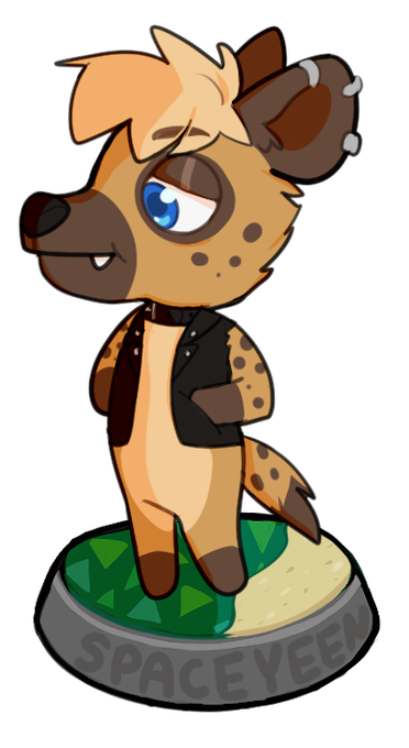
After finally getting to play Animal Crossing I can confidently say it’s single handedly the most relaxing experience I’ve had in a game.
The colours, the characters, the pacing of the gameplay, and the music were just wonderful. It was a nice night I really needed. 💙


FIGHT ON HEALTHCARE/KEYWORKERS!! 🔥🔥🔥
_______________
Please remember that some members of society don’t have the luxury of staying at home or have “social spacing”. We healthcare/key workers are doing our best to protect everyone and ourselves👍👍👍


Adding simple shadows, nothing too crazy, just slight volume, spacing the negative and positive areas on the figure


@DCBatman #91 by @JamesTheFourth @DannyMiki_ @JorgeJimenezArt @rafaalbuquerque @carlopagulayan @ClaytonCowlesb & @tomeu_morey is an explosion of incredible talent on every panel! Brilliant story pacing, beautiful art, colors, and plenty of action!