visuallyのTwitterイラスト検索結果。 3,311 件中 61ページ目

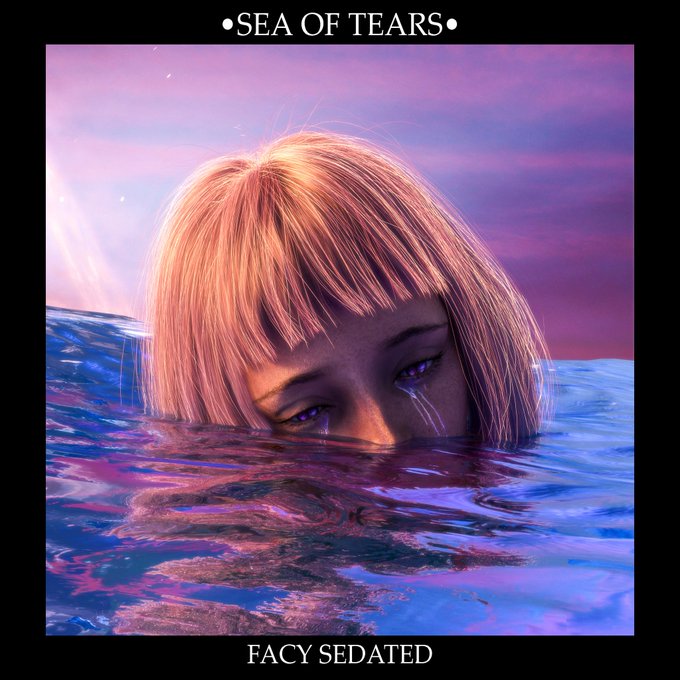
Family ! I am very happy to show you my New NFT • SEA OF TEARS • this work has a very great emotional background and I tried to show it and share it visually and in its description I hope you feel identified🥺💧💜 Price: 0.13 ETH
https://t.co/jgq8M7C4DO


Aside from an updated hairstyle, Yanoltelann hasn't changed visually.
#potwwip


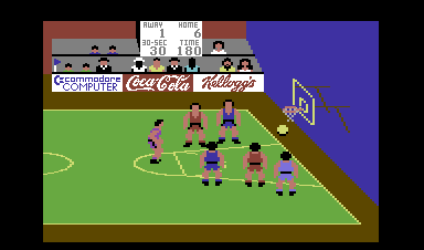
My favourite C64 Sports Sims – No.14
International Basketball
Commodore 1984
Andrew Spencer adapted International Soccer for basketball and came up with another cracking sports game. Visually and sonically very similar to I.S. it also shares the same superb playability.

time lapse video is here 💕 this was a retool of an old painting from 2014 — my cintiq broke so i’ve moved fully to my ipad for now. trying to visually refine the pure Edge that teenage me rattled out was a fun way to figure out process stuff!


As someone who watched "The Girl Who Leapt Through Time" and "Mirai", I have been looking forward to "Belle".
Visually stunning with a strong soundtrack performance to back with the classic to modern story and character portrayal, this movie is a must watch.


@SpawnofAtom Those to are among my favorites, including these. I don’t this the first helicopter is bad personally because it’s very visually appealing to me. And there one shot in the nest sequence that I think is also outstanding


Tried out Sable today and holy shit I'm loving this game so far! Both visually and narratively, it's such a delight. All I want now is like... a boost button for my bike (fingers crossed lol).
@ShedworksDan @ShedworksGreg Great job 👏🏽👏🏽👏🏽


@LacrimaArt Thanks again for the thread! 🥺💕
Hi guys ~
I’m Yeye, a visually impaired artist who loves working with bright colors!
💖Instagram: https://t.co/t8bXcgxFVY
☕️Kofi: https://t.co/TkqCLvx5YZ
I tag @HopeHjort and @LennonRook who got lovely webcomics y’all should check out! 👀✨


Revising seasonal colors... trying to balance having visually different seasons with gameplay clarity is quite a challenge!
#pixelart #indiegame #roguelike


i know everyone's got mad top tier fatigue with joker and we've all had those moments where he just randomly dodges a kill move with the arsene summon
but man, that cut-in animation is sick it's maybe the coolest thing they've ever added to a smash character visually


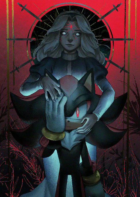
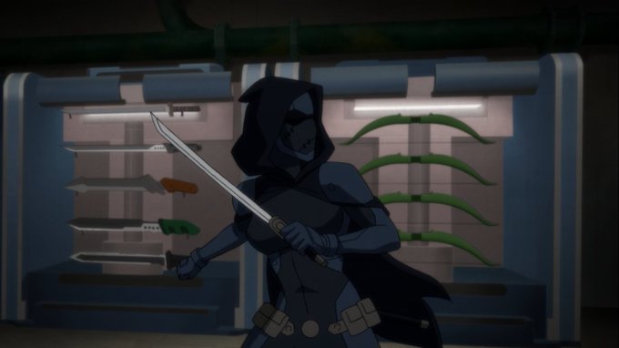
Shiido's original appearance,without her human disguise.
She's a Torijin, an species far above Kaioshins and Angels, but that does not mean that she's a divinity. Shiido is an Elite "Nest" Warrior (not to be confused with Time Nest). Torijins are visually inspired by birds.


Oh neat I can use the new FEH tier list maker to visually explain why the term "Fateswakening bias" annoys me so much in Heroes.
Here's every Awakening unit released in Books 3-5 vs ever Fates unit released in Books 3-5.
They do not get the same amount of love.
20 vs. 37


@semifreqsonic I agree, I like the consistency but some more variety would be nice. I really like issue 7 because the abundance of action lines and blurry line-work made it stand out visually, even if this artist has worked on the comic since


Hi! I am Hana, 23 & #characterdesign Is something I really think is important when trying to tell a story visually, and one thing I have devoted a lot of time in learning to translate for audiences to get a feel for the character's personalities!

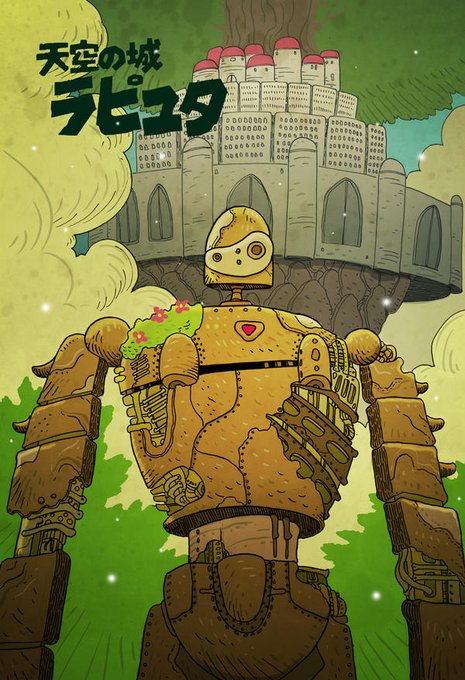
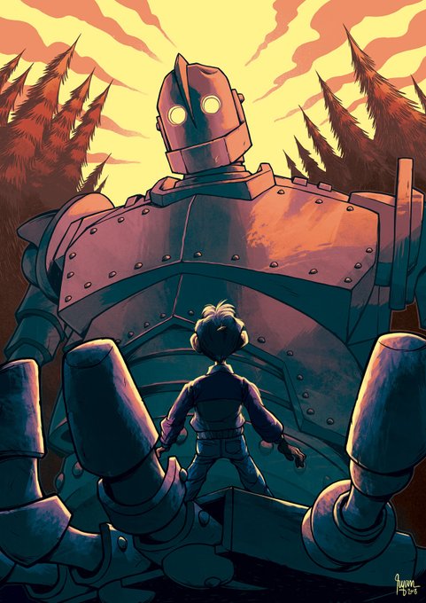
Automatons have been a staple in steampunk fantasy, largely due to their ability to switch between being killing machines & lovably childlike. Some visually stunning ones are in the Iron Giant and Studio Ghibli's Castle in the Sky.
@cheshirecatart / @ryansmallman
#WyrdWednesday

Dont mind the rock statue poses I only wanted to try out the colors on them 🤔🤔 what do you think ? Does it fit them? Should I try another scheme? Is it visually interesting?
#art #digitalart #artprocess #wip #coloring


@humulos THIS. IS. PERFECT. YukiAgumon is literally one of my favorite Digimon. 😄😤 Okay....here's the line! (Went with the variety with straps because it fits better visually, but either version works.)