contrastのTwitterイラスト検索結果。 11,052 件中 62ページ目


"Laugh into Oblivion"
🔥 The Battle for Hell collection 🔥
"Rich, vibrant, overly saturated colors, bold contrast, and brutal imagery "
Thoughts, critiques, feedback and advice welcome!
#TheBeastsofAI #AIart #stablediffusion


“I- um, sweetheart? Who’s this in your picture?”
“That’s my friend Cassidy, I met her at Freddy’s! She’s super nice and has a pretty smile.”
I have finally revealed my Cassidy design for my fnaf au. I had fun designing her to be more gnarled in contrast to her enemy, William.


@paniczkostek I really like using different colors to convey skin! Most of the time it’s based on what contrasts the most and their location(water so blue or green skin for ex)


Shh don’t tell @zee_mino but the next custom 1:1 by our legendary elixir artist @timziev was in our team chat and I just had to share it. Amazing creation with contrast of colors and depth w/ many details from the original Mino mutated like the @VenonymousV mask🔥


#ArtistOnTwitter
Hi!! I'm a 22 French illustrator & animator, I love color and contrast, hope you enjoy my art ✨


Cw: eyestrain
.
.
.
.
.
I really like the stark contrast between my source memories and my bright ass rubberhose style :D


@AdventuresofPip part 37
One of only 2 colourless pieces that will exist in the collection
https://t.co/ONXmnLLkcH
Most Pip scenes are made with the intention to make people feel happy when they see them, but I wanted to have a piece in the collection that contrasts that 🖤


Happy birthday to @AB_Otter!! Time to enjoy a nice hike marveling at the warm colours of the leaves, in contrast with the chilly temperatures outside… better wear a trusty hoodie for those November evenings!!!


A #photostudy of @squishubunny cosplaying Akatsuki Hinata.
I really enjoy studying #HanaBunny's photos since the lighting is really good and full of contrast and I really get to practice my #anatomy and ability to capture skin tones.
Made with #Procreate


Great cover contrast from Gege with volume 18 and 21 to show that this two characters would later on battle each other. They gave us the best battle currently and I’m excited for more to come😆
#JujutsuKaisen


BLOODY RED & WHITE
took me awhile to realize (years in fact)
that I love red and monochrome. just these two hues.
perhaps its the contrast. perhaps its my inner energy.
it represents darkness and light equally.
no wonder I'm okay with gory japanese stuff.
links below🔻


Quick doodles based on my old sketch XDD i just love the difference contrast when i draw them 🐸🐸


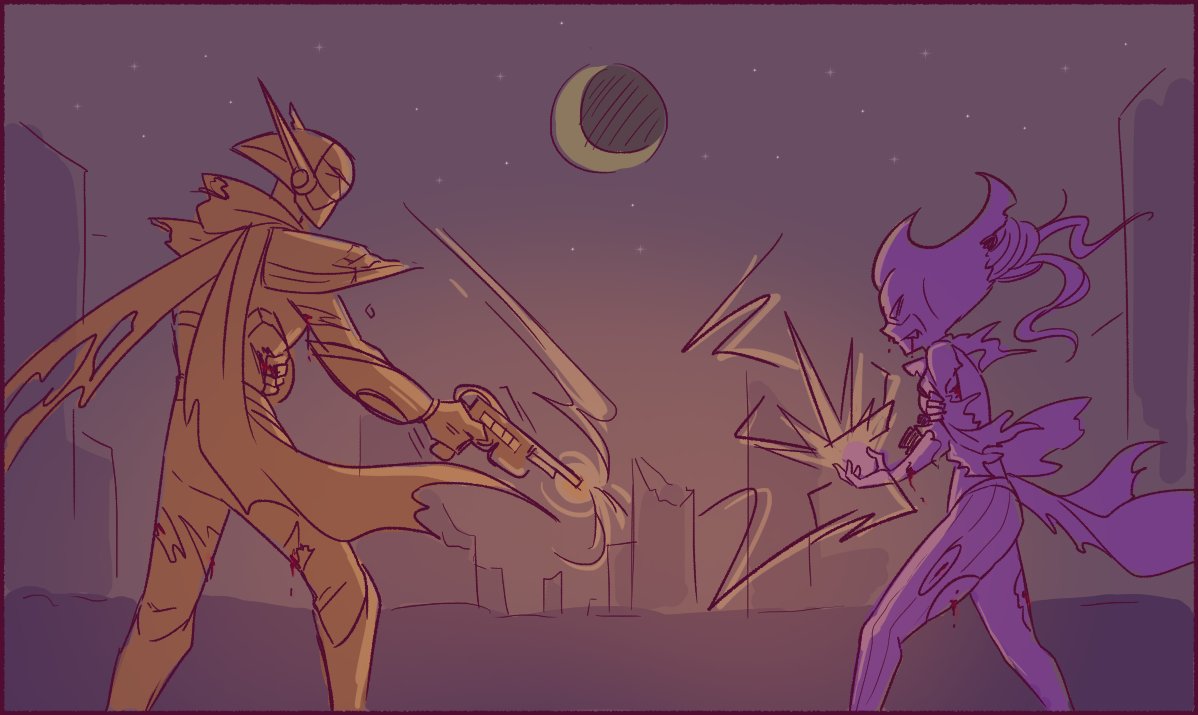
Gege definitely matched up the contrasting Blues & Purples on purpose didn't he. 👌🏽 🔥
#JJK #ShadzJK #JujutsuKaisen


I’ve posted these Shiemi pieces before individually, but felt like posting again because they were actually drawn on the same canvas and I like the contrast lol 🌸🌱


but i did continue to tweak the colors after that 6th step. it was very “yellow” so i added some blushing and redness as well as bumped up the contrast within the green. the final reds are more orange but the shadows are deepened to offset it so it can still pass as red.


『明暗 ~ Contrast』
新しいアイコンです。赤青は便利です。
My new icon picture. Red and blue are suprisingly easy to work with.
#イラスト #illustrationart


Some of my fav sequences from the #ActionForce issue I colored with @nethodiazz on pencils. Coloring the war room with the contrasting red and green lighting was fun. Also loved adding my loose style on the crusades flashback. #colorist #comics #Coloristforhire #commissionsopen


Really wanted to show more contrasting tone pieces, so here are more!


Hey #jttw and #MonkieKid enjoyers! I feel like we don’t talk about this theater production of JTTW enough. It’s made by Gorillaz vocalist and songwriter Damon Albarn and its such a fun listen. It’s very experimental and uses a lot of contrasting modern and classical song elements