opposeのTwitterイラスト検索結果。 2,075 件中 62ページ目


Hello gaymers, I just want to sellout myself quick
Can't really offer some cool valuable things, but where I live in even 1 buck is pretty good, and having more time for personal draws (as opposed to commissions) would be nice
🌚 https://t.co/LfPQxFi6Uk ~thanks


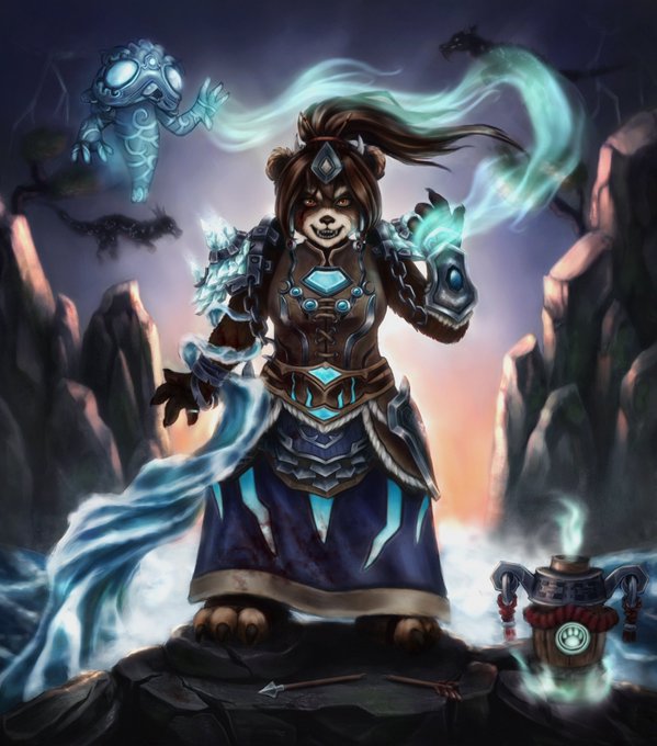
patreon request for @/Paperclaws !!
i have a lot of these to post but ill probably just do one a day opposed to all of them at once


@IvoryyIce I personally consider Mia’s to be a very very light mint green as opposed to blonde but it’s not bold enough!


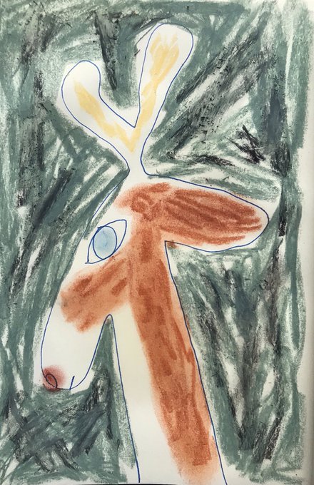
@OpposeArtworks She came out great Oppose! It was super fun to watch this. KInda giving me Lucoa vibes from Miss Koboyashi san's dragon maid!


@anipoke_flygon this is the worst mickey mouse design. I despise the flesh tone face, long eyes, small pupils, and the smaller body as opposed to the rounder one in his original design.


Close up because I can't get over her face. I'm so proud of it, a pleasing face is something I have always struggled with. This gives me so much confidence! She looks so gentle and friendly as opposed to her previous ref sheet where she's staring into the void.


i'm not opposed to drawing porn, but i wish it didn't feel like my only option. also, i'm very allergic today


@IvoryBatThief "There you go exposing my voice opposed to the masked voices I usually use. Honestly, for a woman of espionage, you are rather forward..."


@KilJaded I will keep up and try my luck. I will introduce you to my hero (Tong-Fu) and my girlfriend (Xiang).
Two destinies that are opposed to the elements and were able to find a balance of the power of the elements among themselves.
Yes, if you now language of Art, ypu see story OC.


4 Favorite Games (ignoring the 4 tags)
🗡️Legend of Zelda Majora's Mask
🗝️Kingdom Hearts 2
🦔Sonic Adventure 2 Battle (specifically Chao raising)
🪕Banjo Kazooie
These are more my fave nostalgia picks as opposed to my current faves. (Tho Majora's will always keep that #1 spot) https://t.co/kgIK4j1NSn


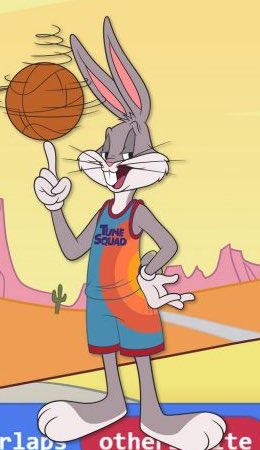
@marksjonathan71 @ZakaZ96 I disagree because if that were true Bugs would look more like Tom and Jerry do in their movie as opposed to looking more like Sonic’s redesign.
His fur has a more noticeable texture to it to make him more 3D whereas his 2D design is way more simplified and not as detailed.


Here's a dumb shit I made during online class as oppose to actually paying attention to it


Decided to tweak and revamp the design of that tanuki girl that I doodled awhile back. Revamping her to potentially fit a more contemporary setting as opposed to the fantasy one she was originally designed for.


Hey everybody! I’ve translated the #Cookiemals’ concept art - since this one was presented in Japanese as opposed to the usual Korean, it was easier for me as I understand Japanese better.
These three are so cheeky and cute >w<
#CookieRun


From Today’s live stream. My idea is to take the style I’ve done extensively in the past and apply it to more western/ North American scenes with animals as opposed to what I used to do which was exotic animals.
“Unleashed”
30x40 inches
Acrylic on canv… https://t.co/S6xRoogg3D


Continuing the ladies sports au series! Hildagard tennis and women’s soccer Ladigard
I’ve used that Hilda joke before, but I consider it a running gag as opposed to a recycling of jokes!
I forgot the angst part behind Ladigard tho :y


Ahh I had a lot of fun painting this cute little mushroom fairy 😄 I miss compositions like this, where a character sits in a physical scene as opposed to just painting a floating head with simple background (I've vowed to paint more bgs this year) #fairyart #digitalpainting #art

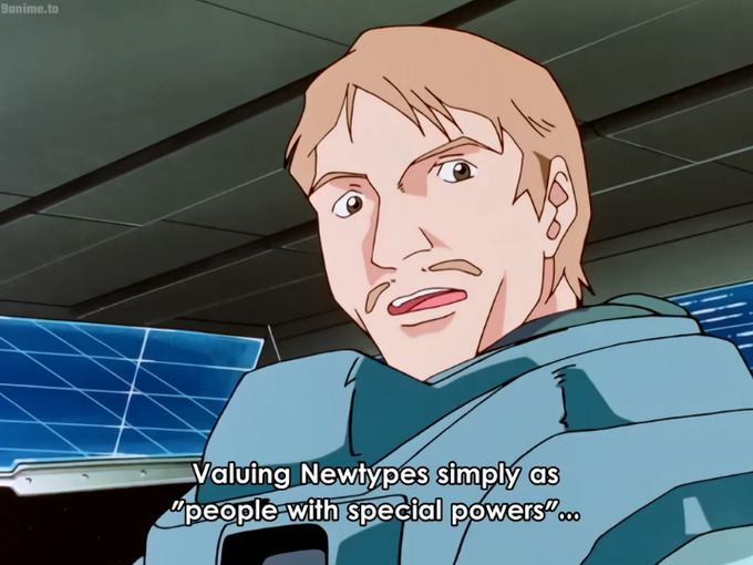
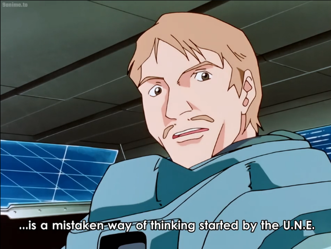
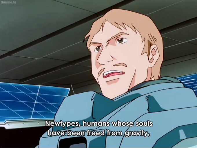

Gundam X really is an excellent clarification and reinterpretation of a world post 0079. As opposed to an AU Zeta, its more like an alternate history, but thats a good thing.
I am once again baffled how this got cut while Wing and SEED blew up.


Nice to have found a way of using colour straight to the page that I think suits me. I suppose because it is still drawing, as opposed to painting, or blocking. As intuitive and daft as the outside lines