opacityのTwitterイラスト検索結果。 1,333 件中 65ページ目


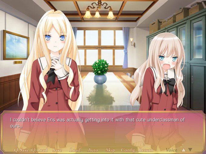

A Kiss For The Petals - Maidens of Michael is available now from https://t.co/4ZLUfBYtY3. Featuring 1600 x 1200 resolution, uncensored CGs, adjustable text box opacity, and more features over the 2012 original.
https://t.co/HEwXvKT9oV
#MaidensOfMichael #sonohana #その花

Scene from A Kiss For The Petals - Maidens of Michael demo version. The opacity of the text box can be adjusted in the Config menu.
#sonohana #その花 #MaidensOfMichael
More info: https://t.co/sJaJFKGcIL


@azlanshahazamy @Procreate I understand. Within Procreate you can control most things. Opacity and size on the left hand size + there is a full brush editor with tons of customizationable settings. You can even import images to use as brushes and texture

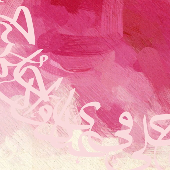
This is a sample work I am currently working on. The fluid brushstrokes and the bold text was used to contrast with each other. The opacity of the text was lowered to provide balance.


✨A fallen star. A message from the future. An incredible adventure! 🌎
Happy New Year! Thought I'd try out my fave style of 2017,
#pixelart with lots of lighting effects and opacity.
#pixel_dailies @Pixel_Dailies #fallenstar #earthbound #nintendo #indiedev #gamedev

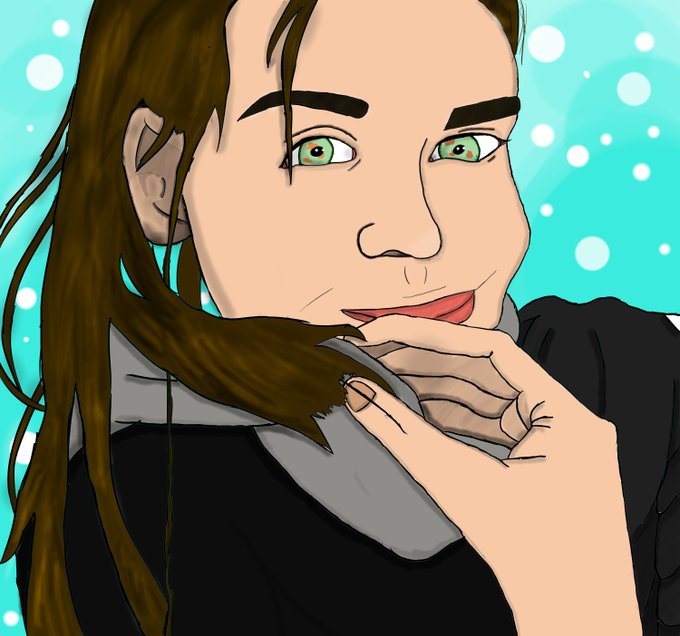


Portrait of Jason, the main character of my project Jason Vs Giants (Jason Contra Gigantes) I was inspired by the @dishonored portraits done by Sergey Kolesov. I had a blast working on this piece changing up brush opacity and flow.

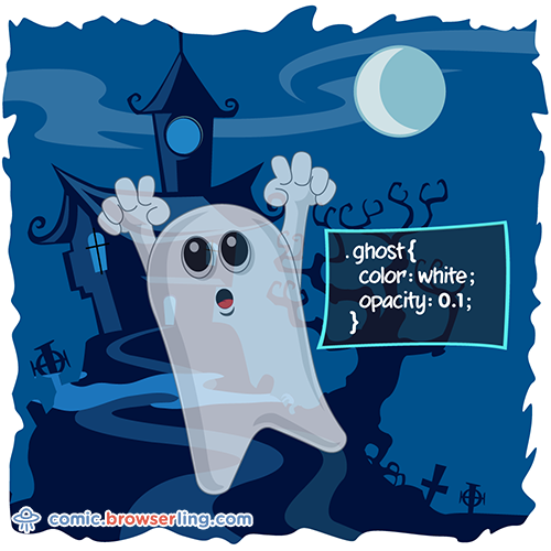
Ghost CSS pun .ghost { color: white; opacity: 0.1; } ... https://t.co/Zo8PBzQvwz - css jokes by @browserling.


Finally I finished this. Clip Studio Paint is pretty great but finding the layer opacity was an issue for Silver's aura so I just kept the black outline around it. #SonicForces


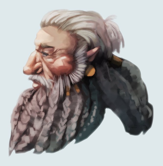
If your art needs a boost, duplicate the layer, field blur, set the top one to screen then reduce opacity to preference. it'll soften and brighten the whole thing.

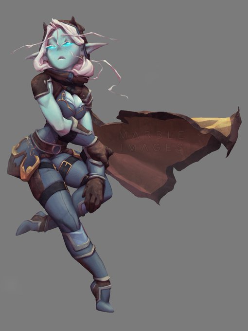
10a: Go back to my Mid layer and use Ctrl+U to change hue/saturation. Click colorize and use sliders to find a tone you like. Do the same for Black and White layers. Made a new layer on top set to overlay with low opacity, using a soft brush with black and white to enhance form.

6: New layer above Black, set to overlay, called White. Like before, use a regular brush and white color to paint in highlights and enhance the form. Set opacity to get desired contrast. Staying objective about the light source will lend to the believability of the character.
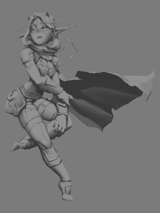
5: Now I create a new layer above Mid, set it to multiply, and call it Black. Like previously, I set the opacity of this layer to a lower setting and begin to paint in all the places light would not hit. Places where two objects meet/overlap, downward-facing surfaces, etc.


just trying blending effect FireAlpaca Burn (opacity 32%) THE COLOR LOOKING SO GOOD, I LOVE

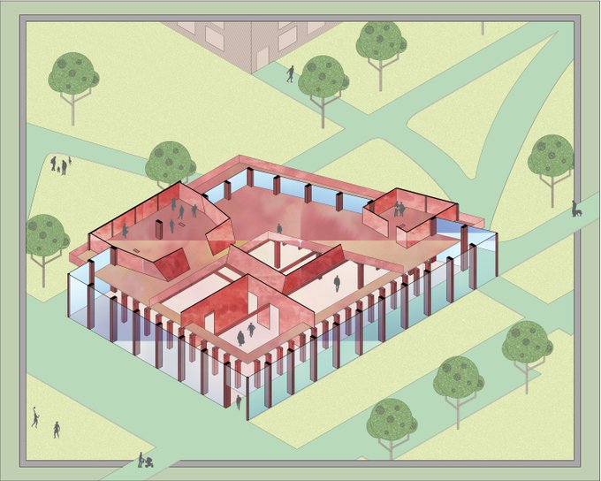


A sketchy thing that I liked how it turned out! I think I prefer working with near-100% opacity brushes.


Better #ApplePencil integration and brush preset patterns and opacity!
Get the new NoteLedge for #iPad 👉 https://t.co/JREFkEB71n


🌟Lighting practice🌟, forcing myself to paint with nothin' but a full opacity hard edge round brush 😭


opacity lowered on color while I try and figure out how I'ma finish this 🤔
just mixed cabbit Ryo-ohki with her humanoid adult form lol