saturationのTwitterイラスト検索結果。 70ページ目

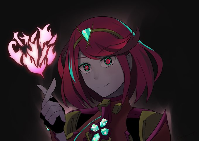
Trying darker colours with more saturation but this Pyra came out looking low key scary lmao #XenobladeChronicles2


If anybody can successfully fix my #clipstudiopaint problem with losing saturation so I don't have to screen cap my canvas workspace to save out every time, I will give them $30AUD.


or maybe...... for your consideration...... this.........
(increased the brightness and saturation of all the colors, but especially the darkest fur color)


@Bigger_Hoss @ahoobby @GaminBlurS If we’re talking about M&L artwork then I have to say that I loved the original desaturated/painted rendering they used to have. But I also really love how they cranked up the saturation for DT and Paper Jam’s artwork too (DT's ethereal blue outlines also go a long way)


The middle short animation was exported as animated mp4 and was concatenation with two static png in the front and back but I think I see some subtle saturation shift between the animation and pics. Do you guys mind looking into this? @Procreate I’m using the newest version

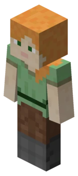
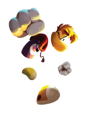
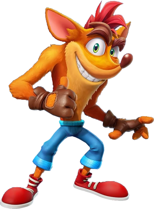

Man why the fuck does over half of Fighter's pass 2 have orange hair 😂😂🤣😂
Wasn't the oversaturation of JRPGs in the first one enough Nintendo is so bad at rationing their content


Dragon Knight Morde is actually quite interesting. Skin tone's more purple, more saturation, rebalancing of his armor (shoulder, chest), and some face/helmet changes. Interesting part is Maki's final version is mirrored.
Left Wiki/game, right ArtStation.
https://t.co/OnzTSSRkOa


originally the colors were going to be a bit more saturated but I made a happy little accident with a desaturation layer and I liked it so I kept it


I don't know which one has better saturation level so gotta post both lol
I traced the chrysanthymum cuz it's so stressful to draw lolol
#illustration #fanart #A3_anime #a3game #古市左京 #sakyofuruichi #秋組 #krita #kritaillustration #A3

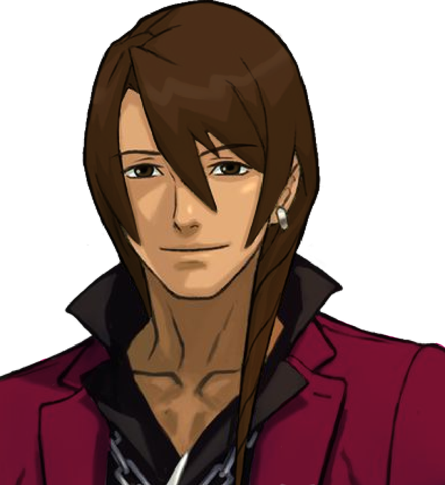

@AdrienWowie objection!! i think the weird, mcdonalds color apollo is the result of their saturation of hair and clothes not lining up. if one desaturates mcpollo's suit and intensifies brunettevier's, it looks SIGNIFICANTLY better! ...kinda


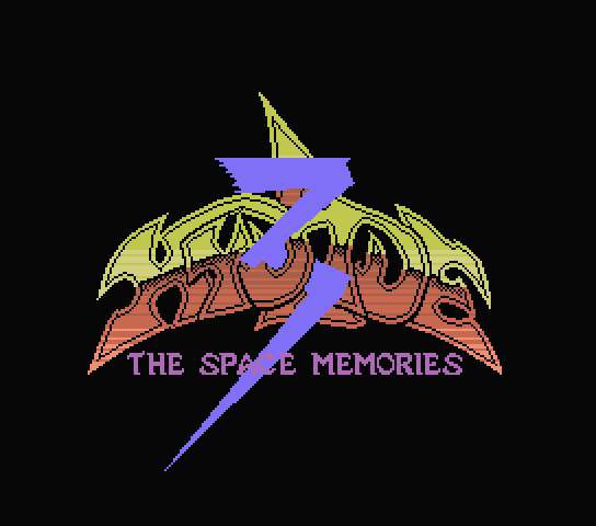


Here comes the fun part. The glowing clustermagic. I use a layer on normal mode, paint from center on outwards, color picking and using the HSV slider to gradually take the local color to its most saturated self. I vary the hue slightly, and favor saturation over value. Don't be


