comparison,のTwitterイラスト検索結果。 1,081 件中 8ページ目

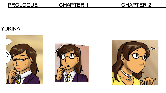

The last two pics are Yukis drawn this year. By comparison, Chapter 5 happened back in 2017-18 and Chapter 6 has an older Yuki, so we can't compare lol https://t.co/iRU6yEtUh8


He looks so bright and colorful in comparison, even though he barely has any colors. He just looks so much more full of life, so much more happy
(yes I know I'm talking about a Minecraft skin let me have this)


trying to break back into drawing...... slowly but surely
here's updated art of chantal, local intern rabbit who risked everything for a safe future for her mermaid gf. they live in animal crossing but real now
bonus comparison, initial art of her from may on the right!


@Eyeabovesky Pales in comparison, but here's my Minnie masked getaway driver! Thanks to @ArtsAbide and #refinedsavages for the inspiration and inclusion!


#xxxAudio by @_PixieWillow
She's A Bully [ASMR]
Kinks: F4M, Binaural, Panning, Cuckolding, Insults, Humiliation, Small Penis Humiliation, Bullying, Scent, Feet, Armpit, Cum Eating, Reassurance, Sweating, Cock Comparison, Big Cock Worship, Shoe Sniffing
https://t.co/JAZbYIQxV2


Mahouka Appendix 2
Miyuki and Lina at the age of 12. During this time Miyuki was trying to master Niflheim while Lina fired Heavy Metal Burst for the first time with. For comparison, Tatsuya fired his very first Material Burst at the age of 13.


just got a moderation on my roblox account for uploading an "inappropriate" asset, which was a character for CALICOHOUSE [sequel to TAPIRHOUSE].
for comparison, two other characters [WHICH WERE APPROVED], are also included
the only difference is his body type
HOWS THIS SEXUAL???


For the sake of comparison, we can see PamPam and MenMen on Spicy and Yum-yum


New sona design because I'm obsessed with green rn and also I like this design better
!! This isn't real size comparison, feral form is about as big as a regular domestic cat !!
also, the anthro form doesn't have leaves on the tail


.... i have found my very first digital drawing
it is from early 2016 and holy shit it is hard to look at
for comparison, i will include my most recent painting as well,, kinda cool to see how far ive come!! :D


omg i forgot to show off the other comparison,, and honestly the one i'm most proud of HFGJGFJHFFD--
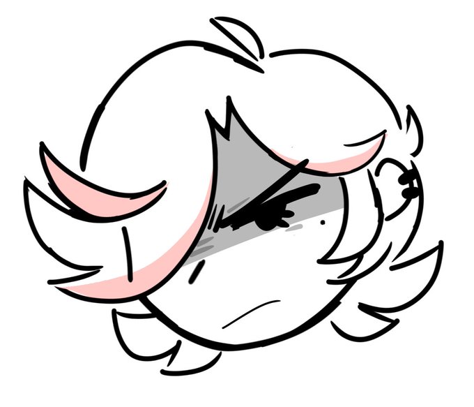
BOOM. what a head-tilt + some wrinkling can do to change an expression


Inspiration for this came after seeing 6.1's "Secrets of the Realm" patch and realizing, damn, Azeyma looks like some sort of alt-universe Kiwawa. Official art for comparison, Copyright Square-Enix. :D


Prompt comparison, then and now..
"a painting of an octopus in the style of Salvador Dalí"
Left = Big Sleep, 2021
Right = #stablediffusion 2022


I just can’t, they are everything ✨💞#tokyomewmew reboot is a masterpiece so I drew this comparison, 2002 or 2022? 💖 #ichigo #art #digitalart


2016 to 2022 comparison, Improvement would of been bigger If I drew things like this more often but it iz what it izzz ¯\_(ツ)_/¯