comparison,のTwitterイラスト検索結果。 999 件


Other fun comparison, crustaceans in general. https://t.co/76Q4YOciQ6


2017 full render vs 2025 quick sketch
"From First to Final"
I really wanted to make a fully rendered comparison, but I didn't have the time. But soon, I'll definitely make one and it will be for the group.


@Succubus6663 Yeah saw that. stupid comparison, especially since the Shoto stare was tiny panel and it was Deku listening to Shoto, which actually made Deku actively look for Ochako and then that stare at Ochako basically got two entire pages. That made him go “OH”


For comparison, this is the same one from the first game, with all the required detailed textures and some effects applied


You vs the character you get compared to
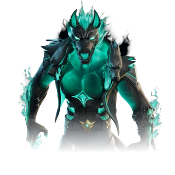
Most noteable and recent comparison, had to draw it
https://t.co/i9Z6qbRjJh https://t.co/3OZQ8obFZs


L for the wrong comparison, Ultima. The actual clone character is right here. https://t.co/7R5yVcbjVT


Like this is a kinda biased comparison, but for example when Deku needs to create a smoke cloud for cover he literally uses a swing of his hand (+smokescreen) to create a smoke cloud the size of mt. Fuji. When Sukuna needs smoke cover he throws a fire extinguisher. yk what I mean


Artists, show us your improvement over 5 years!
A bit over 5 years but a good comparison, so figued it'd fit... https://t.co/1cDluwpwB6


An interesting comparison,
Texas in a comic told Amiya to find her path forward in her footsteps. In an interview with the son of the Colombo Mafia, his father taught him that "When you don't know where you're going, any road will take you there."


Centurion (and Leopard 1 for comparison, I just wanna draw them together)


For comparison, this is my first digital drawing ever, which was made about a week before that Mirko. Just to show what my actual clean style was looking like back then.


@cafekattsun This sorta doubles as an art style progress comparison, too~
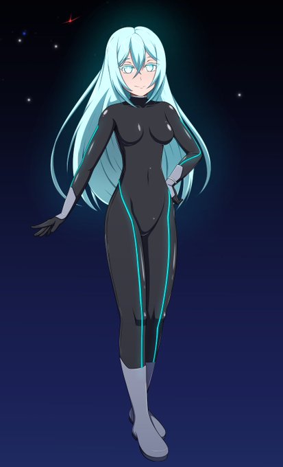
But here's mine. I used the basic suit design for a while, but thought it needed something a little more to stand out, so designed an overcoat type thing to go over it~
![Rc [ 狸キューブ ]さんのプロフィール画像](https://pbs.twimg.com/profile_images/1408316252343476229/ILpb8ZEO_normal.jpg)

@GenkoMoriya that was a hyperbolic comparison, sir~!! XD
**playfully noogies you and prolly gets zapped by your electric mohawk**


@trioart412 i did as i said i would do. prolly not the best comparison, but i like how she looks! fasho