compositionのTwitterイラスト検索結果。 13,847 件中 76ページ目


Reducing colors to B&W and only playing with contrast is a great way to check the aesthetic level of a composition. If it looks decent in B&W, it almost certainly looks great with color.


Ich muss echt sagen, in Sachen panelig, composition ist Shirahama (witch hat atelier) grandios. So pfiffig, so vielschichtig. Ich kann sie mir immer wieder angucken. Olruggio (3. Bild) immer noch mein absolutes Favorite, gefolgt von Dagda.(1. Bild) Freue mich so auf den Anime!🧡


Fragment #015
Vacant
This Fragment has the same composition as Fragment 14. Would Ultraman look like this if he was stripped of his costume?


Yooo, AI Novelist (TrinArt)'s official Derrida art model (ran ~early Nov'22) is now open source!
This is a versatility/compositional variation model, but stricter on anatomy and style than the earlier Trin-sama model.
Read the desc.
https://t.co/fU9PSJrd7w
#ainovel #trinart


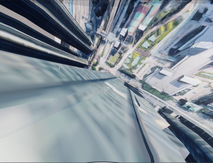

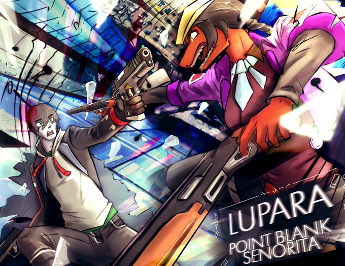
@sonatacreates At first I wanted two characters fighting. Then I thought that it'd be more interesting if they fight in the skies 👀
So I ripped the 3D model of Hong Kong from google maps to make this composition look even better :DD


@DokkanAssets To be honest since a certain time i found the Legends artworks compositions a bit lazy.
Miss thoses dynamics original poses, or incredibles renders.
Fenyon is an outstanding artist, but since he is here i found the atrworks technically beautifull, but artistically boring.




Process breakdown:
I start with a generated output that gives the block out of composition and colors, and then in Photoshop I fix the broken parts (like his knees) & then collage several elements in with digital overpaint to combine and add finer details.
🧵


Masterpiece of the day 💎
Archetype #213 by @kGolid
“The Cube” has to be one of my favourite @artblocks_io ever, such wonderful composition and so unique in the collection. Owner @Vince_Van_Dough


me making complex costume designs: teehee
me later having to draw them in a composition: OH FUC-


working on a short comic to force myself to think more about composition.
Here's a WIP panel from it


Doing some "three-value sketches" (highlights, midtones, shadows) for compositions for two new WW2 pieces.
Trying to get a cinematic feel that is also fairly easy to read (as I feel it'll help with my Warhammer and Star Wars job stuff down the line, too)

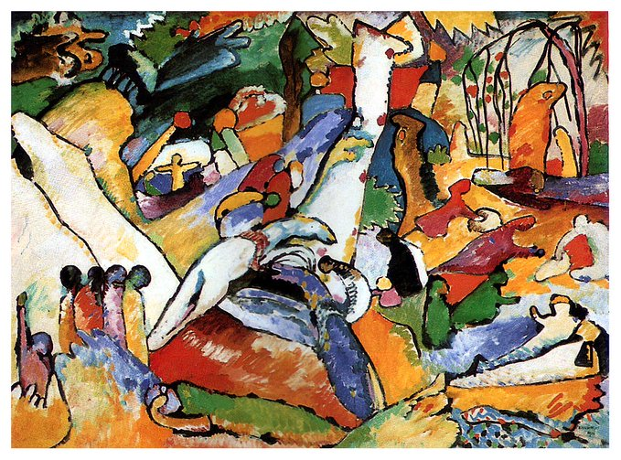


Composition X, 1939 #wassilykandinsky #kandinsky https://t.co/TLPZL8O1uG


The importance in a composition of Framing grid / Colors / Lights / Atmosphere / Angles of view
and make SKETCHES! to bring dynamism✏️
#sketch #art #process #doodle #DigitalArtist