FontsundayのTwitterイラスト検索結果。 257 件中 9ページ目


#FontSunday Some great examples of exclamation marks on vintage matchbox labels. #punctuation @DesignMuseum @nikki_vz


#FontSunday 'The Case For Retiring Our Most Overworked Four Letter Word' which featured in the first issue of Avant Garde Magazine – January 1968. Design by Herb Lubalin. @DesignMuseum @nikki_vz
#Design #Punctuation #Type #Typography


Map of Ansonia, Connecticut, published by the Sanborn Map & Publishing Co.
Source: https://t.co/oVL5NidGWK
#FontSunday @DesignMuseum

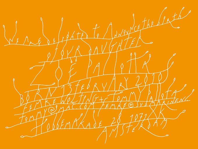
Map love for @DesignMuseum #FontSunday - a vintage Japanese matchbox label


The Character of a Coffee House... Maps of London & Beyond #AdamDant #FontSunday @DesignMuseum @thegentleauthor


Tomorrow's #FontSunday is dedicated to all things #WorldCup- send in your favourite examples from noon!


Design by Bob Noorda and Massimo Vignelli/Unimark for the 1966 Biennale, 2 ways. Venetian #FontSunday @DesignMuseum


Michael Gilette’s amazing Bond girl silhouettes, for @PenguinUKBooks 2008 re-issues #FontSunday @DesignMuseum


Charlie Chaplin's Modern Times film poster #industrialtype @designfestbrum @DesignMuseum #FontSunday


Yes logo - first Crosby, Fletcher, Forbes 1969 and second @_rogerdean 1972 @DesignMuseum @Creative_Entrs #FontSunday


Dyson product design #Creative #British #MarketingBasics #FontSunday @Creative_Entrs @DesignMuseum


#FontSunday Patrick Tilley’s series of posters for the Sunday Times, c.1960. #Sunday @DesignMuseum


.@DesignMuseum's #FontSunday is #newspaper fonts @guardian – Designs by @underlineinc and #WolfgangLaunder

The Sun newspaper printed in gold for Queen Victoria's coronation, June 28th 1838 #newspaper #FontSunday @DesignMuseum


Here's great set of numeral-shaped pens by Philadelphia's John Story for @DesignMuseum's #FontSunday celebration of numbers.

#FontSunday | Custom numbers for the People Love Music identity by @Bureau_Bruneau
@DesignMuseum @Creative_Entrs


2AFN poster by Experimental Jetset.
An amazing talk by Experimental Jetset for @walkerartcenter : https://t.co/QrLNsEv9hI …
#FontSunday @DesignMuseum @Creative_Entrs


#FontSunday | Yummy numbers by @Cess_tm, a 3D illustration studio based in Madrid
@DesignMuseum @Creative_Entrs