comparison.のTwitterイラスト検索結果。 2,015 件中 86ページ目





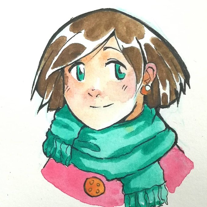

I'm using watercolors & Inktense for years now, but somehow I never made a comparison... I just randomly switched between them lol (¯ . ¯٥) Which one do you like more? Even colors of Inktense or splashy watercolor?
1 W&N, 2 D, 3 left W&N, right D
#inktense #derwent #winsornewton


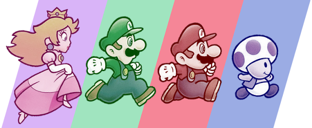
The Mario Kart Tour render for Pauline is a bit low quality, since Mobile games are just Like That. So I used waifu2x, though it's not the best for 3D render images. Smoother on the left, original on the right, for comparison.
Still waiting on that Aces render though.



(partial) OC height comparison. A few I had to leave out because I didn't have good full body references of them.


So, not gonna lie, was inspired by TheMeatly's speedpaint of Miss Undertaker. 😁
I decided to challenge myself, to do something different that I've always wanted to try. I drew it normally just for comparison.
Background's still not my strong suit-
#ShowdownBandit

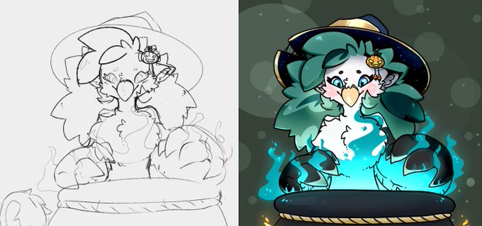
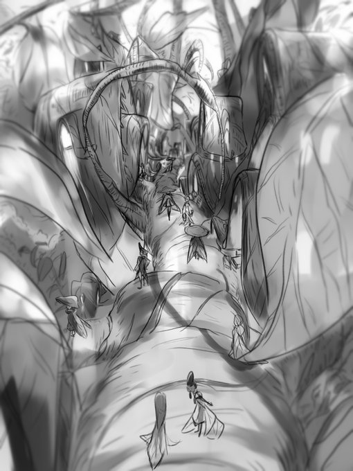
Oh yes, if anyone wants to know what my rough sketches look like! Here's a comparison.

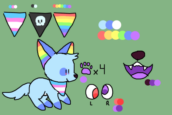
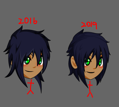
my first reference of pawz from 2016 for comparison... hes burple now


Tried out some experimental shading. it's similar to how i render but i tried making it more soft.
Final and sketch side to side for comparison.


Been doing some icons for my characters on toyhouse, I really do enjoy headshots and doing little painty ones. Updating some old ones cause they looked effed in comparison. I'll never be done fml. #digitalart #OC

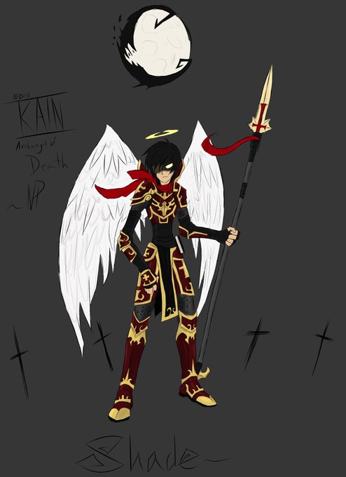


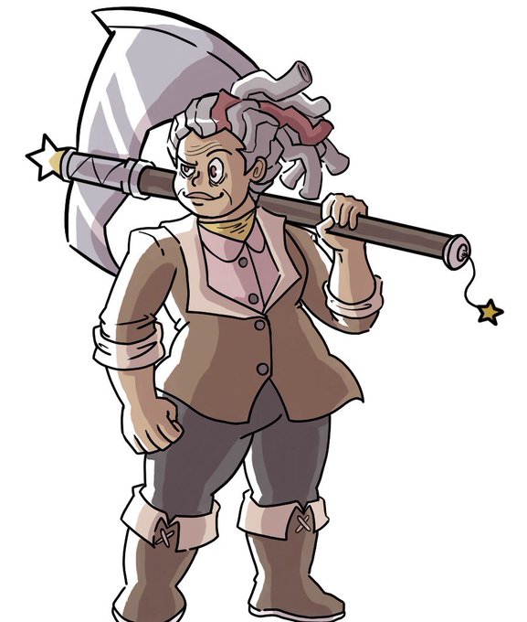
Colored! Side to side comparison. She’s actually 70 years old and she also fought a bear in tonight’s campaign.


This one was all CLAMP, though. Notice the sharp angles and lean bodies. Additionally, this illustration falls right in line with eighteenth-century portraiture. Just look at Élisabeth Louise Vigée Le Brun’s Marie Antoinette and her Children (1787), as a point of comparison.


(Previous design shown for comparison.) I hope to do fully colored drawings of the redraws in the future. Just havent had time to do another big project lately. Weh.


Two Cirno's, a side-by-side comparison. I both improved and changed my style a lot, lol


Finished revising one of my pieces I made last year for my Candidacy Review. I kept the background but decided to redo the characters & values from the ground up.
I also included the original for comparison. #illustration #fire #Autumn #AutumnVibes #slapstick #SCAD



Square Enix has released the new key visual for the Final Fantasy VII Remake to celebrate the game's 22nd anniversary. Here's a comparison. Read more here too: https://t.co/ZLTfbegBFv