designhのTwitterイラスト検索結果。 236 件中 10ページ目
Do you remember what the websites looked like 20 years ago? Visit our exhibition Web Design in 2001!
https://t.co/S7awKGKlrI
#WebDesignHistory #20yearsago
Highlight from the People!
Graphic Arts for CBS Television
Georg Olden and Lou Dorfsman, 1952–58
contributed by Mark Quigley and Tony Best
.
#PeoplesGDArchive #GraphicDesignHistory #GraphicDesignArchive
Happy Holidays ❤️with Frances MacDonald #graphicdesignherstory
Highlight from the People!
"Aviation Tomorrow" collages created for a mural for Western Airlines coffee shop, 1945, designed by Grace Clements
Wolfsonian Object Collection
#PeoplesGDArchive #GraphicDesignHistory #GraphicDesignArchive
Highlight from the People!
endpapers for Art You Sure You Love Me? designed by Herb Lubalin, 1969
published by World Publishing
from https://t.co/U8Jb2IAd7R
#wrappingpaper #GraphicDesignHistory #PeoplesGDArchive #GraphicDesignArchive
Ethel Reed (1874-1912) moved to Boston with her mother in 1890 and at age 20, without much schooling, began to work as a graphic artist. Over the next two years she produced more than 25 posters which earned her recognition across the US and Europe. #graphicdesignherstory
おはようございます🌞
昨日はですね、うん、世代的な猛者が集まってですね、うん…
富樫先生の名作『幽遊白書』コス大会を嗜んできました✨知識量がやばwすごい楽しかったです🌸
次はジョジョかな(`・ω・´)✨
また遊びませう🥀ありがとうございました👻
#DesignHunting
#MHWIBPhoto
#幽遊白書
Anna Sipkema designed two beautiful "Flower and Leaf" calendars for the Dutch publishing house C.A.J. van Dishoeck. These three color lithographs were created for the 1904 edition. #artnouveau #graphicdesignherstory
Highlight from the People!
"Levi's for Gals" logo, 1968.
#PeoplesGDArchive #GraphicDesignHistory #PeoplesDesignArchive #Levis @levis.vintage.clothing @levis
Jan van Toorn, 1932–2020
“People calendar” for Dutch printer Mart.Spruijt, 1972
.
"The calendar proposed a new form of engagement for the graphic designer as a mediator and manipulator of photographic meaning." (Rick Poynor)
#GraphicDesignHistory #PeoplesGDArchive #JanvanToorn
Highlight from the People!
Meine Frau Inge und meine Frau Schmidt
Roland Oehme (film director). 1985.
Translation: My Wife Inge and My Mistress Schmidt
#PeoplesGDArchive #GraphicDesignHistory #PeoplesDesignArchive
Highlight from the People!
Las Veintiseis Letras
David Consuegra, 1964.
#PeoplesGDArchive #GraphicDesignHistory #PeoplesDesignArchive #BookDesign
Highlight from the People!
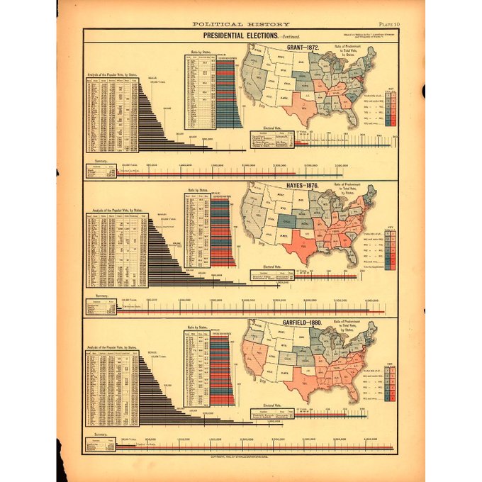
Plate from Scribner's statistical atlas of the United States
c. 1883
Library of Congress
.
Election maps have been around for a century!
#peoplesgdarchive #graphicdesignhistory #graphicdesignarchive
Highlight from the People!
Presidential campaign posters from the Library of Congress.
#PeoplesGDArchive #graphicdesignhistory #GraphicDesignArchive
Gaming company websites in the 90s. Dark design was very popular for these sites at the time. Id Software, Nintendo, SEGA, Empire Interactive and more https://t.co/l8vhli1VoC
#WebDesignHistory
Highlight from the People!
Early ballots look like party tickets or invitations! We love this new book This Is What Democracy Looked Like by Alicia Yen Cheng of @MGMTdesign @thisiswhatdemocracylookedlike
#ballotdesign #election #PeoplesGDArchive #graphicdesignhistory
Meet the grunge web design style in the 90s. A somewhat sloppy look, scattered elements, dirty background or torn edges are the main features of the style called grunge design.
https://t.co/SBFkcItgLR
#WebDesignHistory #Grunge
Do you remember how looked the best of flash websites in 2001? Visit our exhibition of forgotten flash websites from the early 2000s.
https://t.co/S836Sn7lYR
#Flash #WebDesignHistory
We added new websites from 2000 to the Museum. Look at how creative and graphically diverse was web design 20+ years ago.
https://t.co/DuMGnjpBH8
#WebDesignHistory
The collection of dark websites in the 90s.
https://t.co/ZsHlYtesIH
#WebDesignHistory


