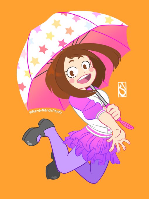
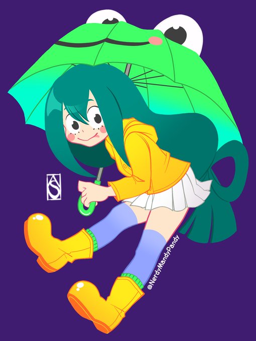
comparison.のTwitterイラスト検索結果。 2,015 件中 98ページ目


Finished Devilman: Crybaby and I enjoyed it a lot. The new art style made the old manga drawing looked less disturbing and somewhat cute in comparison.


yesterday i drew some fanart of the first series i really fell in love with back in the day and thought i'd put the first one side-by-side for comparison..i still have a long way to go but it's nice to see i've at least improved a little! i'll try harder in 2018!


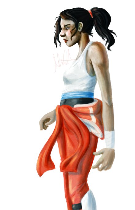
I wanted to share some of the first things I drew with my tablet back in 2013. I totally forgot how obsessed I was with Portal at the time! The last one is from this year, just for some comparison.


DOESN'T HE LOOK LIKE HER? LIKE THE EYES, HEADSHAPE... EARS ARE A DEFINITELY BECAUSE IT'S SUPPOSED TO BE BUT...WHOA. I have to draw Naki soon so I can do the comparison. : O


Here's actually something I did in 2013 for comparison. I'd like to think I'm improving


For #Comic #Writers & #Artists
Here is what one of my scripts look like, with finished page for comparison.
On my blog is a practice script for artists to draw & add to their portfolios, & writers to study off of:
https://t.co/ea34yDCavo


@jholder1224 @TheBethBarnett @HPLehkonen @NickMacari13 @Bob_Salley For #Comic #Writers & #Artists
Here is what one of my scripts look like, with finished page for comparison.
On my blog is a practice script for artists to draw & add to their portfolios, & writers to study off of:
https://t.co/ea34yDCavo


@jholder1224 @TheBethBarnett @HPLehkonen @NickMacari13 @Bob_Salley Here is what one of my scripts look like, with finished page for comparison.
On my blog is a practice script for artists to draw & add to their portfolios, & writers to study off of:
https://t.co/ea34yDCavo


Here's the boyo Josuke in a style similar to the Capcom Aracde Game. Jotaro is included for comparison. 2 poses, 2nd comes straight from All Star Battle.
#pixelart #Jojo #artistsontwitter


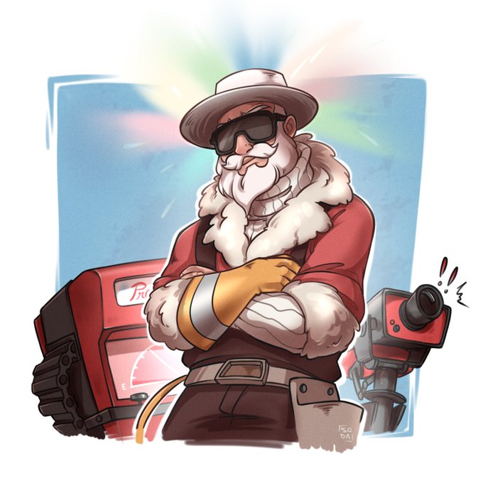

Actually finished the drawing and I'm really happy with my improvement. Also posting the old one for comparison.

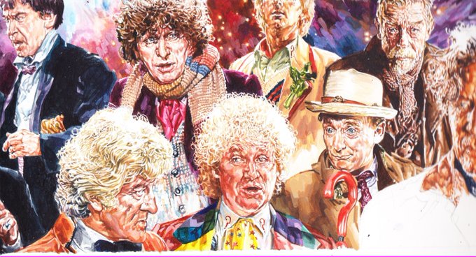


My painting of #DoctorWho : Ghosts is approaching it's final form. If I can get a decent scan of the completed work I hope to post it next week. Meanwhile, here's the latest stage with, once again, the earlier steps for comparison.

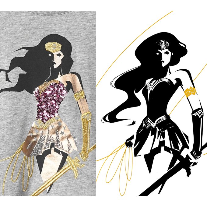
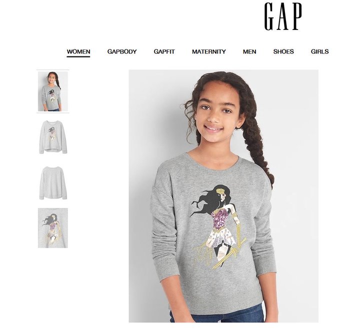

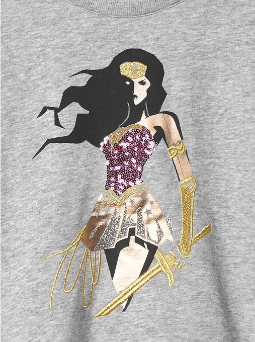
Side by side comparison. My original vs final #GAP product. Assuming is official & licensed...Embroidery is nice but why chunk up the hair?

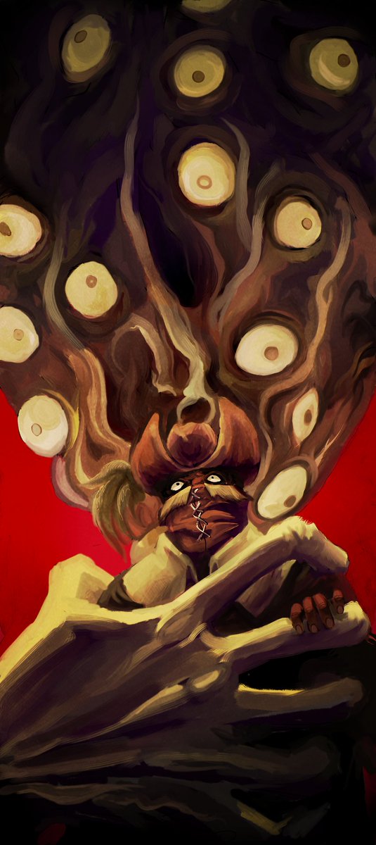
Done a few months ago! Decided to post this on its own without the old version comparison. Poor Henryk. #bloodborne


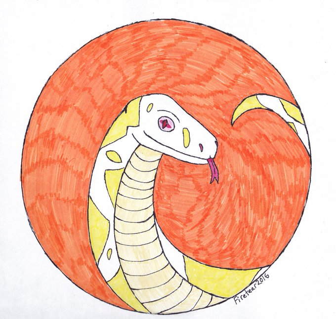
Just finished up a digital re-coloring I did of my old(drew it about a year ago) traditional piece I drew of a Sharp Snow Boa Constrictor morph. New pic and old pic shown for comparison. My traditional art has improved since then, too.