TypefaceのTwitterイラスト検索結果。 674 件中 2ページ目
It’s finally here 😎 “Infamous” #typeface is now live at https://t.co/WwYnufFDhI (with 25% off).
I thoroughly enjoyed making this #font. The slight slant was fun to work with, and it was a nice challenge to get the lowercase visually consistent with the uppercase 🫶🏻
【東京TDC賞2023:TDC賞】
【Tokyo TDC Annual Awards 2023: TDC Prize】
M/M (Paris) — Michael Amzalag + Mathias Augustyniak [France]
Title: Fossora Typeface
Client: Björk — One Little Independent Records
Typeface / Animation
https://t.co/W2McEskE0Z
https://t.co/x4q6IkwYm2
So excited to present you our real punk typeface, that inspires for totally bizarre designs! Are you ready for some bold moves? https://t.co/ieT1aAMSY2
2023 i'm learning more about typefaces and graphic design in general, i feel like really interesting fonts and design can elevate the aesthetic of a given show/comic/illustration and give it a certain nuance i don't know how to articulate yet
Don’t know how many people noticed this, but the typeface for the latest Stranger of Paradise DLC is similar to the one found in the Japanese Famicom release of Final Fantasy II
Oui! with 38 OpenType features, Altesse offer a lot of possibilities. The 1557 glyphs are divided as follows: two sets of capitals, two sets of numbers and lowercase glyphs, punctuation, ornaments and vignettes.
➽ https://t.co/K345Id9o8k
— — —
#typefaces #fonts #typography
5/6 Typofonderie's Year in Review 2022
November: Austerlitz
Austerlitz, is a humble typeface in small sizes & a charming Parisian Didot in large sizes. 56 fonts divided into 4 optical sizes of 7 roman & 7 italic.
https://t.co/eryJITVYv5
— — —
#typefaces #fonts #typography
i can actually remake this with the right typeface now since i reinstalled all my fonts.
🔤 Austerlitz alternates: Italics offer different endings for the g and y, in reference to the detail of the g present in Romans (Affiche, Gros, Labeur, not in Petit)
➽ https://t.co/BoOPfuLJzB
— — —
#typefaces #fonts #glyphs
🔥🔥🔥 Just to show you some French words set in different optical sizes of Austerlitz. Extract from this page:
➽ https://t.co/BV3XNc6GFG
— — —
#typefaces #fonts #glyphs
🔤 Austerlitz alternates: Asymmetrically, the typical shapes of Roman a and italic a are available. In fact you can use the roman a shape in its italic version, as it was the case a century ago for certain typefaces families.
➽ https://t.co/BoOPfuLJzB
— — —
#typefaces #fonts
It's time for light, beautiful hand-drawn fonts! Meet Rissa, a stunning typeface that will give your designs an authentic brush handcrafted feel. Such display font just won't be left without admiration! https://t.co/1ZUdvki0d2
👋 New! Austerlitz, is a humble typeface in small sizes & a charming Parisian Didot in large sizes. 56 fonts divided into 4 optical sizes of 14 styles.
➽ https://t.co/eryJITVYv5
Discover the history of this typeface loosely based on Série 16 by @jfporchez
— — —
#typefaces #fonts
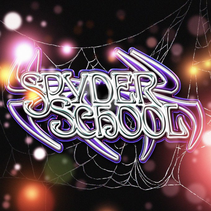
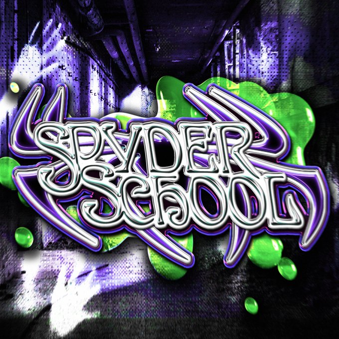
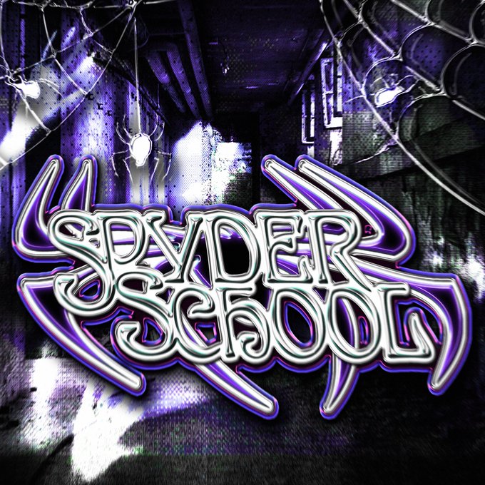
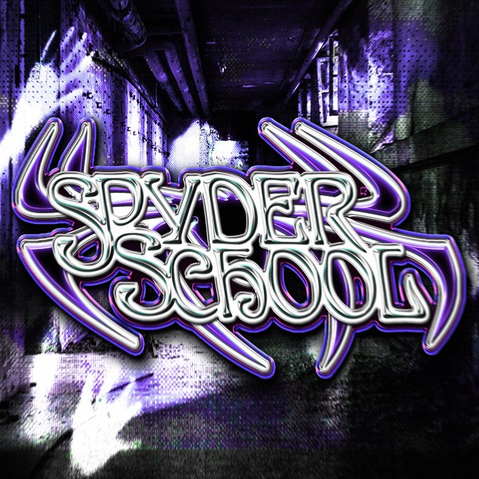
Also a first preview for the new logo made for the long awaited #spyderschool revival loving working on #typeface :))) #art #logo #commissionsopen #chrome #chrometype #LogoCommission #LogoDesign #Spiderverse #light #slime #y2k #creepy #liminalspaces #backrooms
(17/62) Usually England’s home kits can be quite boring, but I think Nike has done quite well lately. This one looks to me as a successful experiment. The typeface is definitely a great plus.
Western art #typeface retro #font isolated #english #vector image https://t.co/j7p5SRHYCQ
#newreleases Void by @optimofoundry is one of the 13 typefaces we highlight in our inaugural Fall Font Report.
Plenty of #typography after the jump
https://t.co/nfDNozDYjI
#typography #typefaces #typedesign #fonts #variablefonts #typeroom


