midtonesのTwitterイラスト検索結果。 2ページ目


Day#23
Focused on better grouping and proper midtones. Not perfect but deffo on the better side of things


Day#9
Another cake.
also abusing the cup in the background to start messing around with proper midtones. Kinda neglected them before


I'm glad I decided to scrap the old shading layer(left image) and be a lot more reserved with the midtones and pushed the contrast!


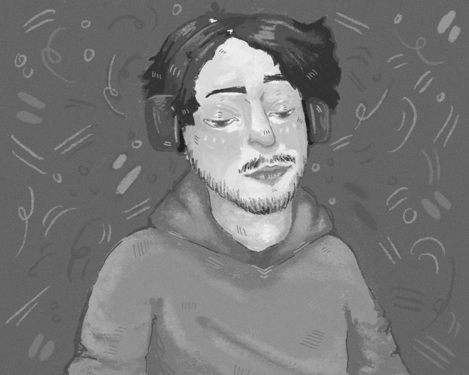
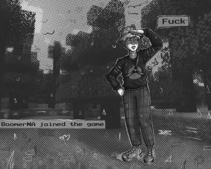


I'm pre-coffee this morning so bare with me, but I colour picked some midtones and like, sure he could be darker, but the harsh lighting really makes him look whiter than he seems to be. That spot on his peck is like, mostly highlit. https://t.co/xVYlY1hy0Z


my buddy @devinkorwin gave me some advice about grouping my midtones so there is less variance in value, applying his fb helped give this one a better read ✍️


Never shared the close-up here, so here's the close-up. I gave the lights a smooth, wet look, while making the midtones and darks gritty and textured. I think it worked out well, stylistically speaking.


For those who asked- some WIPs from the last 2 Pieces. My goal with these was to better control my composition by having most of the painting done in 3-4 layers: Effects, shadows, highlights, and midtones. I drew on top of these layers to find my shapes, then adjusted accordingly


Why Mike Mignola is so great!
This was short demo based on Mike Mignolas drawing of hellboy, showing how form is best described with only two value. Adding midtones made this painting :D
#mikemignola #hellboy #digitalart #digitalartist #2dart #2dartist #comicart


@axolotlknight Flats -> first render using layers of opaque color (darks and lights over midtones) -> refine and add deeper tones with a blue tint - realize my tones still aren't contrasted enough so apply a curves layer to amp it up. Which I think I did more of later as well.

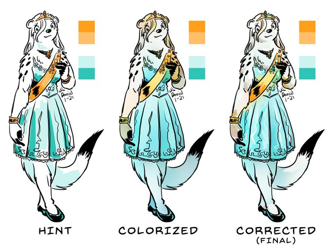
Some people, said they liked the colors on my last pic so I made this to demonstrate my coloring process. First, I select a palette and loosely block in colors. Then, I use Clip Studio Paint's colorize tool to generate some pleasing midtones. Lastly, I paint over it manually.


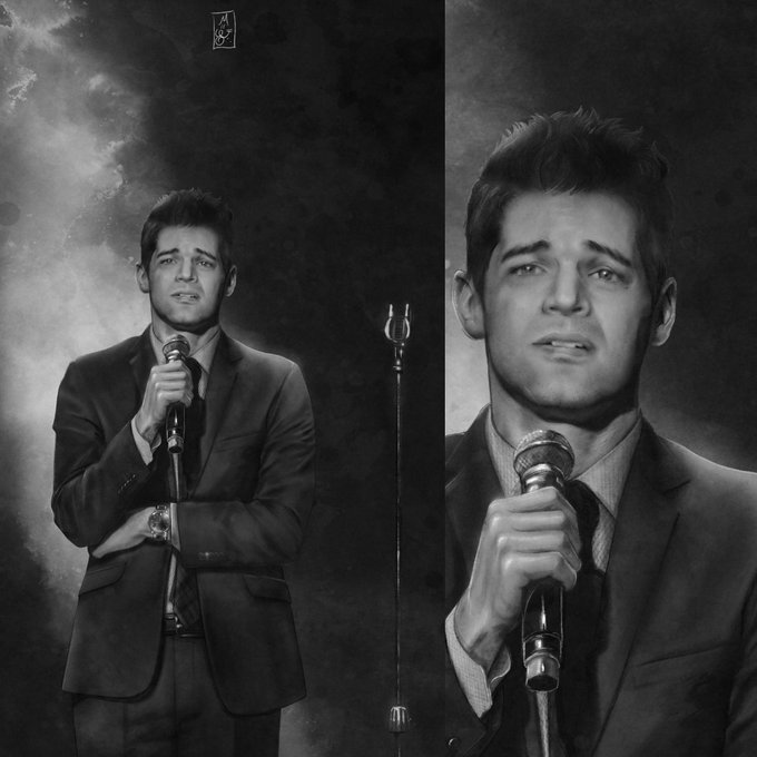


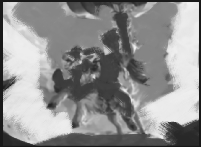
very blown out. However in the actual piece it's mainly midtones so that my rider and the background can still be important in the visual hierarchy of the image! THIS WAS HARD. It's hard not to paint an explosion like an explosion but still make it look like one.
4/5

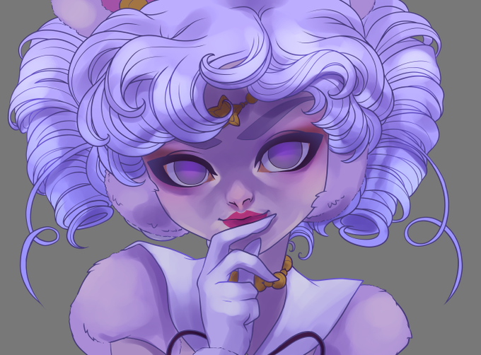
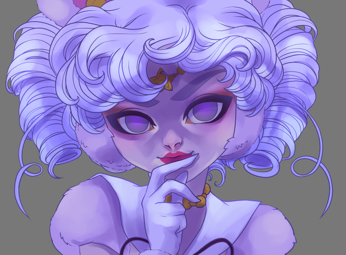
Changed the outline to a dark purple and adjusted color balance a little
I don't like pure black outlines
I like to make highlights a little more yellow, midtones a little more red, shadows a little more blue, but play and see what works


@cwunchbar Peep the parts where the lights hits directly, then the midtones in between, then the shadows away from the light which are the darkest. The midtones is the actual natural color, unaffected. Same applies in the picture


~2 hour study, left as-painted and right with the midtones tweaked 🌸 (model dominik sadoch)


this comic is nice cause the style makes color picking for midtones/shadows/highlights pretty easy, and it has different types of lighting too