typographytのTwitterイラスト検索結果。 35 件中 2ページ目


This week we present a few of illustrator Donald McKay’s red and black historiated initials for the 1925 Grabhorn Press printing of Richard de Bury’s 'Philobiblon.' #TypographyTuesday Learn more here: https://t.co/1xma7xlNk2


Woody Leslie’s book 'Parsely' is “a verbo-visual artist’s book that uses words alone to both narrate and illustrate a story, ostensibly about the neighbor’s parsley being eaten by some caterpillars under my watchful eye.” Learn more: https://t.co/aAH1jfmzMb #TypographyTuesday


In this week's #TypographyTuesday post, Head of UWM Special Collections Max Yela takes a look at the typography of 'Harry Potter'! Read about it here: https://t.co/pkHMos9gQP


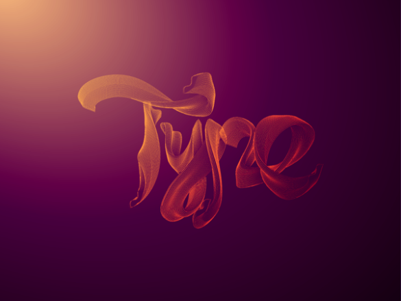
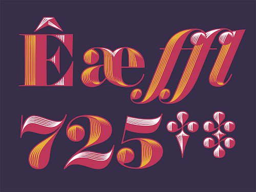
Some Typography for your Tuesday from typography specialist @AlexTrochut 😉
👉 https://t.co/XaUjoPRJsh
#typography #type #lettering #creativelettering #3D #Typographytuesday #typetuesday

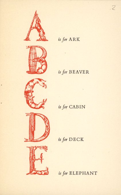

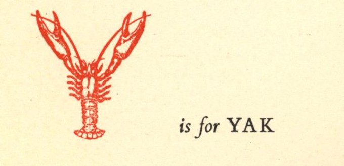
It's #TypographyTuesday and we've got a little mystery afoot! All we know about "Noah's Alphabet of the Ark" is that it was "taken from an 18th C. alphabet" and bears the ownership label of Lili and Erich Wronker of The Ron Press. Any ideas? See more here: https://t.co/1pKamOyuNc
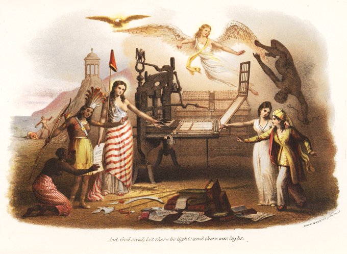
It's the American Encyclopedia of Printing! Which begins w/ a colonialist chromolith, of course. #TypographyTuesday https://t.co/5BTtJ8dcXO


This #TypographyTuesday we give you "The Discovery of Florida," hand set in Fransiscan type. Grabhorn Press, 1946. https://t.co/xwchXxNdTB


We've got a new acquisition this #TypographyTuesday: Simon Redington’s SHAKE: The Ballad of the Blue Jean Bop https://t.co/HqUVA9KrVj

Abstract typeface from the creator of the Photoshop cover https://t.co/bkmbfgDXFh #albertoseveso #typographytuesday
We're enjoying a bright Tuesday with #Obsidian typeface by designer Jonathan Hoefler #typographytuesday

There's something ever so slightly Oriental about this Kewl font by @sudtipos - and we like it #typographytuesday

This pretty floral font by Anniksha Began has got us dreaming of summer #typographytuesday http://t.co/wBbkXX2SoR

"There are a lot of naff script fonts out there," says @maxrandall, "but this is a good one." #typographytuesday


Painterly, yet figurative sculptures of typography created by Pawel Nolbert #typographythursday #digitalarts