TypographytuesdayのTwitterイラスト検索結果。 29 件
Remember, if you can’t find the colors in life, create your own! 🖌️ #TypographyTuesday
🎨 - “Find The Rainbow” by @heatherstilluf
View This #Art: https://t.co/38PQ32IQod
Well, someone’s in a mood. 😆 #TypographyTuesday
🎨 - “Back Off - Red” by @cocksoupart
View This #Art: https://t.co/pQGpXVTDiH
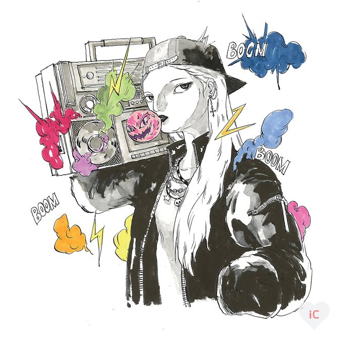
When the music is so good it brings everything to life! 🎶 #TypographyTuesday #SupportWomenArtists #5WomenArtists
🎨 - “Boom Boom Radio” by Nolawon
View This #Art: https://t.co/qp3qBH1yFs
Strength is knowing the power of standing together. 🤝🙌 #TypographyTuesday #InternationalWomensDay #SupportWomenArtists #5womenartists
🎨 - “Support Each Other” by Doodle By Meg
View This Art: https://t.co/JKQMK8xGM9
It’s ok; it happens to the best of us. 💭 #TypographyTuesday
🎨 - “Hold On Girl” by BrushBound
View This #Art: https://t.co/aGrwcBR1C8
Something about having a cup and your pup keeps the day going. 🐾 #TypographyTuesday
🎨 - “Coffee And Corgi” by @sketchandpaws
View This #Art: https://t.co/xKgArZreJx
Such a delicate yet dramatic way to bring a little grace to your space. 🖤 #TypographyTuesday
🎨 - “Grace Heart” by Willow & Olive
View This #Art: https://t.co/MKIwoYHMSV
For this week's #TypographyTuesday we present a new addition to our collection, 'Takenobu Igarashi A-Z,' which highlights the typographic work of Japanese sculptor & graphic designer Takenobu Igarachi, published in London by Thames & Hudson in 2020. More: https://t.co/rBDWJLCo83
“T” is for Tuesday – and today we’re showcasing some totally tender-hearted prints! Browse more monogram art by Might Fly Art & Illustration. 🐉 #TypographyTuesday #TooCuteTuesday
🎨 - “Monster Letter T” by Might Fly Art & Illustration
View This Art: https://t.co/7izZjQChVN
It’s almost Halloween and there’s no better way to celebrate on a #TypographyTuesday than sharing some borders featuring skeletons and devils from 'Specimens of Printing Types and Ornaments Cast by James Conner & Son,' printed in NY in 1852. Learn more: https://t.co/jnT6ISHM4r
This week's #TypographyTuesday post was on Weiss types as featured in 'The Weiss Family,' a three-pamphlet publication produced in New York by the Bauer Type Foundry in 1931. Learn more here: https://t.co/7xwbV1bYsc
‘Nuff said. 💗 #TypographyTuesday #wordsofwisdom #positivevibes #florals
🎨 - “Do Everything With Love” by Mia Charro
Shop This Print: https://t.co/fZn2BaSm1E
It’s the little things… ✨ #TypographyTuesday #quotestoliveby
🎨 - “About Life” by Galaxy Eyes
Shop This Print: https://t.co/mZ37UfvnOn
This week for (late) #TypographyTuesday we present some ornate initials from Geoffrey Chaucer’s A.B.C. called La Prierie de Nostre Dame, printed in San Francisco by Robert Grabhorn and Andrew Hoyem in an edition of 1000 copies in 1967. Learn more here: https://t.co/4jb5RmQgme
This week we present a few of illustrator Donald McKay’s red and black historiated initials for the 1925 Grabhorn Press printing of Richard de Bury’s 'Philobiblon.' #TypographyTuesday Learn more here: https://t.co/1xma7xlNk2
Woody Leslie’s book 'Parsely' is “a verbo-visual artist’s book that uses words alone to both narrate and illustrate a story, ostensibly about the neighbor’s parsley being eaten by some caterpillars under my watchful eye.” Learn more: https://t.co/aAH1jfmzMb #TypographyTuesday
In this week's #TypographyTuesday post, Head of UWM Special Collections Max Yela takes a look at the typography of 'Harry Potter'! Read about it here: https://t.co/pkHMos9gQP
Some Typography for your Tuesday from typography specialist @AlexTrochut 😉
👉 https://t.co/XaUjoPRJsh
#typography #type #lettering #creativelettering #3D #Typographytuesday #typetuesday
It's #TypographyTuesday and we've got a little mystery afoot! All we know about "Noah's Alphabet of the Ark" is that it was "taken from an 18th C. alphabet" and bears the ownership label of Lili and Erich Wronker of The Ron Press. Any ideas? See more here: https://t.co/1pKamOyuNc


