TypographyのTwitterイラスト検索結果。 6,961 件中 111ページ目

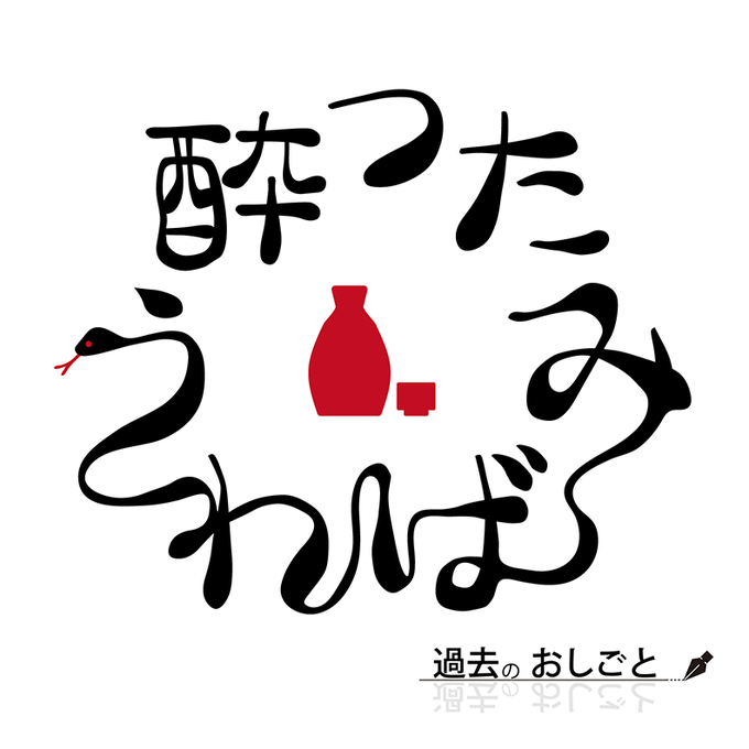
【納品報告】
サークルロゴを作成させて頂きました。ご依頼ありがとうございました。
#有償依頼 #logodesign #typography #ロゴデザイン #作字


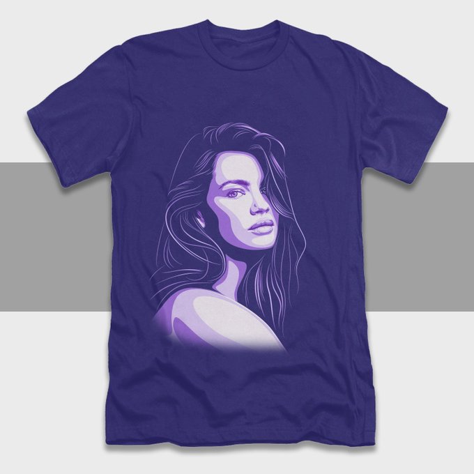
Hi, you need the unique best design, please contact me.
more info/order: https://t.co/NyAUF5O0Lm
#tshirt #tshirtdesign #bulkdesign #trendy #retro #urban #hoodies #sweatshirts #typography #creative #graphicsdesign #design (Etc)


“Reversing Into the Future reveals a glorious, technicolor smorgasbord of wild typography, tongue-in-cheek image appropriation, and art school weirdness.” More about Andrew Krivine’s bookish ode to new wave > https://t.co/a8sRnwZoNb


Lest we forget… never repeat the tragedy. #RemembranceDay2021 #LestWeForget #絵描きさんと繋がりたい #イラスト好きさんとつながりたい #グラフィックデザイナー #graphicdesign #typography #digitalillustration #illustration #art
My Instagram👇🏻
https://t.co/2WiWtZdgiZ


Morillas Branding - B3TTER Breaking the Healthy Snacks Category
.
https://t.co/J6NodPSTbq
.
#food #snack #typography #agency #branddesign #brandidentity #packagingdesign #graphicdesign #designawards #worldbranddesign #WBDSAwards #wbds


Artwork:
Bespoke illustration graphic, with typography.
Typefaces:
‘Kern’ by @pizzatypefaces.
(O)’ Tenebras’ by Doménico Barreto.


@jeffbrutlag You could always make something with interesting typography. I put some samples below of what I mean. Colors, typeface, and texture to express the general vibe instead of illustrative imagery. And you could use accent icons or images as well but leave the type as the main focus.


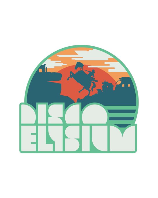
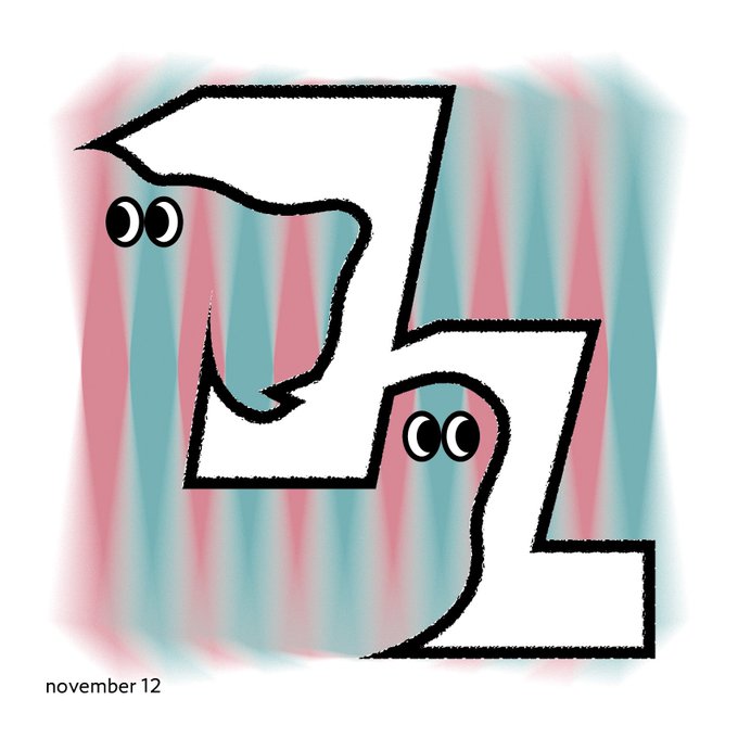
012/??? And here’s a fun patch I made using the typography I built. “Sunrise, parabellum”
Available for interesting projects. DMs open
#designer #gamedev #DiscoElysium


And how does that make you feel? @risarodil's "Inside Out" typography series taps into our deepest emotions: https://t.co/X26jpA2g2s

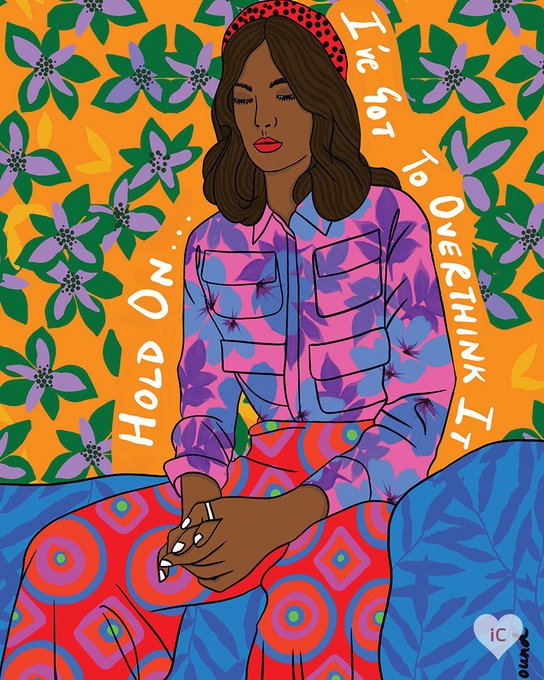
It’s ok; it happens to the best of us. 💭 #TypographyTuesday
🎨 - “Hold On Girl” by BrushBound
View This #Art: https://t.co/aGrwcBR1C8