typographのTwitterイラスト検索結果。 120ページ目



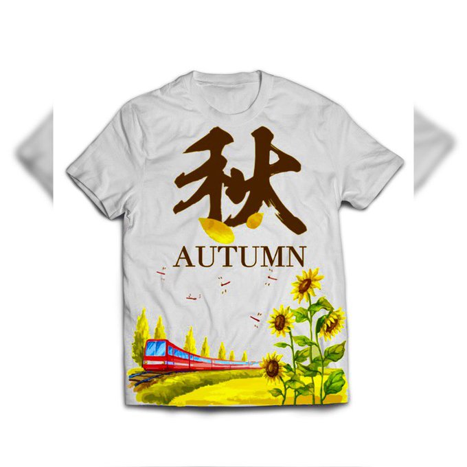
A red train along with pure grass, sunflowers and a single dark orange kanji letter in color, including a solid typographic text.
#autumn #autumnseason #autumn2021 #fall #fallseason #fall2021 #art #artist #artwork #digital #digitalart #digitalartwork #illustration #illustrator


Lest we forget… never repeat the tragedy. #RemembranceDay2021 #LestWeForget #絵描きさんと繋がりたい #イラスト好きさんとつながりたい #グラフィックデザイナー #graphicdesign #typography #digitalillustration #illustration #art
My Instagram👇🏻
https://t.co/2WiWtZdgiZ


Morillas Branding - B3TTER Breaking the Healthy Snacks Category
.
https://t.co/J6NodPSTbq
.
#food #snack #typography #agency #branddesign #brandidentity #packagingdesign #graphicdesign #designawards #worldbranddesign #WBDSAwards #wbds

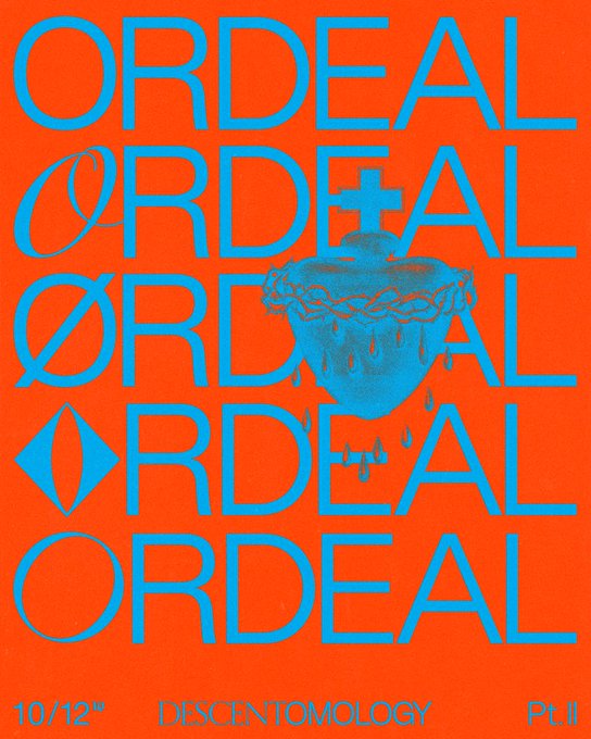

Artwork:
Bespoke illustration graphic, with typography.
Typefaces:
‘Kern’ by @pizzatypefaces.
(O)’ Tenebras’ by Doménico Barreto.

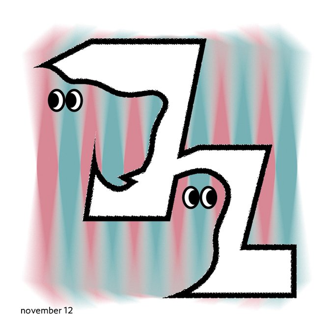


@jeffbrutlag You could always make something with interesting typography. I put some samples below of what I mean. Colors, typeface, and texture to express the general vibe instead of illustrative imagery. And you could use accent icons or images as well but leave the type as the main focus.

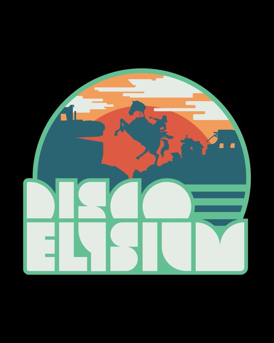
012/??? And here’s a fun patch I made using the typography I built. “Sunrise, parabellum”
Available for interesting projects. DMs open
#designer #gamedev #DiscoElysium


And how does that make you feel? @risarodil's "Inside Out" typography series taps into our deepest emotions: https://t.co/X26jpA2g2s

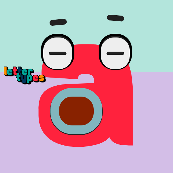

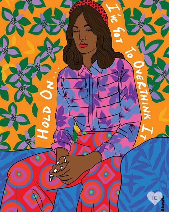
It’s ok; it happens to the best of us. 💭 #TypographyTuesday
🎨 - “Hold On Girl” by BrushBound
View This #Art: https://t.co/aGrwcBR1C8


Mistigris #1 [10/94] Full ANSI/ASCII/LIT Release Video
.
https://t.co/HNR7ghoJCR
.
#ansiart #ansi #ascii #asciiart #pixelart #textmode #textart #text #art #demoscene #bbs #retrocomputing #retrographics #8bit #8bitart #typography #graffiti #graffitiart


DUDKI Brand Design
Beautiful sophisticated logo design for this restaurant brand. Suitable colors and elegant typography. The logo variations and the trumpet icon adds an extra flair to the brand. So well done! https://t.co/o4phftzz7y


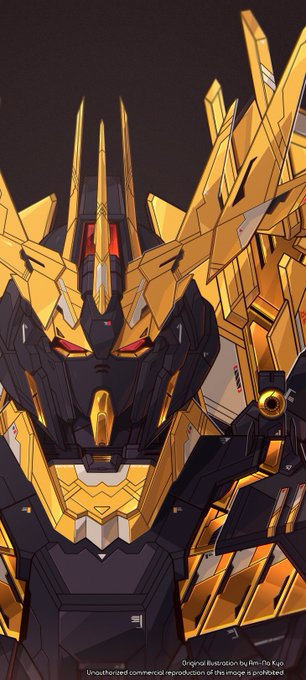
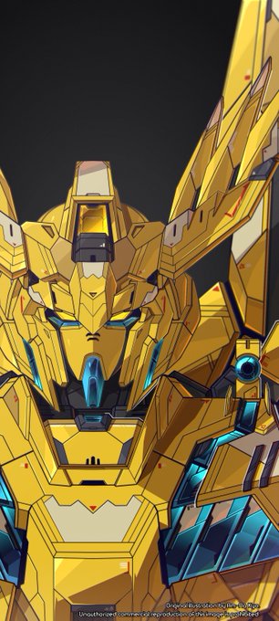
Dark-mode background of these stuff, in case you're interested 😉
Now, I also made it clean without typography/letter, so it won't bother your widget. https://t.co/DLq2YnoeHG