opacityのTwitterイラスト検索結果。 1,338 件中 13ページ目


@FrenchieFie @M4RCYSC0RE I don't like watermarking either, because it's hard to decide where to put it so it won't spoil my work. Usually I lower the opacity so it doesn't interfere. Here is an example


A quick step-by-step on making fur in Affinity Designer. I kept different layers to allow me to adjust the layer setting and not have to go to each line when adjusting the blend mode and the opacity.
#Affinity #affinitydesigner #stepbystep #tutorial #vector #vectordesign #furry


@SEGAmastergirl Like this, pretty much
Get a darker color, choose the texture/shape of the brush (I use airbrush), go over it, multiply it, and decrease opacity for it


There's something weirdly pleasing about adding color and lowering the opacity of most of the lineart here...
#AITSF


Last big one - toggling opacity up/down! My lining brushes don't use opacity since it makes my thin lines too light, so this lets me still lightly sketch/subtly build color w/o that!
You can use the opacity + transparency to get soft edges on strokes or blend colors in layers!


idk what to look up to find a solution to this but does anyone know how to change the opacity of a symbol in flash without it showing all the layers separately like this


Random, but I find that doing this with a Multiply layer and Lower opacity looks really good (Hope this helps) #DigitalArt #ArtTip


@poddostarline @graffiti_bri As for Neku and Minamimoto—I think it’s not so much darker and lighter purples as it is like, Neku’s is more red-tinted and Minami’s is more blue-tinted :]
Here’s some images for comparison (also good to note that the opacity of the colors differs at times)

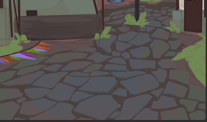
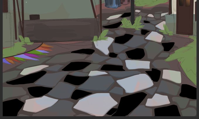
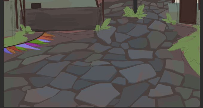
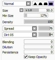
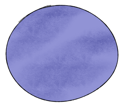
@WindObsessed legitimately though, i first just make the rock shapes, and start with a darker base, then use a lighter color and offset it a little to make it look like its a thin rock
then i use the overlay black and white and then individually color random rocks then lighten the opacity


@kindlestuck same!! i block in lines with like a semi transparent brush and then the gradient map makes the lines look cool where they change opacity, im in general a sucker for adjustment layers adding like more colour shifts over what would normally be just a gradient between 2

when u dont know how to shade so u just use one of those opacity pressure brushes and go ham with different shades where u think shadow would be


@kxovIAcrS7kxxXx I don't know how they do it but I do it like this:
-blur your image
-place a copy (not blurred) of your image on top of the blurred one
-reduces its opacity


@caelemsky I’m pretty amateurish, but I’ll put a low opacity white streak moving along the motion lines to highlight it a tad and give it some oomph. Also I refuse to give context for my example.


@DivineParahdox you can duplicate the art layer, add a hole to that layer, and add a blac effect border in the layer properties. rasterize that layer, change that layer to white, and add another black border effect. rasterize again, convert brightness to opacity in the edit tab


Alpha lock your layer, and use Air brush to put some darker color to the darker part of her hair. Make the opacity of the brush to 40-60%.


Having a layer on “Add” with 15-20% opacity to give a strong contrasting light here and there is the biggest lifehack I’ve discovered all year!
#digitalart #procreate #portrait #illustration


'A Peasant Woman'~ Hilaire-Germain-Edgar Degas, (1871)
A Peasant Woman is part of small series of works where he tackles the problems of painting white material against light with its opposing qualities of transparency and opacity.


feel like Photoshop brush. Color Thickness and Opacity by Pen pressure. https://t.co/vK15rCGPUG #CSP #ClipStudio #basicbrush