ContrastのTwitterイラスト検索結果。 10,554 件中 122ページ目


i love the contrast between kyo and tohru after realizing their feelings— kyo becomes more confident and touchy, meanwhile tohru’s a fucking disaster and a half ajsjsj


retconning it to be as if Kotarou's always had the body built of a super athlete and nice hair even before then. His old design in contrast to Koyuki made sense since he was kind of scrawny and had this bad case of a bad haircut (in the anime at least)


A Twitter thread from @StormblessedD4C compiling the official art of Spy x Family shows the Forger Family relaxing in a nice contrast to the manga's latest arc.
https://t.co/C2wCHehxmd


10 ♥️
A Bitter Sweet Contrast beetween a Criminal and
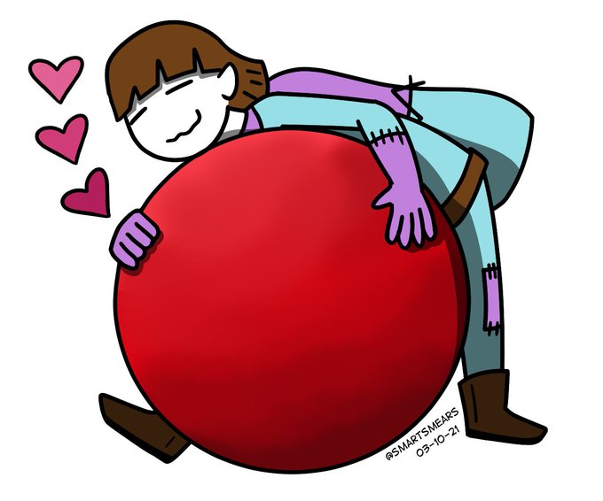
10 hearts shaped kids balloons.
#NFT #NFTCommunity #NFTs
#NFTProject #nftart #NFTartwork


Y EL INF CHIKITO DIOS ME DA TANTA FELICIDAD EN PARTE VOLVER A VERLO PQ SE ME HACE MUY TIERNO Y A SU VEZ ME DA RISA TODO EL CONTRASTE CON EL MAMADOTE
Pero bueno aún se tiene que recuperar el pequeño
Pd: tkm @elpiwawas


@Yotakuboi Contrast HERO Chaos. He's impractical as hell, but LORD do I adore his design and them. Especially as a HERO card.


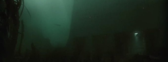

Few examples as striking of how avoidably bland and visually dead the Disney+ shows are than the contrast between the same location appearing in Fallen Order and Obi-Wan


Wanted my jelly to look more gloopy and transparent so took some advice from new friends on my course and I’ve tried to add more contrast. Thanks @WillMackieart. He’s already starting to look better.


#SciFiDaily I continue my memorial tribute to Ken Kelly with this great piece he painted for Creepy #73. It's a gorgeous piece that does everything a cover should do. The color contrast catches the eye, and the action catches the imagination. Great stuff from a true master.


來自なすの老師(@nasuno42)的Lovelive sunshine同人畫集《CONTRASTED》正在蜜瓜熱銷中
https://t.co/eHYsjYVhG5


∑(;゚Д゚) 7月29日から8月28日まで【ガンダムワールドCONTRAST in 沖縄】やるだと!!
(∩´∀`)∩絶対に見に行くゾ~ッ!!!w
o(*ΘωΘ*)b あと限定商品(ガンプラ)も買いたい~今から貯金じゃ~~~っw💦

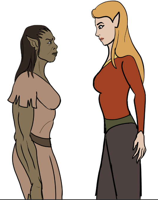
Just a colored drawing of a female orc in contrast with a female elf


A couple more WIPs for the FFVII photo book. Trying to work better contrast/lighting into this project... need a lot of practice...

Sneak peak of book cover art in progress! I have a real thing for red/blue contrast right now.


I like both Samantha's and Jessica's designs for different reasons.
Samantha for encapsulating the childlike silliness that is part of her character and Jessica for not only being a stark contrast to Carly (her sister), but also for giving her a "mellow" look https://t.co/fycP5R8pro


@shareocs I really like Ball Girl because it feels simple and yet really distinct. Plus the light blue and purple colour scheme was a really great idea. Really good contrast.


@miilywashere Definitely lineless, I love playing with shapes and contrasting colors.