comparingのTwitterイラスト検索結果。 125ページ目


Recent comments comparing me to John Egbert has awakened trauma from long ago of my friends displaying me as him.

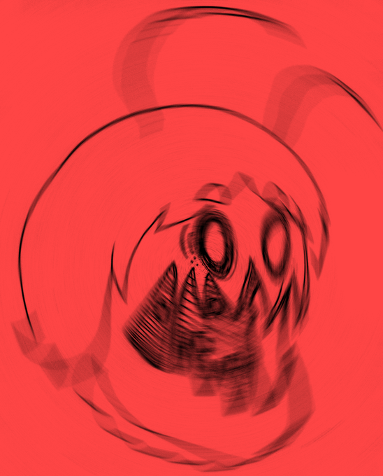
*reads timeline*
MAN I LEFT FOR AN HOUR!
WHO TF OUT HERE COMPARING BORG WITH PREDATORS GETTING OUTTED OVER JUST HIM TRACING?
I need names to block, because thats freaking stupid.
Tracing is bad but is NO WAY comparable to freaking groomers man.


cue me comparing art i made when i was 11 to now (18)
i still use the same software; Nintendo 3ds w/ Colors!3D app
(small thread 1/3)


Jim looks like... 😏💙
Prussia from Hetalia!
Part 1 of the #oclookalikechallenge / #youroclookslike challenge in which I asked my followers who my oc Jim reminds them of and draw some fun crossovers to break the taboo of comparing ocs with other characters! 🤗


Felt like doing a HW Tetra thing and comparing it to what I did last year


Hey here's one of my own Alexis and Jenny comparing boob sizes


I saw a few of those art tweets comparing a recent piece with something a few years ago and I thought this was particualrly relevant to that. The first one was done nearly a year ago, and at the time I thought I'd never get any better from there

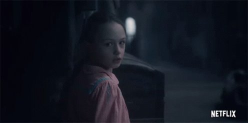
Halfway through #HauntingOfBlyManor and frankly growing bored. I’m still interested in the characters and the mystery, but it’s a tad repetitive/redundant as far as imagery.
I loved Haunting of Hill House so I’m def comparing the two. Tighter pacing in Hill House imo.


Comparing the two render engines of Blender.
"Elma, would you please stand still for a moment?"
The boots model is from a different game and
the dress is a mod from Skyrim, called 'DreamBurrows Princess of The Woods Retexture' with cloth physics.
Absolutely stunning!
#Xenoblade


I'd like some feedback on something.
Are my designs (for my sonas, ocs and fusions) good? interesting? I know i shouldnt be comparing myself to other but, i often see people get so much love on their sonas/ocs/designs and i cant help but wonder if im.. idk, interesting enough?


魔法を夢みていたけれど
魔法を叶えるのは「自分」の望み次第
尊く儚く純真に
You have a power to dream come true. Never comparing with others just believe yourself.
#イラスト #虐待防止策2020 #今日の積み上げ #illustration

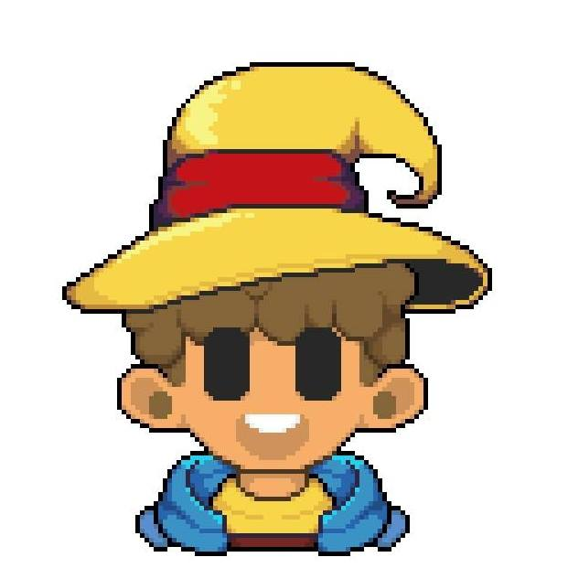

Last year's remade comparing these two pixel-arts.
-
#pixelart I #pixelartist I #ドット絵 https://t.co/rRn3ZJrbcB


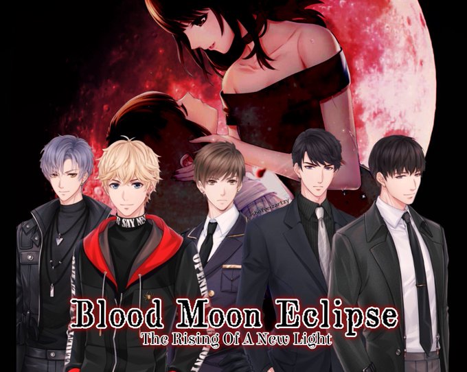


Just comparing from before and after I’m really happy that it was worth it and that I would get so much support. I know they aren’t gorgeous original arts (as my original art isnt that great 😅) but I hope these can motivate people to actually play the game! (2/3)


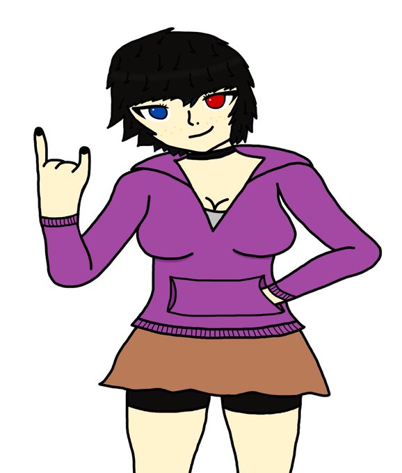
I think I’ve found the first ever pic of Steph from a few years ago. Comparing it to her recent reference pic there’s been a pretty decent change huh


How it started: How it's going:
(gonna do a few of these because I like comparing)

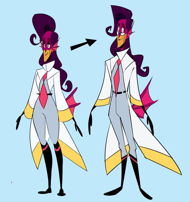

Comparing last year's Flinn model to today's redo; angles suit him more I think!
#ocs #biofincorp


Now vs before
Character belongs to @CheezeyRufflez
It's not done but comparing different sketches

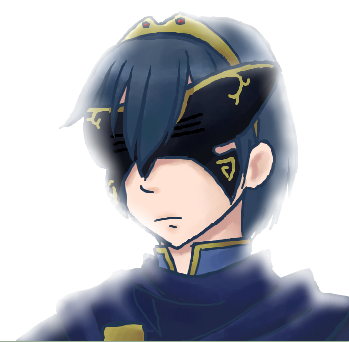


Meanwhile my first chrom was drawn only in 2017, my first Masked Marth was back in 2012 :Đ
here is a redraw
2012 VS 2017 VS 2020
I like to see my own improvements, comparing my old arts to my present ones :Đ
#FireEmblem #fireemblemawakening

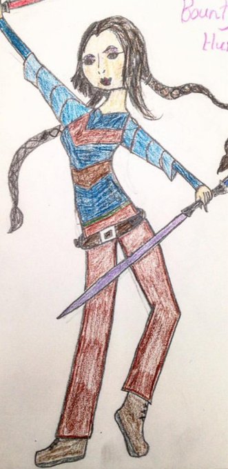


@gracebdraws I actually have redraws of two of those! It feels show at times, but comparing them helps me see how far I've come!