typogのTwitterイラスト検索結果。 127ページ目


Inject a good sans serif font into my veins at all times.
#typography #illustration #art #meme

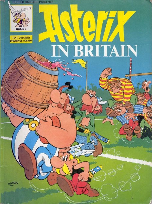
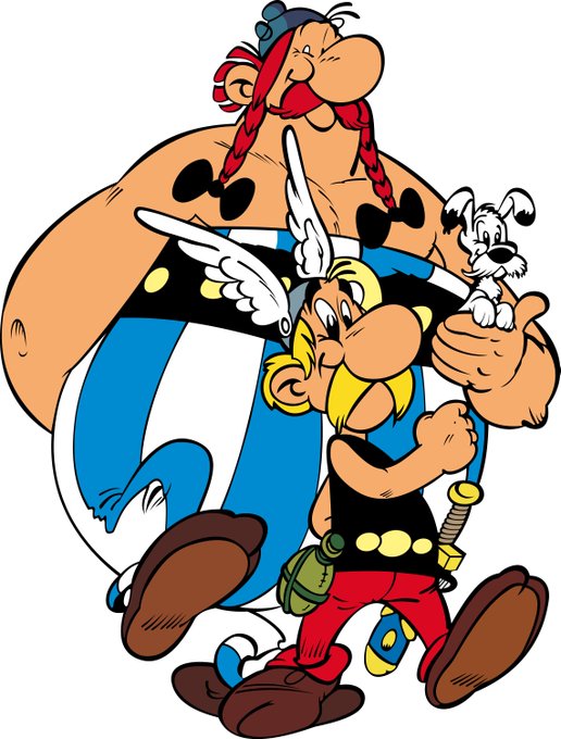
@GaryLoew Asterix comes from the fun world of European comics. It goes back about 60 years now, I think. I didn't know about the Asterisk and Obelisk connection in typography.
As with Tintin, I'm only passing familiar with Asterix. Something I should explore some day.



Learn how to create kinetic typography with page transitions using CSS & JS https://t.co/IddGGCz7M1

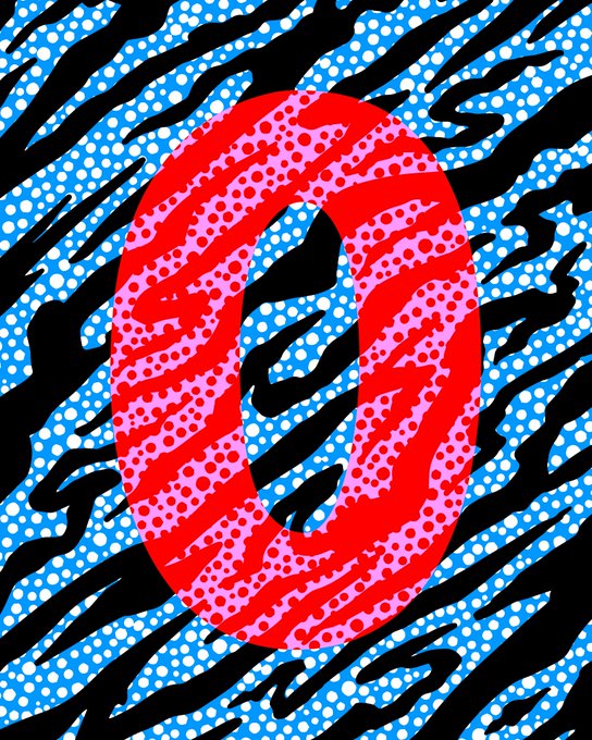

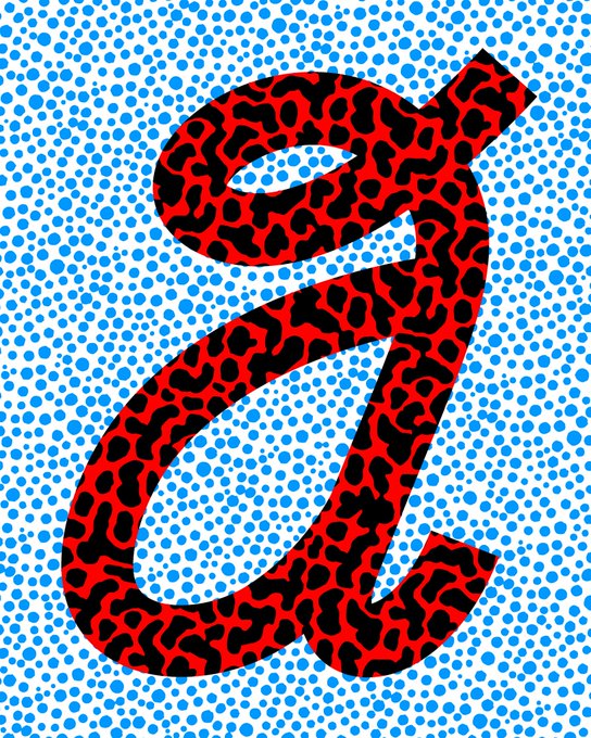
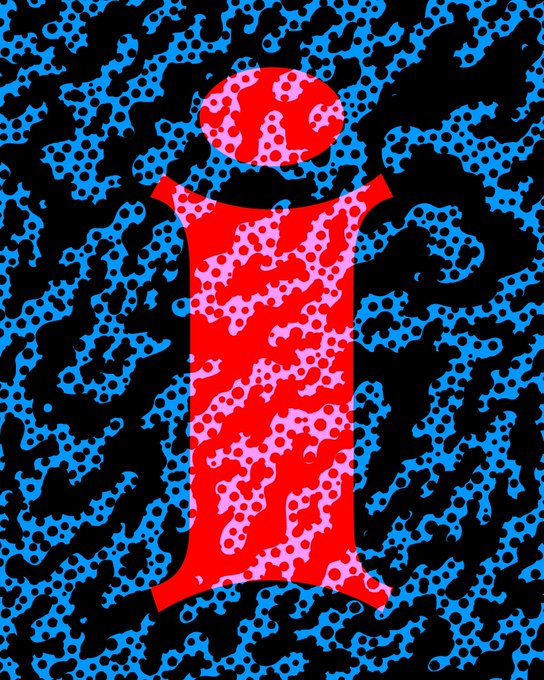
Some of the vowels from my alphabet project on @hicetnunc2000 . Go see the collection so far on my page: https://t.co/0SyIDIZjah
Will be doing a big burn when I get to Z.
#HEN #NFTs #NFT #CleanNFTs #hicetnunc #typography


🔥"HEAVEN'S ON FIRE"🔥 I designed this label for @hideoutcoffeeco earlier this year.
#branding #coffee #typographyart





And how does that make you feel? @risarodil's "Inside Out" typography series taps into our deepest emotions: https://t.co/QUndlARfOc


One of the ideas of Anisette Petite is to incorporate non-typographic details that are found in the lettering of posters and signs. It's not easy to accept an inconsistency when designing a typeface that you want to be consistent!
https://t.co/0YsGMv2mcL


I had to make 5 posters for my typography class and got a 100. I made one for Lisa of @BLACKPINK, Willow Smith, Fluffy the clothing brand, Panda milk tea and @lorde's Solar Power album. 😭😭😭 #artPH







Detroit - Slab Serif Typeface https://t.co/NqKVoswgZr #slabfont #truetype #fonts #logofont #typography #label #badge #sea #college #woff #typography


The circular shape of a circle is filled with various color schemes of leaves along with an orange heart and dark cursive typographic text.
#autumn #autumnseason #autumn2021 #fall #fallseason #fall2021 #art #artist #artwork #digital #digitalart #digitalartwork #illustration