opacityのTwitterイラスト検索結果。 1,338 件中 14ページ目


ya, ini yang bikin daya tariknya itu patternnya yang riweuh bgt ya, kalo mau apply in pake brush lace aja yang banyak, sama tumpuk2 di layer lain tp opacitynya diturunin biar keliatan rame
kalo ini kurang rame btw


Processการลงสี เดี๋ยวนี้งานหลังๆลงสีแบบนี้เกือบทั้งหมดเพราะว่าคุมโทนง่ายดี ลงสีพื้นที่เราอยากให้เป็นโทนหลักของภาพให้ทั่วส่วนที่จะลงสี(ส่วนใหญ่ใช้สีเนื้อแบบส้มอมชมพู) ล็อคเลเยอร์แล้วก็ใช้บรัชลดopacity~60เพ้นในเลเยอร์เดียวเลย ใช้บรัชเกลี่ยบางส่วนให้เนียนแล้วก็ตบโอเวอร์เลย์ เสร็จ!


@KazQuala overlay and pick colors that would look good under the pink filter, i also lower the opacity of the color folder to 90%
example:


I posted a wip of this palette swap, but I forgot to put the full version back up after revising my final version.
It became obscured by the blending layers and opacity values of the end result.
#MonARTch #MultiverseMonarch
#EuphoricAvatar #DigitalArtist

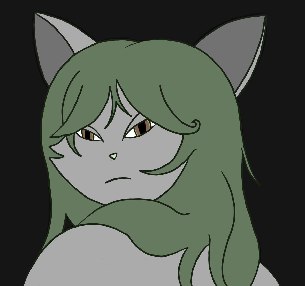
Quick draw, Persona Pop (o^^o)!! (Not lowering the opacity for my watermark this time)
#ArtistOnTwitter #persona #DigitalArtist


@artsydoe Pressure opacity but also smooth but also chisel???? Who’s to say, really

the pic underneath the top layer without the opacity toned down to 90%


@Wild_quesadilla I usually reduce the line opacity then change its color to whatever color I plan my overall shadows are going to be. Then I merged it with the color layer and paint it over. You can see that I changed the line to red here.


IN THE 4TH IMAGE I FORGOT TO LOWER TSUKASA’S OPACITY SO YOU COULD SEE THE FULL TEXT WHOOPS HERE


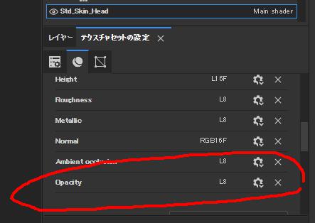
Some of you may have been waiting for this: #Substance3DPainter now includes new bakers: height, bent normal, and opacity (here we can appreciate how bent normals improve the occlusion and reduce light-leakage) - https://t.co/6KxTmEhqQj
#gameart #VFX #MadeWithSubstance


@techbubble great👌
small tip
First, do a quick sketch
Bring down the layer opacity
create a new layer, Redraw the sketch this time more accurately
You can do this a few times to make sure you got it right
Then create a new layer on top and do clean line art.
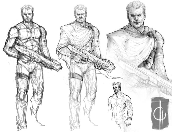
examples from my own work


!! BONUS with helmet opacity
pops his helmet off like a soda tab
/lovingly


Something else I rely on a lot is PS's Gradient Map Adjustment Layer. Sometimes I use it a reduced opacity to bring some unity to the colors, other times I use it at 100% in order to simplify the color scheme. Wonderful tool, so many options with it.


Experimenting a little with very low opacity, soft brushes. I really, really like what i'm getting so far!