DistinctのTwitterイラスト検索結果。 4,747 件中 15ページ目


While not the initial plan, i thought it was very distinct!
As tribute, even well after we went our separate ways post middleschool, i vowed to never change Kents shoe color for his costume, regardless of what people said. I even changed the costume later to match it more!


I think now with these more distinct changes
I feel it's a lot more clearer for me where things go
Lots more 9s now https://t.co/lN2IuD9TK2


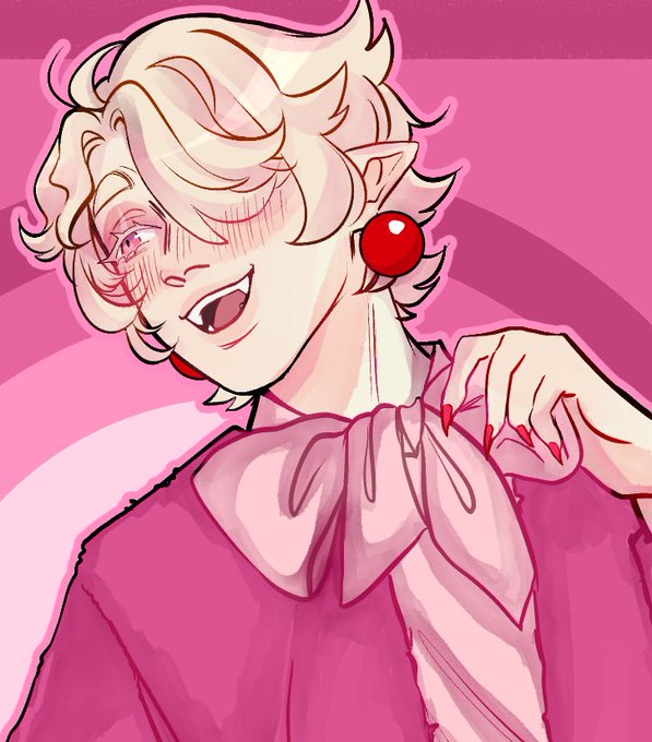
The distinct bright colors and splashes makes @miksketched_’s artwork stand out. The artist describes it as “melting, with a slight crazed look”.🫠
"I use colorful palettes, thick-cartoony lines and fluid shapes," Mik explains, to give them a lively and playful feel.🤲


Me wanting to draw a simple anime style that'd look good in model form and be marketable vs me wanting to give all of my characters extremely distinct facial features and noses and eye bags and lips and realistic proportions who will win


We've reached our last Role to profile, and it's Specialists. Like every other Role, there are 4 specializations, but in this case they share little in common. It is more like there are 4 distinct new Roles: Runners, Hunters, Trappers, and Terrain Artists.


Equian Paras and Parasect
have distinct forms that change their typing, allowing
them to live in a range of environments.
FB: @PokemonFutureandPast
Insta: @pokemon_futureandpast
Twitter: @TheEquasRegion
#Pokémon #fakemon #Equas #fake #regional #ancient
#primal #Paras #Parasect


@Sketch_Devil @1inkygirl My biggest problem with this design (and there are a lot oh boy) was definetly the fact they gave him normal teeth instead of the comic accurate "sharpened lip" look
he just looks so much less distinct without them


#269 Calamity Jane
Jane has the distinction of having her final ascension art completely redone. It was first leaked early on in production and the artist redid it for a more airy, fun look that better suited her personality in game.
Her full name was Martha Jane Cannary.


next up is brine! he’s probably my favorite design i’ve ever come up with. it was really hard to make something that was distinct, but not so much that he looked heroic or important (he DID start out as a cabin boy). it was also a nightmare to get human clothes onto a rat body.


I DONT HAVE ANY DISTINCTIVE ONES i used to draw in like completeky different styles from time to time just check my instagram lmao
so yeah have this (there is no difference ik) https://t.co/4pvSRbHW0A


Alright! and here's a bonus one that also feels distinct. I sometimes don't realize I'm actually doing something entirely different until it's over...
Would you say it's accurate that these feel like different styles? :0 https://t.co/Bs5RDDZoAS


Please recall! The Antlion Worker from Half-Life 2 Episode 2 and the Antlion Spitter from Half-Life Alyx are two distinct and different types of antlions. Failing to recall this differentiation will unfortunately result in being sent to the place known as The Silent Prison.

Idk I think my line is decently distinctive https://t.co/exlcB9517b


I have a feeling that my traditional and digital styles are quite distinct from each other https://t.co/GlCNA1R0K1


I hope Square Enix stops giving new IPs the Bravely Default logo style. It was unique when BD did it but now it's progressively getting more boring with every new series that uses it. Please go back to distinct logos that make games stand out much better. 🙏


Nils Dardel (1888-1943) (https://t.co/xut94t8aT8) is one of Sweden’s most popular artists. I love his distinctive, colorful style. "Mexican boy" (1940) is excellent.
#art #originalart #paintings #beautifulart #fineart #figurativeart #artist #artwork #painting #drawing #artistic


@scarolinewells True.
But if the blue and grey is done right,
it's absolutely distinctive.
And he loses none of his edge.


With Huff N. Puff dissipated (along with his storm), only one Star Spirit remains entraped, but not for long! @chuggaaconroy (Klevar was a bit hard to design in a way that was distinct from Skolar. Two Smart OnesTM in a single team does that for ya lmao)


@BamBanDibuja It never stops, it helps that all the designs feel distinct and try to go for different aesthetics. Two more really good ones imo