FontのTwitterイラスト検索結果。 142ページ目

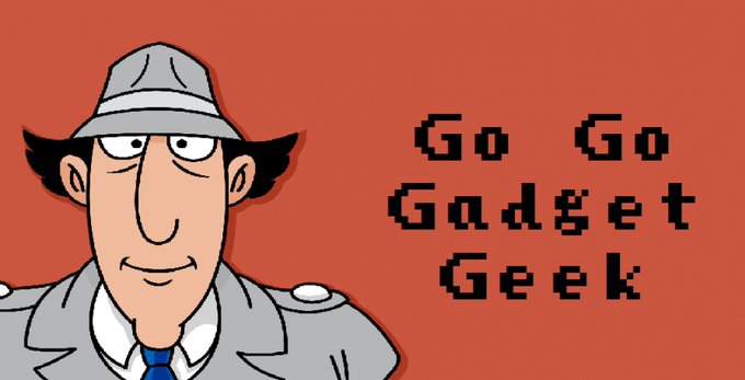
Oh just take a look at this!#Cartoon #Eyewear #Font #Text #Illustration #Line #Headgear #Pleased #Fictionalcharacter #Visioncare


🖤 THREAD 🖤
Les dernières commande que j'ai fais en mars ~ Toutes les demandes de portrait / bannières ou autres se font :
▪️En DMs Insta / Twitter
▪️Par mail : tetsu.drawing@gmail.com


This took me way too long, but I'm pretty happy with how it turned out. Been a good while since I used alcohol markers & I've never used them as a base for color pencil. The Persona font is made by HattyMikune & ToxicDevil on YouTube.
#sailormoonredraw #Persona5 #YuukiMishima

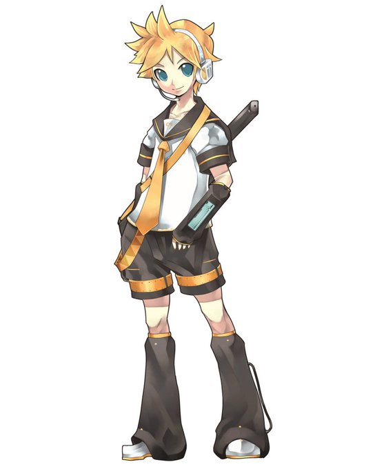

my favs from childhood vs now rlly just said different font


Who like it ?#Eyewear #Cartoon #Glasses #Animation #Cool #Font #Illustration #Graphicdesign #Fictionalcharacter


Sorcerer, Witch & Wizard ✨💫
Some visuals with our typeface : the Kalistê !
A font designed by Antoine Brun and available on our foundry website : https://t.co/UOFqrx15eR !

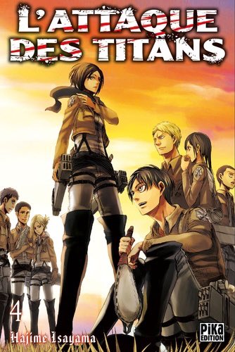

Ce sont les couvertures des tomes 4 et 23 qui font un parallèle assez intéressant quand on y repense


People with dyslexia: I'm busy working on adding OpenDyslexic support. Some questions, if you don't mind:
* Is the attached image sufficiently readable (font size 24pt)?
* Would more line spacing help?
There will be additional font size options, probably 20pt and 28pt.


Bonne journée à tous pour cette #InternationalAsexualityDay ! 🖤🤍💜
Pour ce petit jour un peu spécial je remet ici mes créations qui font écho au drapeau de l'asexualité !
#LGBT #Asexual #PurpleArt https://t.co/g8sKxiM76U


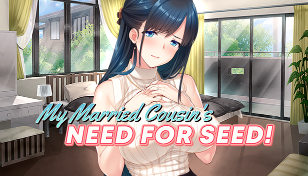

This game would've been a lot funnier if they'd just used the "Need For Speed" font for the logo. 🤣


Lovely Paws by deedeetype
https://t.co/67fXv2waUP
#typography #freefont #font #comicfont #typeface,

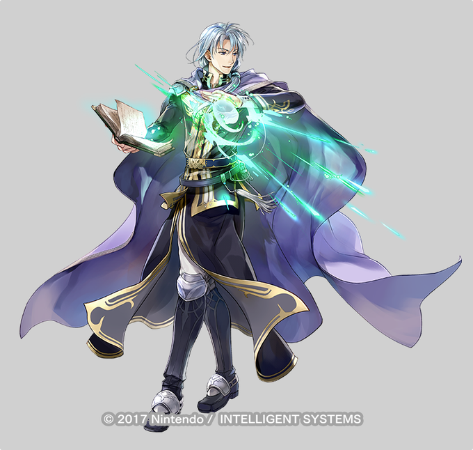
Aussi, font chier à sortir la bannière FE7 avec Pent et Louise, qui sont deux de mes persos préférés de la série, alors que je viens de littéralement cramer 350 orbes sur la ban légendaire de la semaine passée.


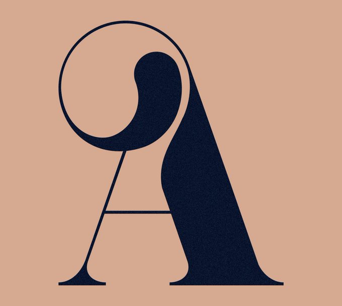


Mint Soda font by Patrick Seymour - @patrickseymou
For more inspiring graphic design and visual culture visit
⟶ https://t.co/NNYgziKQ6v
#graphicdesign #graphicart


@ArtsyGrandpa I will never not be proud of this piece, even though it was an experiment. I was happy with the cat, with the font making, with the background, with the colors! It’s my favorite thing I’ve made

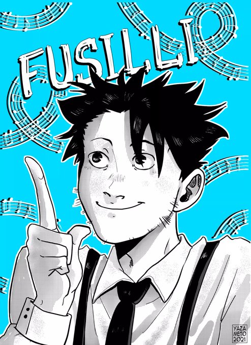
Un moment que je voulais le fanart et la sortie des premières planches d'@Em4sh font que c'est le bon moment 😎
(allez lire tout ça)

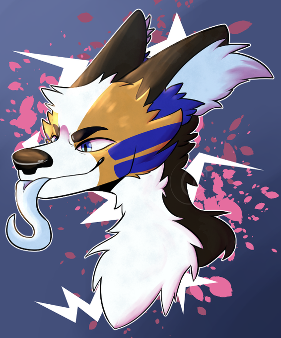

// caps
HELLO HI HERE'S SOME ART FROM ME FOR ONCE </3
@astraltora THE MAN, THE FELLA, IN ALL HIS GLORY
HE'S JUST LIKE
⚡🐕💙
YKNOW??
(floppa minecraft font just used for cropping LMAO)
#digitalart #art #furry #furryart

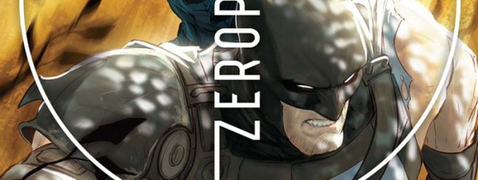
#Batman et #SnakeEyes font la bagarre dans Batman/Fortnite : Zero Point #3 | https://t.co/UpMbalbKSV https://t.co/wQTlt8TyS7

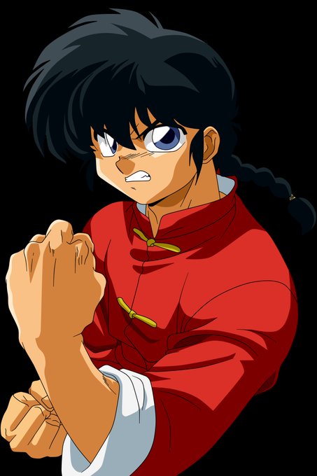

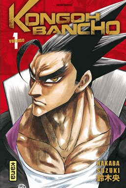
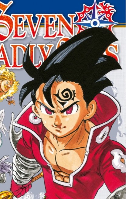
Pour en revenir au Copier-coller, voici quelques mangaka qui ont fait la même chose, évidemment tout n'y est pas, car je ne connais pas tous les manga du monde, mais ici, je prends au moins exemple des mangaka les plus populaires qui font exactement comme Mashima