graphicaのTwitterイラスト検索結果。 150ページ目


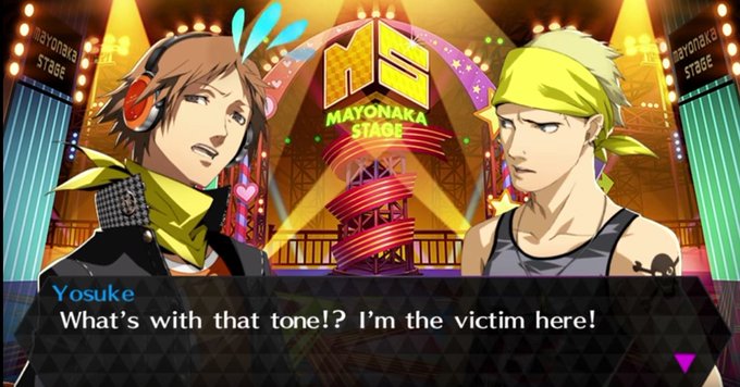


ok I'm no graphical design artist but I think I figured out why yosuke bothers me so much. Look at how much screen he takes up compared to Chie and Kanji. He's wider and taller. This makes his neck stand out even more than usual.
You can compare the P4G portrait to see it too


Peach Rings!
#graphicart #artwork #bayareart #illustration #marijuana #weed #bayareartist


'We are a stolid and a taciturn race, we of the Five Towns. It may be because we are geographically so self contained; or it may be because we work in clay and iron; or it may merely be because it is our nature to be stolid and taciturn. But stolid and taciturn we are'


Mothy😇😈
Or what Xuegui and Mogui call him: E.T. Lolol #illustration #drawing #digitalart #artist #graphicart #painting #originalcharacters #mangaart #animeart


Hi all! Recently, I've been entering the monthly contest at @svslearn and wanted to show you my entry for June!
#illustrator #graphicartist #artwork #svslearn #junecontest #svslearncontest #createartdaily #draw #becreative #jungle #monkey #dontstopcreating #draw #joshuadagesart


Another commission for @finstarhund, this one's him and Spot in the Paper Beast setting. This was so fun and gave me even more appreciation for PB's graphical design.


model / photo: @______minuit
.
#collage #collageart #graphicart #コラージュ #コラージュアート #artwork


🦎 A monograph on the fossil Reptilia of the Cretaceous formations.
London, Printed for the Palæontographical society, 1851-64.
https://t.co/b3KHNqJcet


We're thrilled to introduce @Noble_Artwork as the next featured artist in our "Heads Above the Rest" campaign! 🌟
-
Explore more of his work here: https://t.co/Jo9k7aowgb
-
#characterart #conceptualillustration #headsabovetherest #graphicarts #conceptart #directoryofillustration


Our goal is to add new graphical quality content to Sailormoon Fan Videogames done in the 90's arcade style. Support us in anyway you can. By supporting our project you are also helping accelerate the process in making a quality Sailormoon fan videogame.


For #Feathursday this week, we return to our sibling collection, the American Geographical Society Library’s set of French natural history books 'Dictionnaire universel d'histoire naturelle' with a few hand-colored, steel-engraved avian plates. Learn more: https://t.co/gTXb43vVmj

model / photo: @______minuit
.
#collage #collageart #graphicart #コラージュ #コラージュアート


Thank You For Your Kind Words, I Appreciate It #Alternative #Pop #Art #DigitalArt #Eclectic #FoodBeverages #GraphicArt #Illustration https://t.co/G3NobIgt6N