ContrasのTwitterイラスト検索結果。 10,816 件中 151ページ目


Theme: Aesthetics
The reason I paint essentially is to create visual excitement/ aesthetics, using the elements of colour, shape, rhythm, contrasts & textures.
I see my abstract paintings as having a life of their own, initially inspired by experiences in places.
#abstractart


@IceCreamyWolf Because black is the ultimate contrast that makes any color POP... with a caveat though since darker colors and vibrant blues dont really work super well. Red and White's also pretty good.


You can't see much of it in the mockup, but pretty proud of the background. For GBA screen so really trying to push vivid colours and good (bg/fg) contrast by compressing the value range in the back, ending up with a pretty Sailor Moon kinda style.


Work in progress - I'm enjoying working with a subtle background offset by strongly contrasting shapes, to create a dynamic abstract painting.
More work to be done on this, but it's a good start!
#artcanhour #artcanorg #workinprogress #wip #richmondartsociety
#abstractpainting


I think I've figured out what JN's full aim is.
Its capturing the stories and appeals of every #anipoke series, taking pieces from each one in order to form something new (like Chloe's arc). And its divisive cuz of this fanbase's such contrasting opinions on each of those series

#NewPFP
The contrast😂
Am I allowed to be this cute? Maybe I'll edit the foaming mouth back in 👉👈😳


@Seldionn Oye Seldionn, vengo super tarde pero en fin, la prueba definitiva de la falsedad... combina las dos primeras imágenes, bájales la saturación, el contraste, tómale foto a la pantalla y bue... ahí queda la "filtración" XD

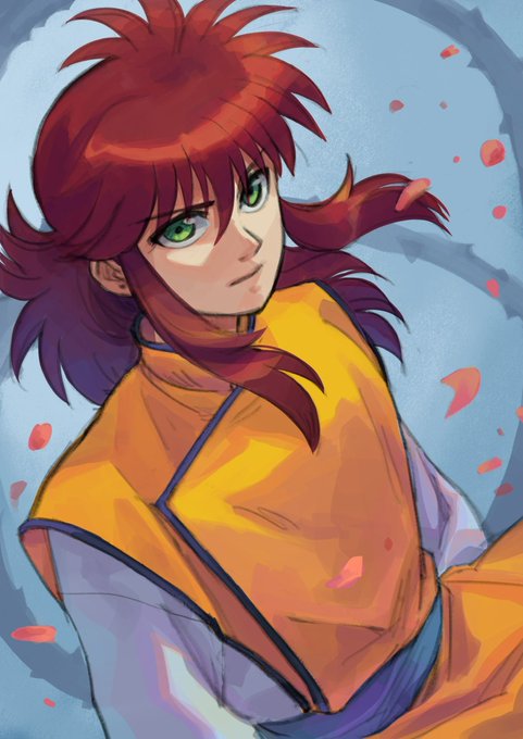
#Kurama, from Yu Yu Hakusho. He was my favorite as a teen, I loved his calm attitude, but now, I noticed he’s not just a nice and sensible guy, he can be quite vengeful and cruel too (I like that contrast so much!) And his interactions with Hiei rock !!!!


Shigenori Soejima the artist for Persona games... Just fell in love with the way he draws the eyes, hair, also contrast, shadows, and colours in his work but still keeping it "simple" anime. https://t.co/fk253ONQzK


CREO que tengo los colores bien, menos los colores de la espada y la máscara, esos los coloqué para que contrastaran bien con su ropa, pero si me equivoco díganmelo.


messing with Levels (basically a classier brightness/contrast setting) in premiere is such a pain compared to photoshop omg i change one thing and its like

THIS IS THEIR DUALITY 🖤🔥
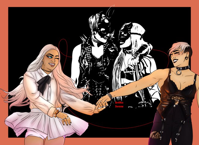
Two of my favorite looks from @RheaRipley_WWE and @YaOnlyLivvOnce cause I Love the contrast between them
Tried a new a style out too for the Mania look- let me know what y'all think !!


the stark contrast between their face expressions in the sun and moon awakenings is so interesting


@thimblew00d YEAH. People think it’s somehow racist for brown characters to have white hair bc??? Exoticism?? Or something?? It has become a trend in recent years but I adore it, it looks nice. Good value contrast. Case in point: they


Going live in ~30 minutes, Imma finish this and hopefully get better at using values contrast in my future pieces too!


【VOCALOID4】The vocal synth of the hour is Kobayashi Matcha.
Matcha is a calm and collected girl who tends to hide her emotions, in contrast to her best friend Masaoka Azuki.
Originally released for VOCALOID2, her voicebank wasn’t public until her V4 release.


Fairy Gift 🌼 I made some revisions to this illustration from last year. The biggest change was increasing the contrast because I felt it looked a bit flat before. One day maybe I’ll redraw this piece!