contrastsのTwitterイラスト検索結果。 767 件中 17ページ目


Sneak peek of forthcoming #NFTdrops from my #digitalcontrasts series Beauty#20 #nfts #digitalart #art #digital #cryptoart #cryptoartist #Crypto #token #beauty


Leaving her in flats for now but voila! My Ethereal Dissonance AU Mayday! I'll make her guitar later
I love how much she contrasts between the other Ethereal Dissonance designs, and of course it is on purpose.
#NSRMayday
#NoStraightRoads


@CherrySpotArt Hello n congrats!
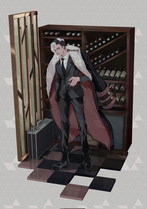
I'm Dealter, recently start writing random things in artshare replies.
I like blue. But I somehow enjoy drawing red. It easily contrasts to other colors so always provides great results.

Sneak peek of forthcoming #NFTdrops from my #digitalcontrasts series Now#11 #nfts #digitalart #art #digital #now
Sneak peek of forthcoming #NFTdrops from my #digitalcontrasts series Earth#14 #nfts #digitalart #art #digital #earth


New Ground Floor Exhibition: Rhythms of Place. Shenac Twiggs's exhibition gathers inspiration from the overlooked aspects of the everyday, together with a bold, contemporary style of strong graphic shapes, contrasts and edges. The exhibition is on display until 13 November!

Sneak peek of forthcoming #NFTdrops from my #digitalcontrasts series Yes#1 #nfts #digitalart #art #digital #yes


Just watched Venom 2, and that scene...the F-bomb scene...contrasts Eddie and Venom against Robbie and Eli.
Eddie is sentimental; Venom is ruthless.
Eli is sentimental; he carries elaborate, prolonged revenge fantasies about Yegor Ivanov. Robbie, pragmatically, just kills him.

Sneak peek of forthcoming #NFTdrops from my #digitalcontrasts series Wow#1 #nfts #digitalart #art #digital

Starting inktober a bit late. I’m going to try to experiment with brushes, colors, and contrasts with this month event.
#inktober #inktober2021 #inktober2021day1


Here are a couple more relief prints for #printober. These are both from around 2008 and are around 5" x 7". I mostly focus on intaglio and etching techniques, but it is nice to work with the bold shapes of and contrasts of relief printing, from time to time.


Looking back on updated coloring styles, I'd like to think I've come a long way!
The current style, GlitchPOP was inspired by this older POPshade style from 2015!
It's much more fun but still very much me! I love bright colors and harsh contrasts a lot!


@kairolion I know it's kinda plain but I just LOVE red roses. The simplicity, the gorgeous, alluring color, contrasts so well with the green stem, I just really like it 💙 I'd say it kinda compliments my boy Jack? funny enough I've not gotten a rose in a pic with him hah


@wtf_fra_
The White Queen of the GCOM, had tons of fun drawing her! Also, I'm a sucker for crass contrasts. I hope you are, too.


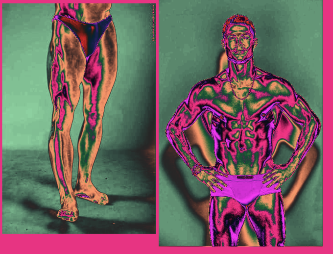

I'm trying to study drawing more, but facing the problem of not understanding volume (mainly in anatomy) is kinda really hard. Maybe im bad at observing?
Anyway, I built this redioactive gradient map that contrasts values.
It kinda helps?
Thoughts?


@NeviTheLettyFan probably third, red is nice ~
black contrasts her white skirt well ~
(though plain white and pink is always cute >u<)


People forget that in the beginning of the Yashahime anime, Towa acted rough and looked down on others. She's surrounded by weak people so she puts on a face, she's not comfortable showing vulnerability (this is why her speech contrasts with the final episode "I AM the weak one")


Love the use of contrasts both visually and symbolically in this piece. #fantasyart
Uyuyan Guzel (Sleeping Beauty) by ertacaltinoz https://t.co/qnNG3GjZee

