DistinctのTwitterイラスト検索結果。 4,747 件中 165ページ目


I ran again tonight. Maybe it was so humid that steam was rising off the old abandoned road I was running on, but I saw five distinct misty shapes in my headlamp. One of them brushed my face. That was still less scary than the army of mosquitoes who accompanied me🦟


Adam (@/LitchiKitti), aka that cool dude with the funky warrior cat amvs (my favorite ones, by far). He does super funky art too! Lots of bright colors and such a distinctive style, I'm always happy when I can snag a commission! Check him out here: https://t.co/5JXT3M4uim (4/?)


Someone said that 0ld Xian's art is bad. ( ´゚Д゚`)
I'm sorry, but I really have to disagree— I am well aware though that it's merely an opinion. Xian's art is so, so good now! And even back then when it wasn't as clean as it is now, it still was good and very distinct. +


Also, wanna take a quick minute to shout out the great cover art! I actually thought it was from the early 2000s when I first saw it because it's so distinctly Battle Network. It's uncredited, but I believe the artist is Shinsuke Komaki!


Brief Themes for Peculiar Animals
Hey, guess what? I released a music album. 🎉
10 orchestral themes for 10 animals with very distinct personalities.
Link in comments.


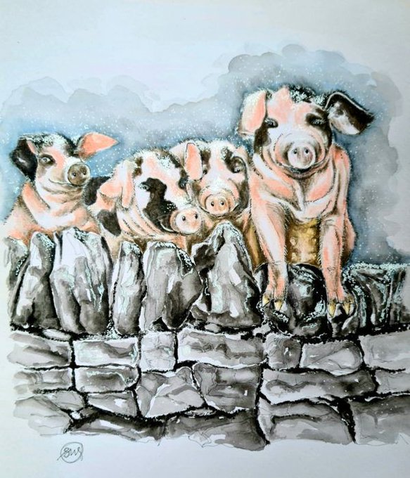
Susan Worker's "distinctive, personal style captures the vibrant spirit that nature, wildlife and landscapes have to offer".
Browse Susan's work today: https://t.co/A4crmpdUMZ.


One reason I loved the older final fantasy games so much as a kid was how well Amano's weird and unique enemy designs translated into pixel form. It's hard to find anything as solid and distinct even 30 years later.


@mintminnim i like the way i color, and i like how i draw faces and hair as well, i used to hate it because i thought all the face i draw look the same, but now i've been able to put some distinctions on the facial features i draw and im happier about it!


@Shadderstag It gets hard to see what makes my style distinct 'cause I'm just so used to drawing it, so I'm interested to see what features you would pick out! :oc


My part of an art trade with @Starryknightttt . I drew her fursona in my style, while she drew my character in her. It's been such an interesting experience, my linework is usually soft while her is sharp, so by trying each others styles we gave our arts pretty distinct feel


Commish featuring the villains of SSSS/Gridman! The commissioner specifically asked for KiloKhan, so I used Malcom instead of Takeshi to make the distinction. #Gridman #SSSS_GRIDMAN #akaneshinjo #kilokhan #blueike #commissions #commissionsopen


art train ✨
(finally doing this lmao)
thank you for tagging me carman!! your style is so distinctive and the colours are always so calming and your sketches are god tier!!!
some more talented artists: @sewoonful @noiryunho @AilimmiliA @pinkycelly https://t.co/HDbQIYiaYL


@cheyenne70 Hey @cheyenne70 , it took me awhile but I finally worked you in as an Easter Egg. Thank you for always promoting us, you get a distinction along with @TheVikkiVerse as having a prominent name in our books!


thinkin about all the custom primarchs ive designed over the years and how much fun it actually is to pick a distinct style of armor- and then slap on some big ol pauldrons and gold trimming on it😩✨


@EdoPhoenixIRL OUR BOYS!!
Also helps that in Drew's first ep they kinda had his hair different with a distinct part, so it looked more like Edo's...those bangs are practically the same. They are TWINS!

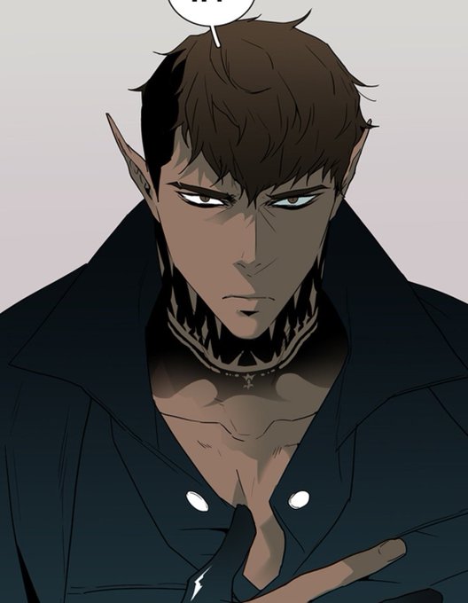

Speaking of this Dear Door demon, i really likes his character design. He's so cool and gorgeous. PlutoDx art is just "fluid" (for the lack of a better word) and i really love the colors they used in their webtoon.
The characters are so distinctive and unique too. https://t.co/5vhPCNFdkd


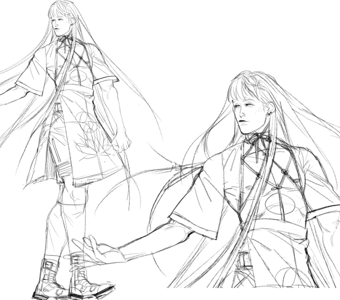

Out of everyone, I'm surprised by how little Lotus' design changed throughout this process. I had such a distinct vision for his character since the beginning.
I always tried to bring him closer n closer into a modern sensibility, playing very carefully with masc n fem motifs.


2.) Try to focus on indistinct aspects of your inspiration, like posture, or the shape of their spine/head/limbs. Don't replicate large parts of the original animal's body completely.
This helps your design feel distinct.


“Grandheron Sans” (https://t.co/fbHi5Zk8Ze) by @andresimardfont is a static grotesque typeface with a DIN-like technical look. Some letters (afklvyAJKMNVXY) sport distinct angular details. 18 fonts, each with 953 glyphs: this legible family is quite well equipped. #366fonts (268)