positionのTwitterイラスト検索結果。 166ページ目


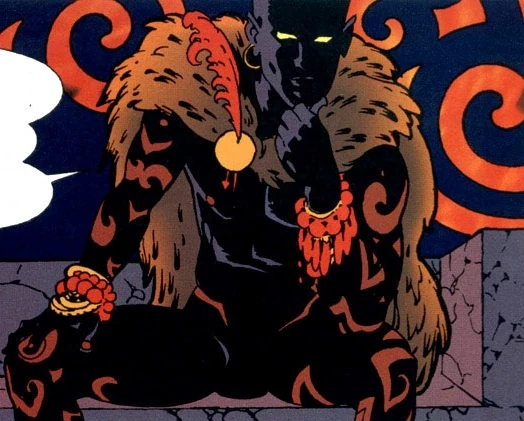


In the meantime while working on all of these I've been experimenting with "breaking" stablediffusion to create interesting compositions, with very raw, and as my friend @DavidLisser described it "rhytmic composition"
A few of those pieces:


Embarrassing story time: I remember the moment I realised 69 looks like the position it stands for. I totally thought I discovered something mind blowing, only to get hit with a “Mimi, how did you NOT know that”
Ah..
#Vtuber #VtubersEN #VTuberUprising


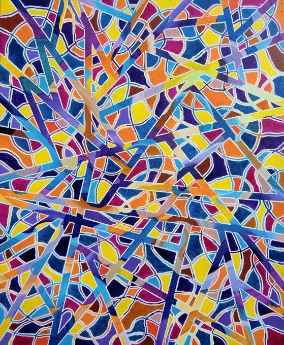
So, once in my rural life, I began to take the time to dive back into color. My first process was very disciplined: 3 large canvases where I returned to my fairly natural composition of round shapes, which I then deconstructed, fragmented and refragmented in layers. 5/


Storm got a small redesign! I mainly tweaked a few colors and changed the positioning of a few of her scars. I also changed the design of her prosthetic leg a bit!
#oc #characterdesign #cyberpunk


#MidJourney V4
"Old man looking out of window at people going up and down the street"
Not bad. I wonder why it's less sharp compared to previous versions, but the compositions and visuals are interesting.


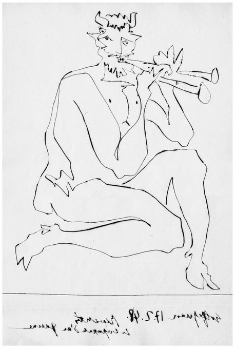
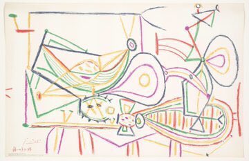
In the first drawing he seeks to capture animal movement, in the 2nd beauty, the 3rd frivolity & finally in the 4th an idea of form as visual mapping. Woman Washing her Feet (1944), Portrait of François (1946), Faun (1947) & Composition (1948)


old compositions committed to digital memory (things I want to draw later so kept them as notes on my phone)


Stimpy and his most prize’s position
#renandstimpyshow #nickelodeon #cartoonart


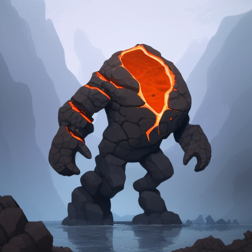
Now it's also possible to use the same finetune, and generate pictures that could be used elsewhere than in the game (ads, splash screens, etc).
Just add "Greg Rutkowski" in the prompt and start seing some cinematic composition, dramatic lighting, etc.


⚖️ “I particularly liked the composition of the selector's panel and the differences and nuances that occurred naturally within the group. A very fair selection.” explains #INGDiscerningEye selector David Ferry RE.
The show opens on 11 Nov 📍 @mallgalleries.
📸Felicity Gill


staff for <The Reason Why Raeliana Ended up at the Duke's Mansion> anime
- Studio: Typhoon Graphics
- Director: Junichi Yamamoto (More Than a Married Couple, But Not Lovers)
- Series Composition: Mitsuki Hirota
- Character Design: Haruna Hashimoto
- Art Director: Kenji Kato


I'm going to both rip on and try to motivate myself for a moment - these are some panel compositions from a short comic I did in 2019 vs. two recent ones from my current ongoing comic.
Severe burnout is very real. Please remember to take a break, comic friends.


Finished the doll designs finally along with an smug mf Opposition Expunged lol because why not.
#daveandbambi #daveandbambioc #StridentCrisis